

Image by
The smartphone has brought photography to the mainstream. You don’t need to haul around a clunky DS or pack up three different lenses to get great photos.
However, the principles behind good photography havent changed much since the days of silver halide film. As good as smartphone camers editing software are getting, you still need to pay attention to the key elements of good photography if you want a quality picture.
My journey can help. I knew zilch about taking good photos until I became addicted to mobile technology. Coming away from a trip or a night out with great pictures thanks to my xel (one of many good phones out there) has fueled my desire to learn more. If you’re a total newbie like I was, or even a fairly experienced amateur, the following photos advice should give you some inspiration new ideas.
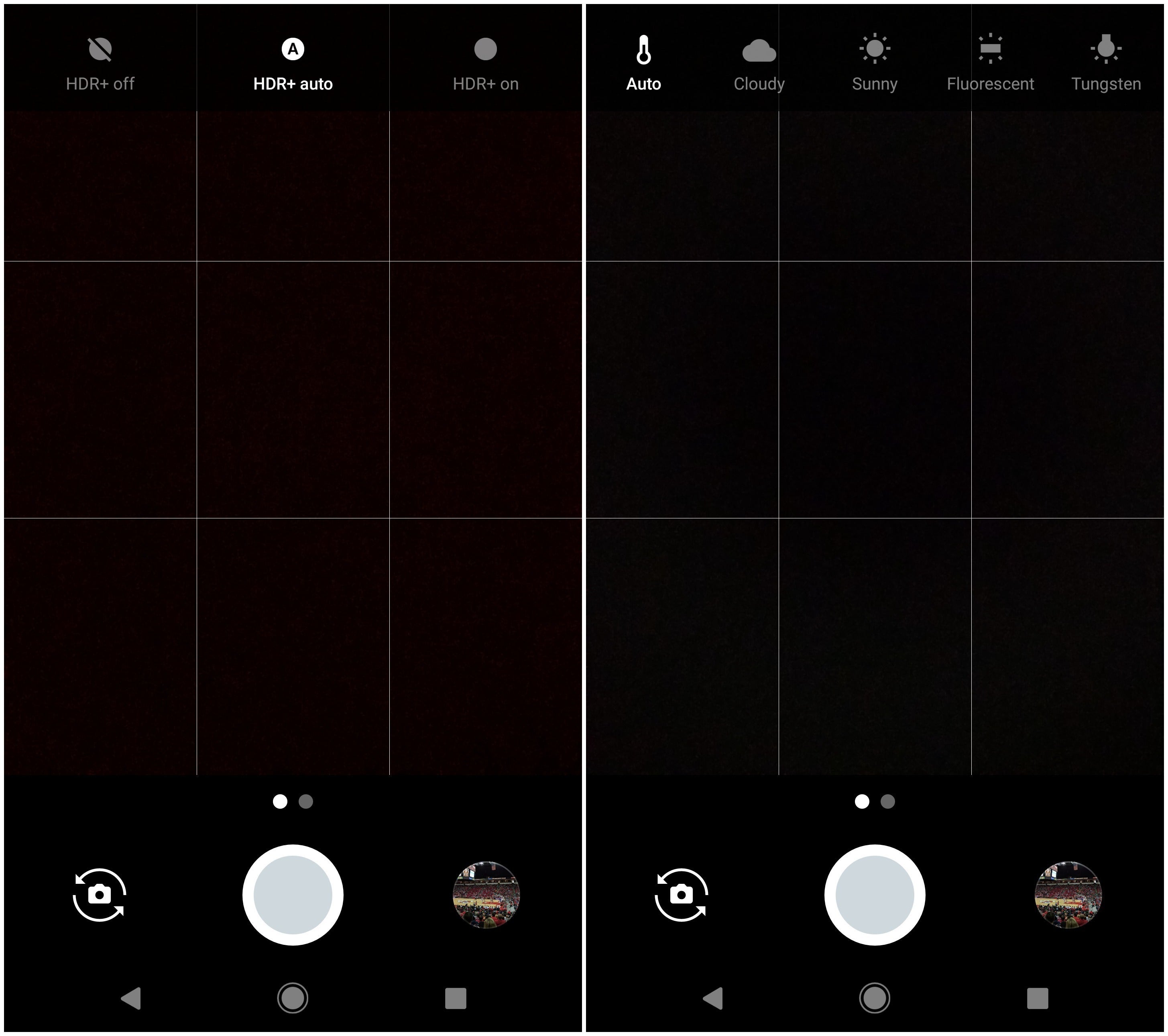

Image by
ether it’s a br new phone or one you’ve had for a while, take a moment get to know the key settings to the camera app.
For instance, I find HDR to be essential, camera software continues to evolve well to take advantage of the capbilities. I also like to turn on the grid because I’m pretty bad at getting the subject properly aligned without it. It makes it easy to compose a shot using the rule of thirds.
The specific environmental settings (cloudy, sunny, etc.) can sometimes help under those conditions, but I typically find a good HDR image in the right lighting will get the job done.
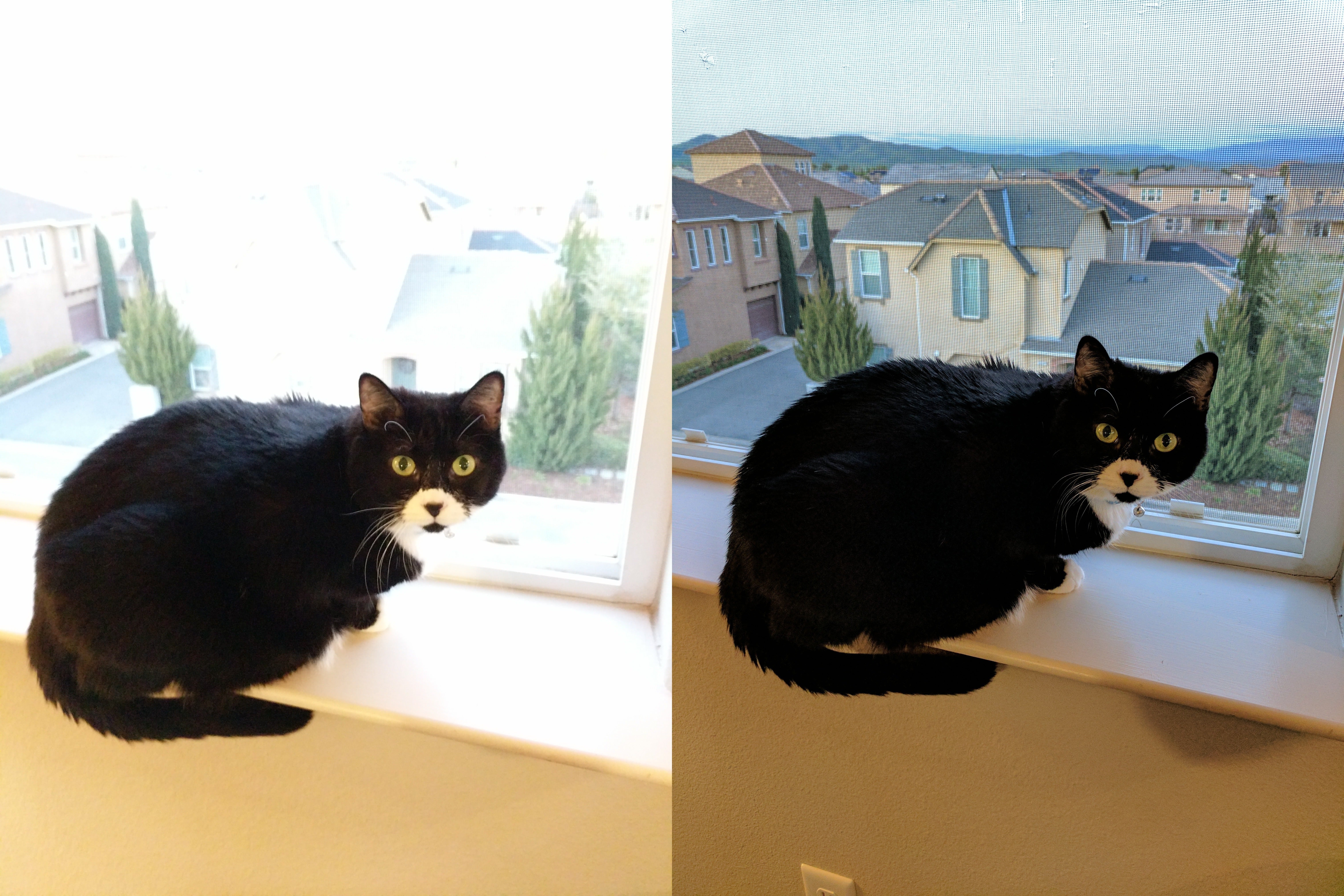

Image by
HDR is one of the most useful camera features on your phone. It sts for High Dynamic Range, its goal is to balance exposure between bright dark areas of a scene. It combines different exposures into a single image, which is why you’ll usually see a brief “thinking time” occur after you take the shot.
The image on the left did not use HDR. en the idoors is properly exposed, the bright outdoors is overexposed. On the right, the photo is far more balanced, as the phone automatically combined a shot where the outdoors was exposed properly with one where the indoors was exposed properly. It’s not perfect (I’d opt for a little color white balancing) but with HDR you can get a much better starting place. Especially for all the places those pesky cats can end up.
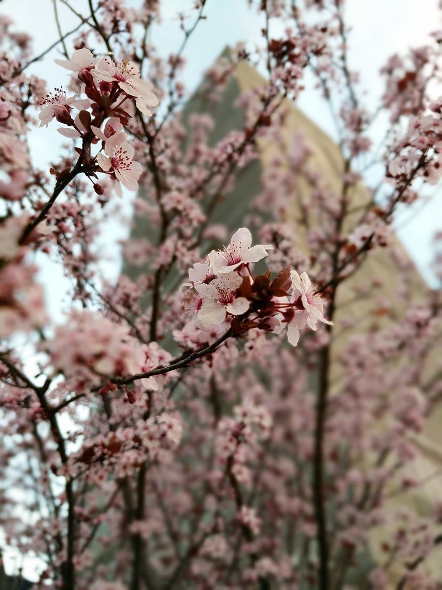

Image by Twitter
This image was highlighted on Twitter by the xel team, which curates some of the best images that are tagged with the #teampixel hashtag. It illustrates another key principle: using focus to make a subject st out.
This picture is great because one set of flowers really sts out, with the rest of the background slightly blurred. On most phones, you can touch the screen to select a focal point. Try it out to see if you can get a similar effect. You’ll want to take a lot of pictures when trying this, as different cameras are better at keeping focused on the object than others. The effect is more pronounced as you move closer to your subject, but get too close you can lose focus entirely.


Image by
A good picture uses color well. You’re not always going to have a collection of colorful objects or a cute toddler available, but you get the picture. The real lesson here is to look for original moments, as these are the type of images that are going to get lots of shares likes on social media be a real hit with the family.
The toddler’s left h is a little blurry, in post-production I would typically brighten things up. But it’s presented here in raw form to give a more real-world example of the makings of a good shot. ok for color, think about how it can enhance the subject or if it can be too distracting.
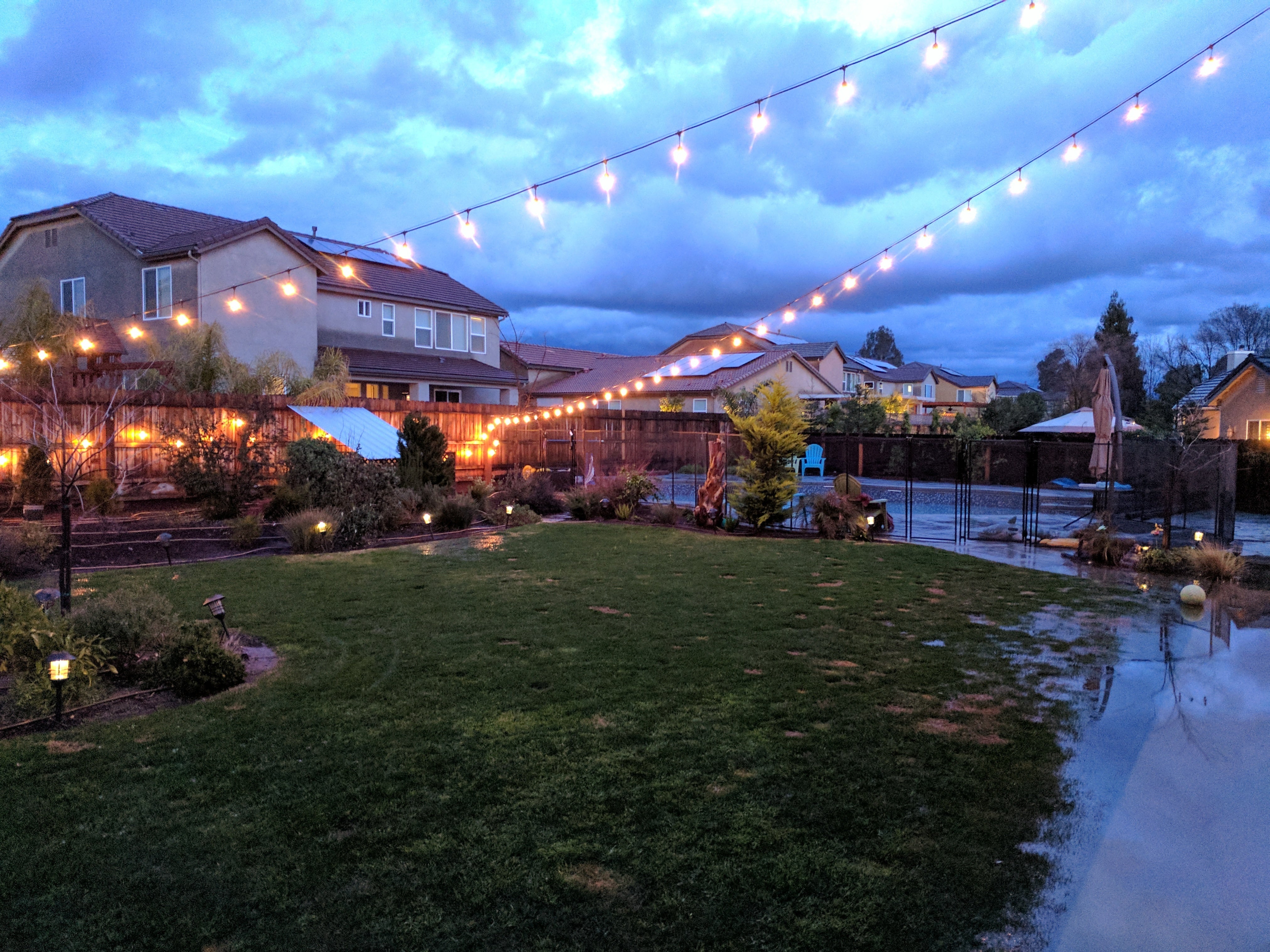

Image by
st because it’s dark doesn’t mean you need to bust out the flash. This picture uses the ambient light to give a good illustraiton of the colors in the grass flooded back yard.
th flash, you’re liable to wash out the foreground or create needless flare. This is why if you know you don’t want flash, you shouldn’t just leave this option set to auto. Sometimes the camera will use it when you don’t want it, the result won’t turn out as mood-setting as this image.
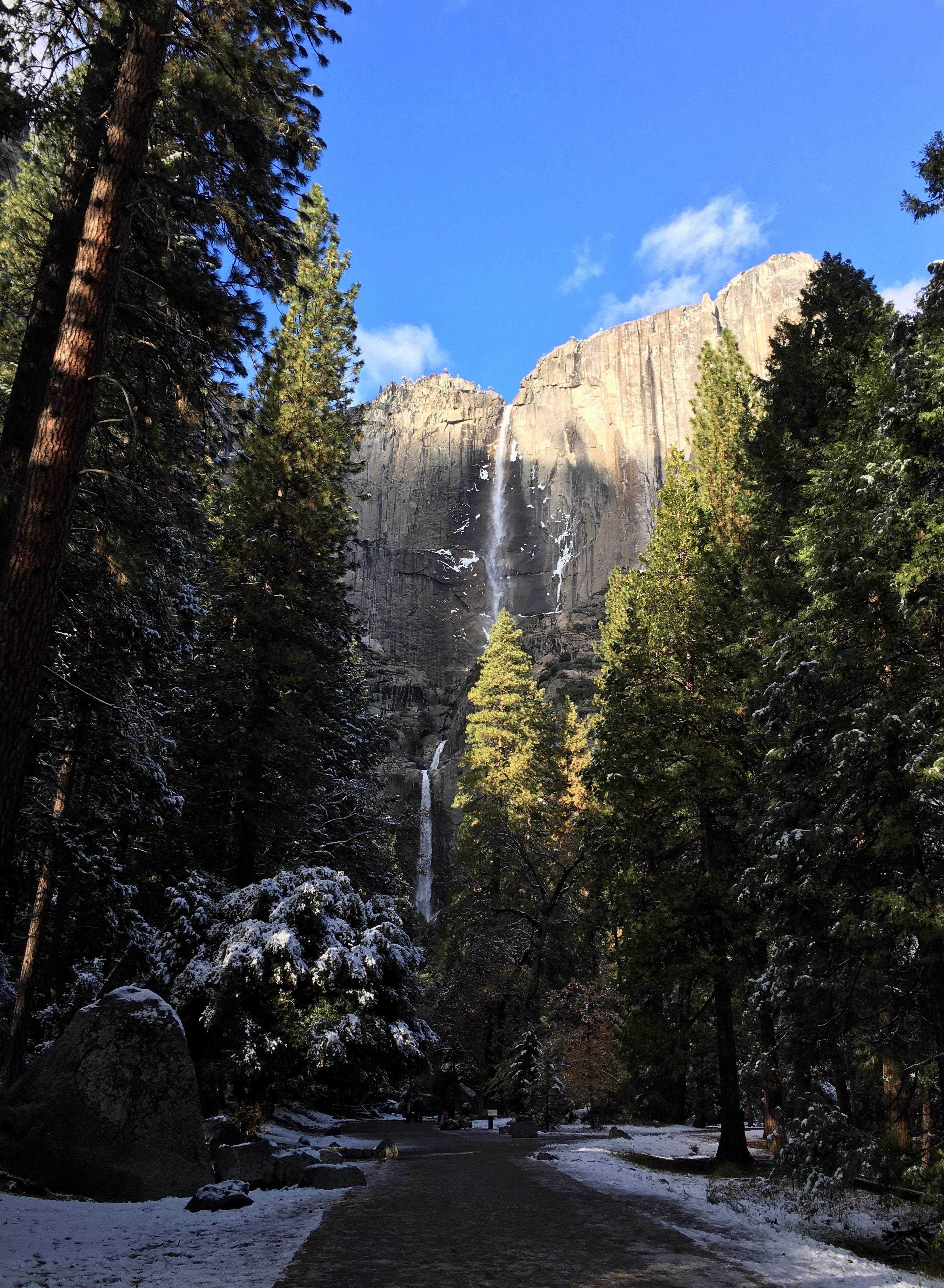

Image by
The first time I learned about perspective was in a high school photography class. That was my last formal training, at a time when we developed pictures in a dark room with lots of chemicals that young people probably shouldn’t be allowed to hle.
This picture illustrates the concept, with the trail dominating the foreground then going off into the background. It’s a nice way to capture a scene, as when you look up from the path you’re treated to the majestic Bridalveil Fall. ghting matters here too—one could argue for brightening the image a little, if the sun was cooperating you’d get even more of the falls in the picture.


Image by
ite balance is an essential element of a good photo. thout it, things look too yellow or too blue, not true-to-life, as in this example taken from Ruth Asawa’s San Francisco fountain mural (toy soldiers added by some clever visitor).
You can repair some of this with editing, but paying attention to light will also help prevent the effect. As you’ll see in the next slide, this image turned out far more brown off-color than it looks in real life.
It’s also a good reminder to use this as part of a mental checklist of what to look for after taking a picture, so you don’t walk away from the scene put all the pressure on your photo editing app. Depending on your camera app, there may be a color temperature setting you can adjust to make sure the white parts look, well, white.


Image by
en you properly white balance your photos, everything looks better. Notice how the subjects look more realistic, including the details in the sculpture, the mold that’s creeped in, those toy soldiers.
ite balance is key, but if you don’t get the right shot the first time, is here to help. otos recently made this one of its available automatic tweaks with a recent update. So while you’ll want to pay attention to this feature, you can also lean on many of the automatic editing tricks found with otos other software.
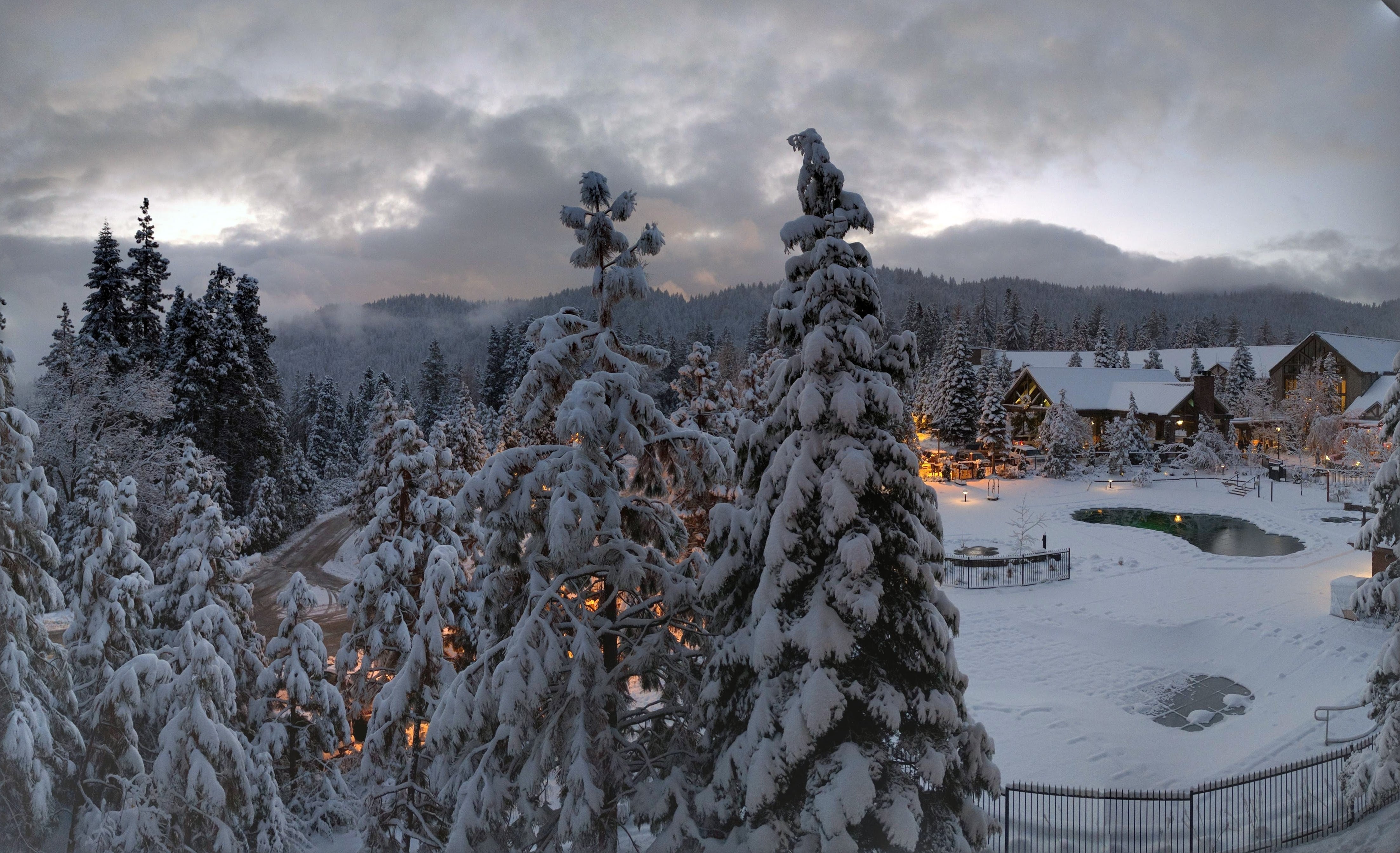

Image by
th modern smartphones, quick easy tools to edit your photos are built right in. This picture from just outside Yosemite National rk was one of the “stylized photos” that appear from time to time in the otos feed.
I was surprised to see how the background lights really glowed, giving this a rather picturesque effect. Snow is always a good place to start when you’re looking for great outdoor images, so even if you follow good principles take time to learn the editing menu see what’s possible by taking a lot of shots from the same location.


Image by
The previous image was a compilation of these two a series of other shots taken at the same time. otos will automatically create GIFs, panoramas, other groupings to give you a little bit of photo magic.
The lights don’t glow quite as well, although they’re still shots that give you a particular atmosphere mood that only comes about from after analyzing the picture.


Image by
Don’t neglect flash even in instances where you think you may not need it. For example, the flash brings out additoinal details of the flower in this photo, but it makes the leaves look sort of “flat.” Compare with the next image to see how the flower’s details are lost, but the leaves look better.
The flash is useful when you have a subject with a light behind it, like someone sting in front of a christmas tree or a brightly lit lmark at night. The camera will often expose for that bright light, leaving the face dark featureless. If your subject is backlit, try using the flash to even things out.


Image by
This picture was taken without flash. It’s not necessarily bad, but you lose the detail in the flower the green leaves of the plant tend to get lost with the rest of the background.
You could likely tweak some of this in editing, but you have more options if you better capture the foreground by putting in a burst of light. Don’t let the fact that it’s light outside stop you from considering the flash.


Image by
Usually when you think good photos, you tend to think of sunlight. However, it’s a little trickier in practice. Bright sun casts hard shadows that show the geometry of an object, but can also hide other details.
You’ll see this in the next shot, which delivers a better quality than the one here. It’s not bad, but the birght sun causes the sky to be overexposed, as the camera tried to balance the exposure for the building.


Image by
tting the subject in the shade or waiting for a cloud can improve your final picture. You’re able to better focus on the elements of the capitol building without that harsh sun taking up the top half of the photo.
Bright lights harsh shadows can mess up your photos, whether your subject is a human, plant, or building. In particular, try to avoid taking photos of someone’s face in bright direct sunglight. You’ll get hard shadows across their eyes nose, ruining their features. ok for a shady spot.


