Android N is the smartphone equivalent of a Russian nesting doll. has built in a lot of interdependent features in the preview version of its next major operating system update. Changes to notifications, a new split-screen multitasking feature, other tweaks build on one another show how the operation system may grow to be more fluid useful.
There’s plenty to find, given that this is just the first developer release, there’s still time for more to show up, particularly with so many rumors roaming around about the app drawer going away or deeper support for virtual reality. Here are the marquee features how they factor in to ’s evolving vision for Android.
lays out the roadmap
says there will be five preview updates before the final release. You can track them at the ogram Overview site, which says you can expect about four to six weeks between updates. A final release is planned for the third quarter of the year, though we can expect to hear a lot more about other changes update plans at I/O in May.
It’s very easy to get Android N: you just have to go to the Android N beta site sign up with an eligible device (Nexus 6 5X, 6, 9, xel C, or Nexus ayer).

Getting into the Android Beta program is very easy, but make sure you know what you’re signing up for.
It’s preview software, so know what you’re getting into: Apps frequently crash, the network connection dies, Android y doesn’t work. Don’t put it on your daily driver unless you’re ready for some major headaches.
If you do install the Android N preview decide it isn’t for you, all you have to do is head back to ’s beta hub un-enroll your device. You’ll then get an update that sends you back to the safety of Marshmallow. st know that you’ll be starting over from scratch with a fresh install.
Smarter Settings
One stout feature that should have big benefits are changes to the Quick Settings Notification Center.
th N, swiping down reveals five quick options available with a single tap (see below).
Yes, no need to swipe down with two fingers or swipe tap just to turn off the -Fi, launch the flashlight, or enable Do Not Disturb mode. Then if you swipe to the right touch it, you can change up the placement of the buttons add in extra comms like Hotspot, Invert colors, Data Saver.
You also may have noticed there’s a native Night mode, which kills off the blue light that is detrimental to sleep. You can adjust the light configuration in the System UI Tuner.
The Settings also have been made over, with a very useful slide-out menu additional information available at-a-glance for the different settings.

The slide-out menu bar tidier organization are welcome changes to the settings with Android N.
In general it’s easier to get around as there aren’t as many horizontal bars that divide up the content. The organization through the slide-out menu also makes it easier to find what you need, though has also kept the search option that’s launched from the magnifying glass icon.
Subtle, but welcome, Notifications changes
The Notifications got a very welcome redesign that at first glance may seem like they’ve been blended together compared to the old configuration. But when you look more closely you’ll see there’s some reorganization a different use of icons colored font.

Notifications get some nice touch-up paint with Android N.
Android N better groups notifications together with a smoother animation more details in each notification. Some apps are already taking advantage of all the options (such as the ay Store Hangouts), though it may be a long while before this capability shows up with other apps.
You can also swipe gently to the left or right on a notification to bring up a menu that will change the frequency of such notifications.

It’s faster to customize how often notifications will bug you.
It’s a good move for more user control. That’s the overall theme, there’s bound to be more as Android N gets additional fixes features.
Some efficiency tweaks to speed up multitasking
Your productivity is about to get a big boost with split-screen mode. Yes, no more envy at Samsung Galaxy owners who have had this feature for years. It’s super simple to use: just hold down the Overview button (the square one) scroll through the available apps. Of course, not all of them support this feature yet. You’ll just get kicked back to the first app if you try to add in another that isn’t supported.
But try it with Gmail Chrome if you want to experience the newness.

Split-screen mode is a huge productivity gain that’s been needed for a while.
You’re also able to customize this behavior: the System UI Tuner lets you enable a swipe-up gesture to launch into split screen if you’d rather do that than hold down the button.
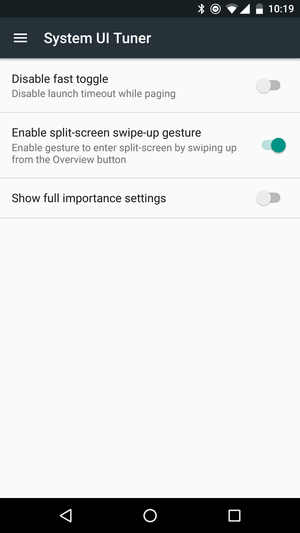
You can enable a swipe up gesture to quickly launch split-screen mode.
Here’s another that’s a huge life-changer: double-tapping the Recents button now takes you directly into the last app you were using. This sounds like no big deal, but I have to tell you it dramatically changed the way I used my phone. Clearly when most people hop to another app, it’s to go back forth between the two apps they were most recently using.
Multitasking in general is a little smoother. en you first launch this you’ll see nearly a full preview of the last app you used while the current one sinks to the bottom of the screen.

Multitasking is more full-screen with the changes in Android N.
The scrolling feels faster you have more visibility of previous apps. However, the search menu is gone. This could be a temporary change, as it’s hard to imagine taking away any chance for you to hop into a search.
The rumor mill is churning
Several items that we’ve heard about didn’t make the cut for the first release. Yet there’s still a chance we could see them before the final build. One such feature is support for the Vulkan 3D graphics A. This is a huge deal for what’s called low-overhead graphics rendering, so games run faster, look better, don’t use as much C. It could result in longer battery life, too. It goes along nicely with the theme of Android N using less system resources, so we’ll see if this pops up in another update.
There’s also been much weeping gnashing of teeth about the possibility the app drawer may be going away. It’s still here for now, but if wants to simplify Android for the masses even further this would be a way to do it. wer users may not like it, but there’s also the possibility Android N could just have the option to use it or not.
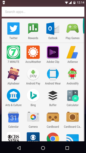
Is this the last hurray fo the app drawer?
There also isn’t any mention of stylus support yet, but now that split-screen is here we expect to see this. The xel C shows that has big goals for turning Android into a larger-screen productivity device. The platform will need this to keep up with the Surface line id o.
Split-screen may be only the beginning of N’s multi-window support. There are hints in the code of a “freeform window” mode. You know, the way a desktop OS like ndows or OS X works. It might be just an experiment, but the references are there in the framework-res.apk component.
Apple is all-in with pressure-sensitive displays, which it calls 3D Touch. A couple of Android models have a similar feature, but it’s not baked into the core of the system, so developer support is thin. wouldn’t be surprised if Android N included an official A for pressure-sensitive displays.
Finally, is all-in with VR given its Cardboard line dabbling with 360-degree cameras. A more native VR mode, much like Samsung has in its latest high-end phones to support GearVR, isn’t that big of a stretch. This would require a substantial amount of under-the-hood work, which is why it probably it’s slated for a later release, if it shows up at all. And given that I/O is gong for an outdoor location at the Shoreline Amphitheater this year, you have to wonder if some type of visual show is in the plans.
A long road ahead
Since there are going to be five more updates to come, we’re sure to see more drop in. Monitoring Android N is going to be a long-term project here at , so we’ll shout as soon as we spot something new with each release.
Don’t forget you can try this on your own if you want, but be careful you don’t trip over those engine parts on the floor.
