ong with a new treat-inspired name, there’s usually some major change to Android design functionality with each major release.
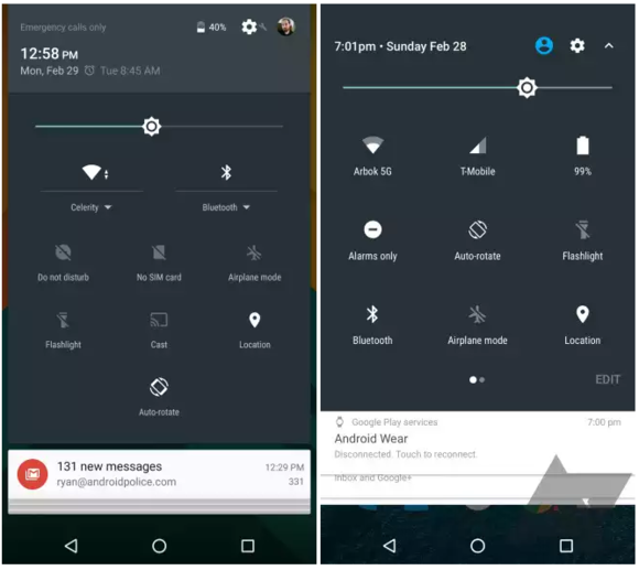
If a report in Android lice is accurate, we may see a new design in the notification shade some helpful additions to the quick settings menu with Android N. The article cautions that these are mockups based on an early build, which means the final version could look substantially different.
The first marked change is to the notification shade, which refashions the interface away from stark, separate cards toward more of a unified appearance.


The notification shade might be on the verge of another makeover.
The other major adjustment is to the quick settings, which moves some icons around appears to add multiple pages. This would give you access to more comms once you make the shade appear with a two-finger swipe.


The quick settings appears to get some refinement the option to put comms on multiple pages.
If there is really an early build of N floating around out there, we may see more leaks leading up to when will presumably show us more at I/O.
y this matters: The most visible change to Android Marshmallow was Now on Tap, but the signature features were under-the-hood improves like Doze App Stby. Android N might be time for to tweak the interface again, as evidenced by this new material. The major rumor that’s been circling around is the disappearance of the app drawer, but we’ve yet to see any substantial proof yet.


