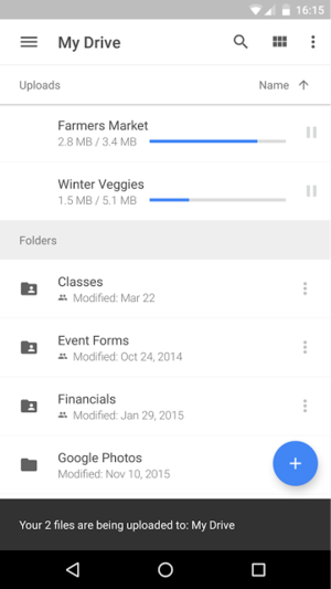
An update to Drive now gives you control over where to send the files you upload on an Android phone or tablet.
eviously any uploads automatically went to a folder called, well, Uploads. Now you can specify a destination folder see a progress bar that lets you know how the process is going, as the Apps Updates blog illustrates.


A progress indicator bar now will tell you how close your files are to being uploaded.
so, the colors finally sync over from what you have selected in the web version of Drive. You can also change them up from the boring gray, they’ll have the same look across devices.


Your Drive is finally more colorful on Android.
An A teardown reveals what features could be coming up in the future. There’s code for shortcuts auto-suggestions for most recently used folders files, which could help speed up the workflow. so, there’s some reference to a device backup, but it’s possible this is some behind-the-scenes work to host Android backup data inside of Drive.
If more leaks out in this version or a future update, we’ll be sure to let you know. Otherwise, grab Drive 4.2 from the ay Store or A Mirror.
The impact on you: Managing a variety of files folders can get cumbersome when working on a phone or tablet. The use of color is something I’ve found to be essential, as it makes things easier to spot at a glance compared to a block of stark colors or white gray. Drive is a key piece of the productivity puzzle, so it won’t be long before we’re back telling you about more.


