Now we know why there were those nagging rumors about was killing off the app drawer in the next version of Android.
It appears to be happening, but maybe not in the way we might have expected. Android lice showed off what it says are leaks of a new Nexus uncher. It kills off the omnipresent search bar in favor of a small button. Tap it to get search, slide it out to go to Now.


Gone is the search bar, replaced with a date widget slide-out access to Now.
The home screen now has a persistent date widget, in case you tend to forget what day it is. To get to the app drawer, the report says you slide up anywhere on the bottom app dock to reveal the rest of your applications. The translucence is very iOS-like as you pull up reveal the drawer.


The app drawer lives on, but with a five-icon grid redesigned search bar.
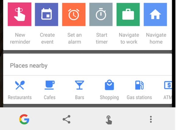
Android lice also found a number of new On Tap options that could make ’s predictive service more useful, such as navigating home, setting an alarm, or finding an ATM.


Now on Tap may be an even better companion throughout your day.
This is likely still a work in progress, so the final build could look a bit different will probably be shown off when unveils its 2016 Nexus phones. It’s also unclear if this will mean the Now uncher is to be no more, if this possible replacement would be available for non-Nexus devices.
y this matters: The new launcher seems to target a few goals. One is to nudge you more into Now by transforming the search bar into a slide-out tab inside of Now. And if Now on Tap gets more features, hopes you’ll take advantage of the predictive service even more. th Android Nougat new phones around the corner, we ought to find out rather soon.


