I’m a big fan of ’s Inbox. It’s dramatically changed the way I manage email, considering that I get a lot of messages that’s quite the accomplishment.
Not everybody is a fan, however, partly because there are a number of “power user” features that haven’t made the way over yet from Gmail.
The critics have a point. Inbox still has a little ways to go before everybody can leave the comfy confines of Gmail. Here are five areas that I would love to see change so that I could leave Gmail in the app drawer for good.
Use Android’s multitasking features
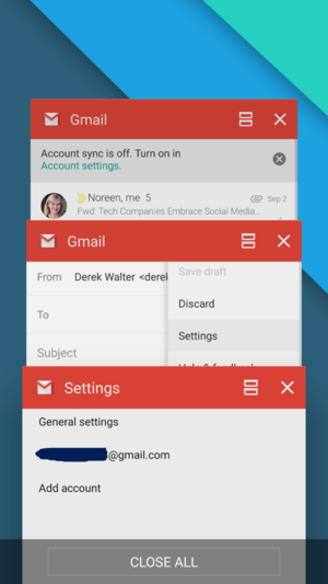

It’s much faster to get things done with Gmail’s use of Android multitasking.
th llipop, allowed tasks to be broken up into individual cards when you hit the multitasking button. The concurrent activities make it much faster to navigate through different tasks inside of Gmail. Since ’s done this for this other apps in its portfolio, it could certainly do the same thing for Inbox.
Save us from annoying newsletters


This is a great feature in the desktop version of Gmail. need it on Android devices.
Gmail lets you unsubscribe from a mass email or newsletter with one click (only when using Gmail on the web, unfortunately). Inbox does a great job at bundling these messages so they don’t clutter up your Inbox, but it’d also be nice if you could get rid of them altogether. Bring us the unsubscribe button, , so we can banish those pestering messages for good.
It’s time to go split screen
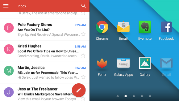

ere art thou, Inbox?
Those of us with a Samsung Galaxy Note could really benefit if Inbox worked with split-screen mode. If you have a Note, you know how productive you can be by dividing up two tasks on that 5.7-inch screen.
Support other email accounts
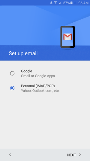

Gmail can hle about any email account, so it’d be cool if Inbox could do the same.
If Gmail can do Exchange, IMA other non- email accounts, then so can Inbox. Corporate email can get just as cluttered unruly, so Inbox would be the perfect antidote. us, the smart features like suggesting reminders could be a needed boost for keeping track of things.
A ‘reply all’ fix is needed
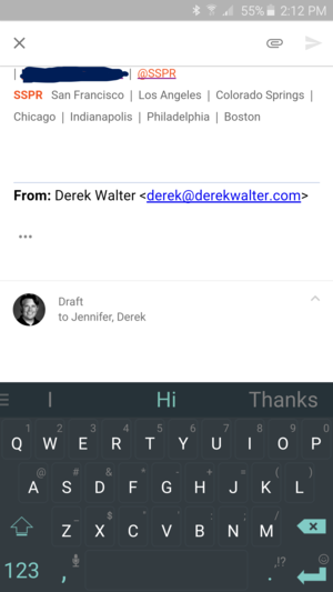

This weird reply-all issue can get rather annoying.
If you use Gmail to send receive with another email address, there’s an annoying problem. By default, Inbox always wants to “reply all” to the message, so you end up copying every message to yourself if you just tap the default “reply” button. So you have to touch the overflow (three dots) menu choose “reply.” It’s not a dealbreaker, but it would smooth things out by getting fixed.
As a whole package, however, Inbox is still too appealing to let any of these quirks get in the way of making it my go-to email app. If you haven’t tried Inbox you should, as swiping snoozing away emails truly tone down the digital noise that comes from all those messages.


