The motto of Oneus is “Never Settle.” It’s an oft-repeated mantra featured prominently in everything the company does. at’s more, the Oneus 2 is billed as the “2016 Flagship killer.” That’s right—the company markets this $389 phone by promising it will blow away next year’s best from , Samsung, HTC, Motorola.
eting is always hyperbolic, but this is just laughable. ile there’s certainly a lot to like about the Oneus 2, it’s immediately obvious that Oneus cut a bunch of corners to reach its price point. You don’t get a quad HD display, or wireless charging, or fast charging, or stereo speakers, or even NFC—all the things that this year’s flagship phones have made us grow accustomed to.
Had Oneus decided to under-promise over-deliver, it would be easy to praise this reasonably-priced phone for what it offers: speedy performance, 64GB of storage, a pretty damn good camera for less than $400. By promising us the world, Oneus has made it hard not to focus on all the things it didn’t deliver.
epare to settle
For the price you pay ($389 for 64GB of storage 4GB of RAM or $329 for the 16GB/3GB version) you get a lot of phone. But you definitely don’t get a “never settle” phone; Oneus can’t give you everything for under $400.
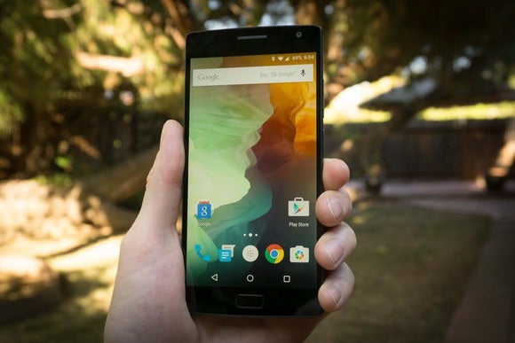

The Oneus 2 is a good-looking, well-performing phone at a great price, but it’s missing a number of “flagship” features.
reless charging? It’s not there. Nearly every high-end phone of the last couple years supports fast-charging, but the Oneus 2 doesn’t. It took about 2 hours 20 minutes to fully charge the phone, which is roughly twice as long as the Galaxy S6. The phone’s 5.5-inch display has a resolution of 1920 x 1080; not a problem in itself, but most high-end phones have 2560 x 1440 displays. You won’t notice the difference in resolution in daily use, but strap on a Cardboard 1080p looks awfully pixelated.
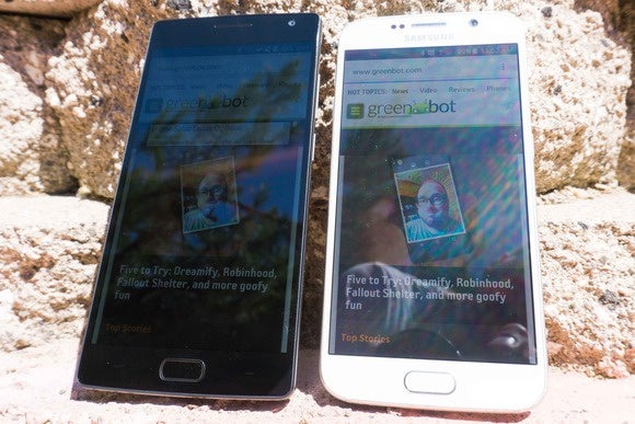

In bright sunlight, the Oneus 2 display (left) is easier to read than last year’s Oneus One, but doesn’t match the super-bright AMOD on the Galaxy S6 (right).
The Oneus 2 doesn’t support the main Verizon network bs, so it’s all but useless on the nation’s largest network. If your carrier supports -Fi calling (like T-Mobile) you won’t be able to use it until Oneus pushes out a software update, which is supposedly coming soon. rse, the phone lacks NFC, so you can forget about contactless payments. Android y is rolling out this fall, this phone leaves you on the sidelines.
And for all you hardcore Android fans that lament the disappearance of removable batteries expable storage in the latest top-end phones, know that the Oneus 2 has neither.
Zippy performance, solid battery life
For all the features missing from this self-proclaimed “2016 Flagship killer,” it does have a big engine under the hood. The Qualcomm Snapdragon 810 delivers benchmarks comparable to the best phones on the market. There has been some concern of excessive throttling to manage the chip’s heat, but that didn’t seem to be a problem in regular use. Yes, the phone gets pretty hot when running processor-intensive apps like 3D games, benchmark scores would grow inconsistent if I didn’t frequently reset the phone give it time to cool off. That has been true of every phone we’ve tested with the Snapdragon 810 inside.
But in regular everyday use, not running benchmarks, the phone availed itself well. rformance remained snappy, scrolling smooth, switching between multiple apps responsive.
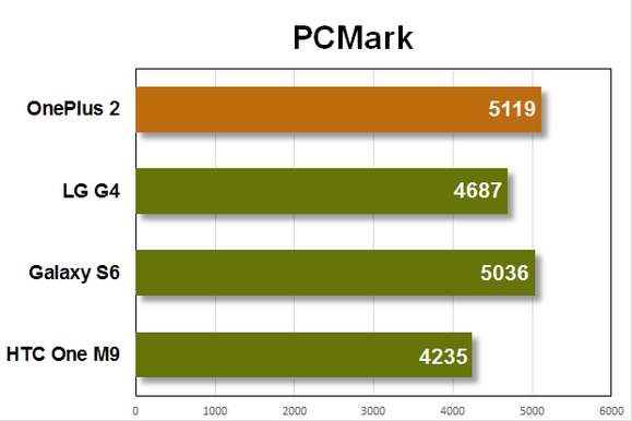

The Oneus 2 delivers excellent overall performance, though it does get a little hot.
The Oneus One achieved stellar battery life with its 3,100 mAh battery. So the Oneus 2 must last longer with a 3,300 mAh battery, right? Unfortunately, that isn’t the case. Maybe it’s the increased drain of the Snapdragon 810, or the brighter display (though we calibrate all our displays to 200 cd/m2 for battery tests), but the new phone doesn’t last nearly as long as the old phone. It lasts “only” about as long as other high-end phones this year—you can count on 4 to 6 hours of screen-on time, depending on the activity. Stby power is great: The phone lost only about 20 percent over a full day unplugged.
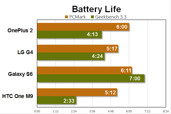

Battery life is decent, but doesn’t quite measure up to last year’s Oneus One.
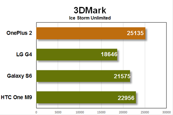

Graphics performance is fantastic, frankly, overkill for a 1080p display.
ly, the Snapdragon 810 is overkill here, Oneus should have opted for the Snapdragon 808 as did with the G4. As the phone has only a 1080p display, the faster graphics performance of the 810 isn’t really needed, the cooler operation lower battery drain of the 808 would have made for a better overall experience.
A very good, very simple camera
No phone, no matter how affordable, can get away with taking substard pictures. Fortunately, the Oneus 2’s 13 megapixel rear camera (with f/2.0 aperture) 5 megapixel front camera both avail themselves well when it comes to making memories. It produces clear shots with good color balance relatively little noise in a variety of conditions. I wouldn’t put its results above the Galaxy S6 or G4, but it’s not far behind, that’s where a top-end phone needs to be.
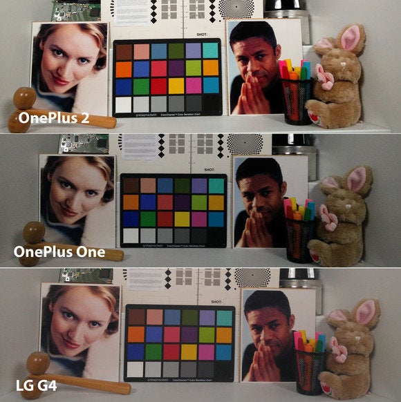

th dimly-lit subjects using interior studio lights, the Oneus 2 delivers brighter, less grainy shots than the Oneus One. But it can’t match the G4’s detail true-to-life color balance.
The phone sports laser autofocus, as the G4 does, in bright light it does indeed focus shoot quickly. Once the lighting level drops, shutter lag creeps in there’s too much delay between pressing the shutter button taking the photo. The phone has optical image stabilization, but it doesn’t seem to work quite as well as on other flagship phones we’ve tested. The panorama mode often produced rather blurry images, to the degree that I assume there’s a bug in it.
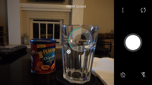

The camera controls basic straightforward to a fault.
The camera software is very simple focused (pardon the pun). You get the stard expected settings to adjust resolution, toggle shutter sound, or show gridlines. You can shoot video at 720p (up to 120 frames per second slow-motion), 1080p (up to 60fps), 4K (up to 30fps). Tap in the image area to set the focal exposure point, drag your finger around that circle to further tweak exposure. It works well provides most of what you need, but it’s a little short on features. Notably absent is a manual mode, which Oneus says is coming in a software update.
Stock Android, only better
st year, Oneus had a parting of ways with Cyanogen, who supplied the operating system for the Oneus One. It replaced Cyanogen’s OS with its own OxygenOS, which was essentially just stock Android with the added ability to rearrange the quick menu items, to choose between on-screen or capacitive hardware navigation buttons, to perform a couple of simple gestures like “double-tap to wake.”


The Shelf beta (left) is inoffense customizable, but not very useful. Far more useful is granular app permissions (right).
The new OxygenOS 2.0 takes the same “don’t mess with Android” principle layers on a few more useful tweaks. The same gestures are there: draw an “O” on the sleep screen to launch the camera, a “V” to turn on the flashlight, or double-tap to wake the device (notably missing is double-tap to sleep). There are a few gestures to control music playback, too.
I love Oneus’ commitment to offering options. Everything is a choice. You can disable or enable those gestures one-by-one. You can choose between showing on-screen software navigation buttons, or using the hardware capacitive buttons beneath the display. The left right buttons are marked by simple horizontal blue lines, giving you the flexibility to swap the “recent” “back” buttons if you wish. You can set long-press double-tap shortcuts for the home button the recents/back buttons.
New to OxygenOS is a beta feature called the Shelf, accessed by swiping right on the home screen. It contains a list of your most frequently used apps, frequently accessed contacts, space to place widgets. I don’t personally find it that useful, but at least it’s fully customizable you can easily turn it off if you like. Unfortunately, you can’t choose to replace Shelf with Now. Offering an option to do so would seem to fit Oneus’ core philosophy, I hope to see it in a future update.
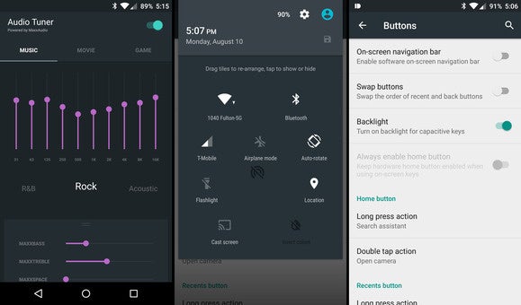

Among the OxygenOS 2.0 customizations to Android is an audio equalizer with profiles (left), rearrangeable quick menu items (center), customizable system buttons (right).
so new is an App permissions menu in Settings that lets you turn on or off individual permissions for apps. You don’t think Dropbox should be able to access your contacts? You can turn off that permission individually (though there’s no telling what that will do to the functionality of the app). This is a great feature that mimics an important part of the new app permissions structure in the upcoming Android M release.
ile OxygenOS may not have the extensive theme support found in other Android spin-offs, it’s hard not to like what I see here. This is Android as it should be: sticking to ’s interface conventions design while seamlessly adding useful features that don’t disrupt the way the OS looks or operates. It’s the philosophy followed by Motorola Nvidia, I only wish more Android hardware makers would follow suit.
Improved hardware design with a few odd choices
Oneus has made a more attractive, better-built phone than it did last year. The display is the same size, but a much slimmer bezel makes the phone smaller easier to hold. The metal edges give it a solid hefty feel, the spaper-y removable back cover has a comfortable grippy feel. It’s still a little on the plain side—there’s a Nexus-like vibe to it—but the materials craftsmanship show a level of polish sophistication that inches this phone closer to the expensive, high-end flagship phones it allegedly wipes the floor with.
One particularly nice touch: a three-way switch along the left side that matches the three notification profiles in Android. You can quickly easily change your phone between Silent, iority notifications only, or l notifications without waking the phone from sleep.
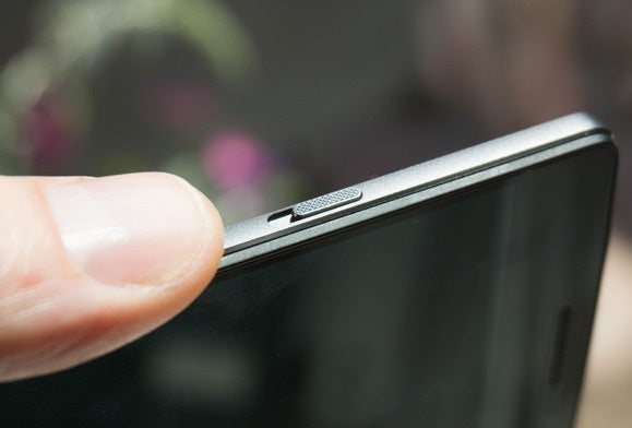

This three-way switch gives lets you control over notifications without even waking your phone.
The fingerprint scanner doubles as a home button, detects fingerprints about as quickly accurately as any I’ve tried. The phone unlocks correctly more than 90 percent of the time, in a second or less. It’s fast accurate, much like that on the Galaxy S6. Oddly, the fingerprint pad is not a button—it doesn’t actually depress when you push on it. This lack of tactile feedback is more annoying than you’d expect. It’s hard to know if the phone didn’t respond to your double-tap shortcut because it didn’t register, or because it’s just taking longer than it should.
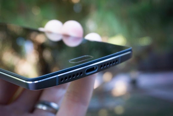

The B Type-C port only supports B 2.0 speeds, no fast-charging. And that fingerprint scanner is not a button; there’s no tactile “click” when you press it.
This is the first phone we’ve tested with a B Type-C port, which you may think means you get the faster transfer speed or greater power delivery of B 3.1. This phone is using the Type-C connector most associated with B 3.1, but it’s just the connector—the phone itself only supports B 2.0. So you get the benefit of a reversible plug (yay!), but you can’t use any of the dozens of micro-B cables you have lying around (boo!). The Type-C plug is definitely the future of B, but I can’t help but think Oneus jumped the gun by tossing it on a phone that doesn’t live up to the performance power expectations set by other devices using the same plug.
If only Oneus made different hardware choices
For a phone with 4GB of RAM 64GB of storage that costs less than $400, the Oneus 2 delivers a lot. It’s fast, has a nice design, a good display, a very good (if basic) camera. rformance is stellar, though the phone gets unreasonably hot at times, the “stock Android with enhancements” OxygenOS is a joy to use.
Oneus’ motto is not “great bang-for-the-buck,” it’s “never settle.” It doesn’t bill the Oneus 2 as “the under-$400 champion,” it proclaims it to be the “2016 Flagship killer.” This sort of hyperbole isn’t doing the company any favors, it only sets up expectations that it can’t meet if it’s going to maintain this aggressive pricing.
Even so, it’s hard to underst why it made some of the hardware choices it did. y dual SIMs instead of removable storage? y no replaceable battery? Both are features that Oneus’ core market of enthusiasts care deeply about. y insist on the Snapdragon 810, when the 808 would have been cheaper, delivered a comparable real-world experience, given the phone better battery life? y use the B Type-C connector while not supporting fast charging or fast B 3 transfer speeds? y skip out on NFC altogether right when mobile payment systems are just starting to take off? y isn’t the fingerprint scanner an actual clickable button?
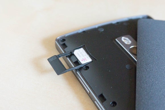

The Oneus 2 supports dual SIMs, which is hy, but I can think of half a dozen features I’d rather the phone support instead.
For all the great things the Oneus 2 delivers at a very reasonable price, it’s almost impossible to use the phone for any length of time not wish for what it might have been. Even if you could buy it without sitting on an aggravating waiting list, I would hesitate to recommend it to someone who isn’t fully aware of the phone’s compromises. As often as Oneus likes to say “never settle,” using this phone was a constant reminder that I was doing just that—settling for one of the best sub-$400 phones instead of buying a more expensive phone that has it all.


