Hangouts for Android is in need of a serious makeover. It sports an uninspired design, lacks the marquee features it needs to st out from the rest of the messaging apps in the ay Store, generally still feels like a work in progress.
ile there are certainly worse messaging services out there—I definitely don’t envy iOS’s Messages users, having been burned by it myself—there are a few kinks in Hangouts that cannot be overlooked. ‘s already taken the first step towards change by acquiring the heralded Emu app for iOS, which has Siri-like functionality, but it will be a while before we see the results of that acquisition. Until then, there is a little sprucing up that can do now to make Hangouts a better app. l it needs is a little elbow grease to tackle these four things.
Voice integration—now


You see these two apps? They perform the same function. SO SMH ‘EM TOGETHER!
Hangouts can’t be a full-blown messaging platform if it doesn’t include Voice. At present, if you need to contact a friend using your Voice number, you have to separately install launch the app to do so—this includes sending a text message. It’d be much easier to switch between your regular, carrier-provided number Voice number from within the Hangouts app, just as it allows you to switch between accounts. It would also save the annoyance of receiving a voice mail having the Voice transcription waiting in both your Voice Hangouts inbox.
Unify contacts
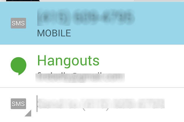
Hangouts should refine the way it deals with duplicates. In the screenshot below, the app displays the same contact twice with both accounts, despite the fact that they’re linked to the same phone number.


Hangouts is not very good at linking profiles.
Hangouts looks to your contacts list to aggregate information, but it’s a mess if you’re using a specific manufacturer’s overlay that doesn’t play nice with the app. For instance, I took this screenshot on an HTC One (M8) with Sense 6; its contact app links profiles, but even though someone might be linked within that app, Hangouts will display them as separate people.
Quit jumping between SMS IMs
Sometimes, when I receive a text message from a person that has both Hangouts SMS, will default to their Hangouts account for the reply. That’s a pretty annoying situation when the person on the other end of the conversation isn’t using an Android device. If they’re not at the computer, they won’t see your message, it’s annoying to have to make sure that Hangouts sends a message the proper way.


Hangouts should be able to automatically differentiate between whether you tend to text message or instant message a particular person then default to that particular contact method every time. To that end, Hangouts would also be easier to use if it offered a receipt confirmation, so you can know if someone hasn’t seen your message yet.
A better UI for everyone


It’s just the busiest-looking interface.
Hangouts is a little overwhelming to look at. st look at all of those unarchived conversations! Even with the buddy icon on the right-h side, there’s too much room for error. That Settings icon is also too far up there, a new user who isn’t privy to the ways of Android may take a while to figure out that’s where it’s located. Maybe when Hangouts gets its Material Design makeover the team to refine this a bit, but for now we’re stuck with a crowded interface that’s hard to navigate.


On the left is Sense 6’s messaging app, on the right is Facebook’s. These are examples of apps that have much better design are easier to navigate. could learn a thing or two from them.


