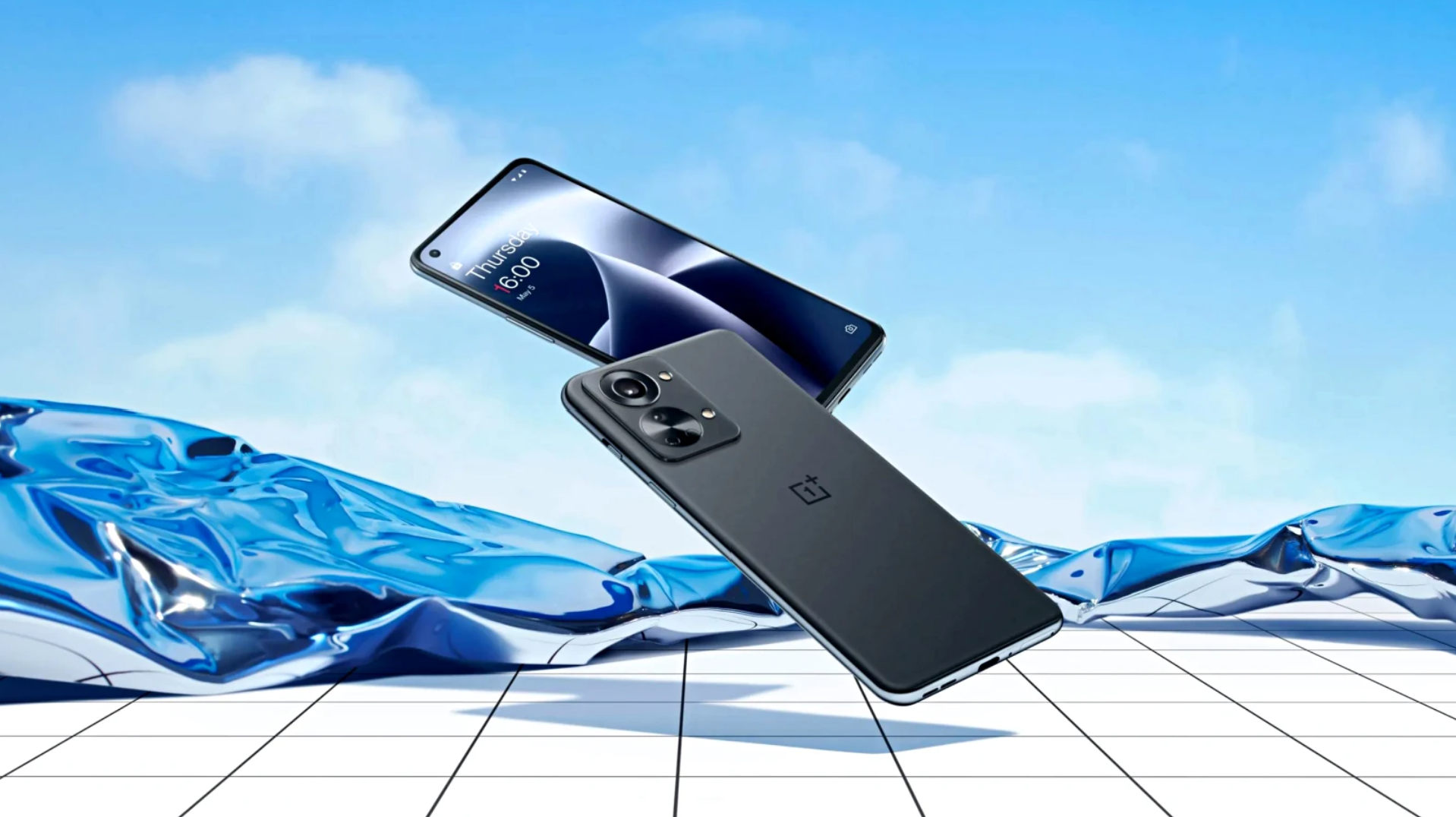
No more speculating. No more teasing. The Oneus 2 is official I put my hs on it. I gripped its metal–wood body. I tapped its 5.5-inch screen. I used its 13-megapixel rear-facing camera to snap photos its 5-megapixel front-facing camera to take selfies. I put it in my purse pocket in my colleague’s pants pocket to get a sense of what it’s like to cart it around as a daily driver.
But what I realized after my first hour with the device is that Oneus’s second stab at a smartphone may actually have a chance at being the “flagship killer” it’s being advertised as. It’s powerful, it runs a near-perfect version of Android, it offers some extraordinary features you’d have to pay extra for with other flagship devices, like 64GB of storage right out of the box. Of course, whether Oneus is successful will depend entirely on how much better it is at marketing this time around, but at least they’ve got a product worth the fanfare.
A familiar-looking phone

The Oneus’s wood backings are really attractive in person.
I made a comment earlier in the day to my buddy, shua Vergara, about how the Oneus 2 looks like a more high-end G4. It offers a similarly angular, masculine aesthetic. The optional wood backing on the Oneus 2 makes the phone more dense , as a result, gives it that premium polish that many Android phones lack. Even though it feels slightly bulkier, however, I liked the overall look feel of the Oneus 2. It’s essentially a refined version of last year’s Oneus One.

The Oneus 2 is comfortable to hold.

The Oneus 2’s helpful three-position alert switch, which lets you set your sound profiles to On, iority, or Silent without going into the operating system.
ereas some Android manufacturers have tried their best to get rid of buttons, Oneus made them all available to you. There’s the stard power button volume rocker on the right-h side, a helpful three-position alert switch on the left, three overlay navigation buttons on the bottom. The Home button has the fingerprint sensor embedded into it, it’s super easy to use—even easier than the Galaxy S6’s. If you don’t want hardware buttons, you can choose to eliminate that lower quarter-inch of screen space in favor for on-screen navigation. The choice is yours yours alone, which is not something most OEMs offer.

The Oneus 2 offers a ton of gestures.
If buttons aren’t your thing, you can use gestures. th the screen off, you can draw a circle to launch the camera, or a V to launch the flashlight. Admittedly, it’s a weird functionality to include in a smartphone—I would have preferred the ability to double tap the capacitive Home button to launch the camera instead—but the phone is surprisingly responsive.
A familiar-looking interface

It’s basically stock Android’s application drawer. Even though it’s not.
The Oneus 2 runs Oxygen OS 2.0, which is based on Android 5.1. The version I played with was a near-ready pre-production version, but besides a few bugs I really liked what I saw. You can’t tell that Oxygen OS isn’t ’s flavor of Android. It looks near stock llipop, but with a bunch of added extras thrown in. Most of the extras are in the Settings panel, but you’ll find some in the Application Drawer, too. There’s also a neat Home screen page called the Shelf, which resides where Now normally does to the left of the first home screen. It displays your most used applications frequent contacts. You can also add widgets if you don’t want them to take up your Home screen. Genius!

One of the best parts of Oxygen OS: the hy Shelf that lives on the left-h Home screen.
The apps that Oneus bundled in follow ’s Material Design guidelines to a T. I had to actually ask Oneus if they were ’s apps or theirs. I offer kudos to Oneus for not attempting to reinvent the wheel—which is what Cyanogen originally set out to do with the first Oneus.

Sorry, Oneus. Not feeling this app.
I didn’t like the reimagined camera application, however. It looked like ’s version, but offered a slightly different menu hierarchy. It was confusing to use. I never liked ’s interpretation of the camera app, either, so by default I really don’t like One us’s.
A familiar set of specs

Hey! Cool! The Oneus 2 utilizes B Type-C!
The Oneus 2 runs on a Snapdragon 810 processor with 4GB of RAM. It’s fast furious, like every other flagship phone out there. I’m curious to benchmark it, to compare its scores to the other high-end phones, but I don’t expect to see any surprises. ’ll revisit it after six-to-eight months of usage to see how it fairs.
ile the Oneus 2 is a demon on the inside, it’s lacking some crucial features that could hurt its “flagship killer” status. It’s missing quick charging, wireless charging, NFC. I can deal without wireless charging ability, but I’ve been spoiled from the Galaxy S6. The lack of NFC is also worrying in regard to Oneus 2’s compatibility with mobile payments. You can’t use Android y (coming soon!) out in the wild without NFC. It also means there’s no Tap & Go functionality to move your stuff from phone to phone, which is a huge bummer for a phone swapper like myself.
A pretty great phone with an unknown future

The Oneus 2 coyly lays on its side, showing off it’s slightly bulky figure.
I’ll admit that, even with all the hype surrounding it, I didn’t think I’d enjoy the Oneus 2. I’m still a little wary of the company because of last year’s transgressions, but it’s hard to ignore the fact that the Oneus 2 actually offers “more bang for your buck.” For under $400, off-contract unlocked, you get a powerful premium flagship device with gorgeous swappable back covers, 64GB of storage, a 3300mAh battery pack, an energy-efficient 5.5-inch 1080p display, a near-stock Android experience.
Oneus promises that its community its users are its main priority. This is its year to prove that. It’s got the product to back that claim, but hopefully its actions will, too.


