Android /a> certainly shares a host of design changes, with some tweaks more dramatic than others. The new “recent apps” menu in Android has not only received a visual overhaul, but it also works a bit differently.
In previous versions of Android, tapping on the recent apps button would reveal a list view of open apps, depicted by thumbnail images. If you own or have used an Android phone with Ice Cream Swich or higher, you likely know how the menu looks, even if skinned by a manufacturer. (http://www.tntechoracle.com/)

th Android the multitasking menu has been refreshed, complete with a 3D-like stacked card setup. Not unlike the existing tab UI on Chrome for Android, recent apps are shown with more content displayed, in a much larger size. en Android officially launches, individual Chrome tabs may even appear as multitasking cards, depending on the context in which they were spawned, further blending the web native apps.
The 3D-like scrolling of Android s multitasking window does look nice enough, but it’s just eye cy.
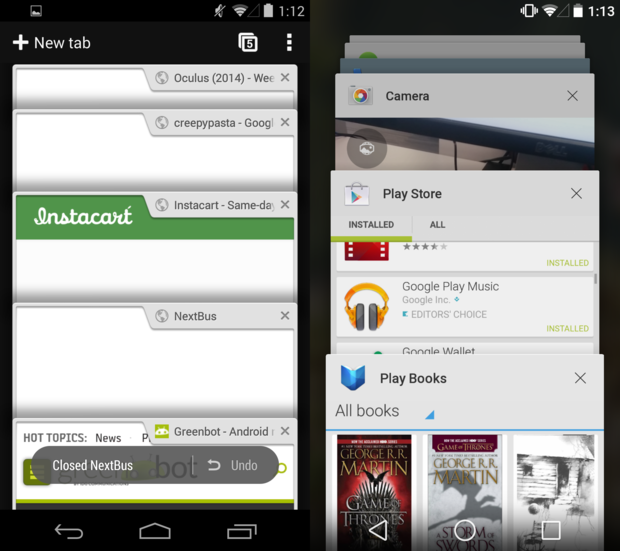
The new multitasking windows (right) look very similar to Chrome’s open tab menu (left).
It’s not all about visuals, though. Recent apps works differently than you’re used to, in that it spins off new tasks as appropriate. This hasn’t always been the case.
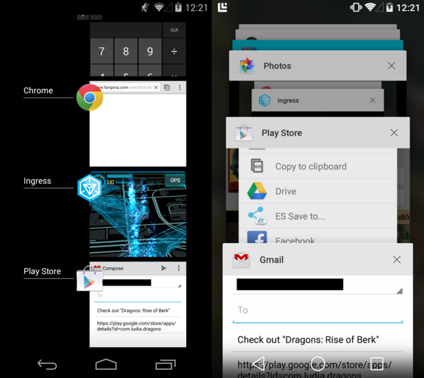
In the image above, I attempted to share an application from the ay Store to someone through Gmail. Say you attempted to do just this then pressed the home or recent apps button. In previous versions of Android, the sharing task would be saved within the ay Store app in recents, which is why you see a thumbnail of Gmail inside the ay Store window on the left.
In Android attempting to do the same results in a dedicated Gmail tab appearing in the recents screen, allowing the user to easily get back to the application in the ay Store. This makes a lot of sense, but this doesn’t always work. Trying to share restaurant information from Maps to someone through Gmail worked as it did in previous Android versions did not give Gmail its own tab. Such is the experience of beta software.
For more information on the way Android hles tasks within the multitasking window, check out this + post by Diane Hackborn.
So, while Android s new multitasking menu is visually more appealing, it’s also smarter. It’s not perfect, but given that this is just a preview of Android we’re working with, there’s enough time to get some of the kinks worked out.
