You really have to h it to for making Android more presentable over the last few years. at once was unsightly awkward is now usable sometimes even downright elegant. It’s gotten to the point that the pure Android builds on Nexus devices have all the features you need to get through the day without the clutter of OEM skins.
It’s not only about the bare essentials, though: If is going ahead with the rumored Android Silver program to push its preferred software experience, it really ought to look at some of the cool things OEMs are doing with Android. Yes, it’s not all bad! Basically, should steal some ideas from its partners.
wer saving modes

has somehow managed to ignore the battery life issues on Android for the last six years. Sure, things have gotten better for the most part, but there’s no system-level power saving mode built into Android. This has led virtually every manufacturer to design its own power saving implementation that can be toggled on with a single switch, or triggered when the battery drops beneath a certain level. Adding this should be a no-brainer for .
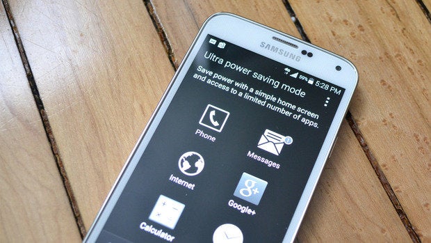
The best versions of this technology come from Samsung HTC with the newly released Galaxy S5 HTC One (M8). These devices include power saving modes (called Ultra Extreme wer Saving) that not only change software features, but plug in directly at the hardware level. The Qualcomm 801 processors in in the GS5 M8 are down-clocked two of the four cores can even be disabled to save power.
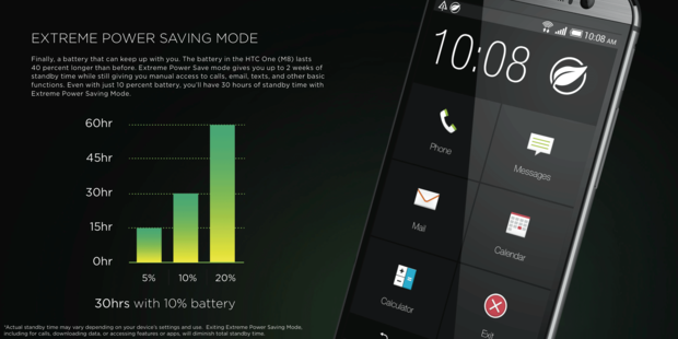

Both devices disable background data load up a simplified interface more suited to the low-power mode. Samsung even switches to a black white mode that lets the Super AMOD display sip power. The power savings from tapping this one button can increase stby time several times over. It’s a very consumer-friendly feature, needs to get this in its version of Android stat.
Sleeping with one eye open
There’s a neat trend in newer phones that puts the screen to use even when the device is asleep. You can continue to hit the power button to wake up your phone like some sort of caveman, but these features provide a really cool user experience that would do well to emulate.


‘s implementation of screen-off functionality is called Knock Code. You can define a pattern of taps across the four screen quadrants to act as an unlock code. It saves you from reaching for the power button secures the device—neat. HTC does something similar, but without the security aspect. The Motion unch feature lets you swipe in various directions on the sleeping screen to instantly unlock launch various actions. For example, you can set the device to wake up when you swipe up open BlinkFeed when you swipe right.
‘s departing Motorola division might have the best tweak on using the sleeping screen. Active Display is Moto’s name for the way a Moto X wakes up the display to alert you of new notifications. You can view, dismiss, open notifications just by swiping across the screen while the rest of the phone sleeps soundly. The Moto X also wakes the screen automatically when it detects that you’ve picked it up or taken it out of your pocket, meaning you don’t have to expend the energy to reach all the way up to that power button. Thank goodness!


These are all awesome user experiences that make Android feel more inviting, dare I say it, human. Having features like this in stock Android would serve well.
Quick Settings should be quicker
Android’s Quick Settings panel has been a bit of a mess since it was introduced in 4.2 (lly Bean) continues to be a mess to this day. It’s not going to get any better until takes a look at the completely rational tweaks to the formula made by its partner manufacturers custom ROM designers. Basically, everyone has changed ‘s implementation of these quick-access toggles because there are so, so many ways to do it better this is an important feature.
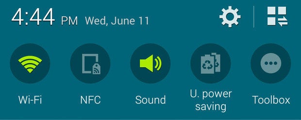

For example, Samsung have a single row of toggles at the top of the notification shade for faster access. The system settings also allow for rearranging the fully exped Quick Toggle window the single row above your notifications. That’s really a common-sense feature.
Even using the limited array of non-customizable buttons in ‘s Quick Settings panel is weird. Tapping on most of the Quick settings buttons doesn’t even turn things on or off—it opens the corresponding system settings screen for some reason. You actually need to long-press to activate the toggles… except when it’s the other way around, as it is with airplane mode auto-rotate. At this point, should just follow Samsung’s lead.
It’s not that stock Android needs to adopt the look of feel of the skins created by other companies, but should look at the smart things everyone else is doing with the Android platform try to do the same smart things on its own. If does intend to push a stock experience to consumers, it’s important to look at what it’s going up against.


