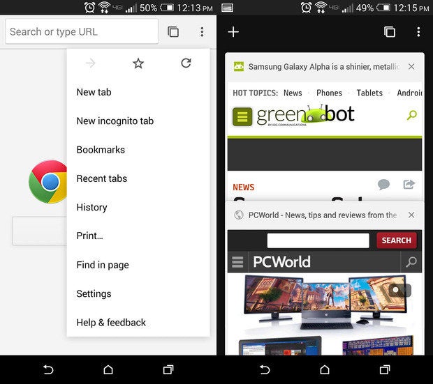
Android is undoubtedly going to be one of the biggest Android updates in years. To ensure it’s a smooth rollout, has already begun slowly transitioning its many Android apps services to follow the new Material Design interface principles. The ay Store already received a half-makeover, now is testing out the new design on its Chrome Beta app.
ile it’s not the official stard release Chrome, it’s likely that ‘s getting some practice in before the real thing arrives, just to work out some of the kinks. Chrome Beta now features a simpler, streamlined design; the menu bar is flatter, the overall interface just feels more futuristic than Chrome does currently.


It’s prettier, flatter, more concise. can’t wait to see what Android will look like in its entirety.
Chrome for Beta also features a dark theme for Incognito Mode—as if to imply that incognito browsing is a “secret” thing—as well as a new icon a more simplified sign-in process. And, as has been the case with past versions, Chrome Beta also features a few bug fixes performance improvements.


Chrome Beta’s “simplified” login shows up first thing when you launch the app.
hasn’t yet updated the Chrome Releases page or Chrome Beta’s ling page with the official change log, but the app update has begun slowly rolling out to devices everywhere.


