is transforming the ay Store into a showcase of Material Design. A new version is rolling out to Android devices that features redesigned content pages, prominent video placement, new navigation icons.
The update bumps the version to 4.9.13, indicating still has work to do before deeming Material Design fully implemented in the ay Store app (which will probably earn it a 5.0 version number).
The focus in this update is the way in which content displays on an app, movie/TV show, or music artist’s page. The top half is now dominated by either a video or a large banner image, which slowly dissolves into the background when scrolling down the page.


The cover art now anchors an album page in the ay Store redesign.
The content categories are quickly visible through new visuals just below the title. For example, games are identified with a distinct icon such as Arcade, Action, or Simulation. The average review score is identified in a separate icon, along with a button that takes you to similar content.
ges also are slightly different depending on whether the content is already in your catalog. If it’s an app you already own, for example, the page leads with update information. Tapping then exps into a separate page, giving a clutter-free space to read further details about the app.
Scrolling to the bottom then takes you to key details such as the version number, size, content rating date of last update.
Another clever visual touch is the redesign to the Action Bar, which is where you’ll find the back search buttons. These actions now float over the content instead of being visually attached. ile they are in the same location, this allows the video or banner to have more screen real estate cleans up the interface.


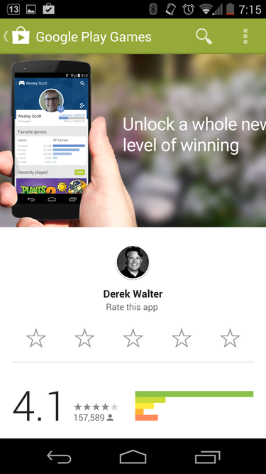
The ay Store redesign puts a prompt for reviewing apps front center.
The main navigation of the ay Store remains unchanged. so, a few apps, artists, movies/TV shows have yet to include a video or banner image. There clearly is some work on the developers’ side that must take place in order to get one’s content Material Design-ready, though that should become more commonplace over time.
In all, the update is more visually appealing demonstrates ’s continuing efforts at making Android aesthetically pleasing. However, at times the experience in the ay Store is a little disjointed with Material Design being implemented in pieces, in lieu of one big comprehensive update.
As is always the case, the new version should roll out to users over the next few days. Android lice has an A if waiting isn’t really your thing.


