Rather than mimic Samsung’s marketing strategy—bigger phones packed with more features— is banking on the idea that simplicity is a better seller. “Consumers don’t have time for unnecessary complexities,” preached Marshall, head of product marketing at in Europe, the company’s G3 launch event in ndon.
Indeed, the new G3 is simple in its approach, even with all the features it has packed in. chiseled down many elements of the Android-powered smartphone to focus on simplifying what it once did in excess. It offers more processing power in a thinner body, a newly overhauled interface, paired-down camera modes so that only the most essential are easily accessible. It’s a major improvement over its predecessor, the G2. The company may have found a philosophy that works for it.
Designed for your hs
The new G3 features what the company calls a minimalistic design; it’s supposed to “feel perfect” in your h because there are no buttons on the side. It feels easier to wield than the similarly wide Samsung Galaxy S5, but it requires just as much reach to get to the top corner of the screen as the HTC One (M8). And while those rear-mounted buttons seem to be the de-facto stard for hsets going forward, they’re much easier to tap than the buttons on the G2. I’m still not sure I’ll ever get used to reaching back there, however.


The rear-facing buttons on the G3 are easier to push than its predecessor.


spent a considerable part of its presentation convincing the audience that more pixels means a better looking screen. “[There’s a] misconception that a human can only see up to 300 pixels-per-inch,” said Marshall, in response to the articles out there that suggest otherwise. The G3 has a 5.5-inch Quad HD display with 11 million sub-pixels—that’s three times more than a Full HD AMOD display, according to the company. It certainly looks better than its predecessor at first glance, but I’m waiting to see how compares to its contemporaries before I make my final assessment.
A simple—but capable—camera


A station demonstrating the “laser focus” on the G3 versus the Samsung Galaxy S5.
Unlike previous iterations, the G3’s camera interface is much easier to use. ke the Samsung Galaxy S5, paired down its camera abilities to only to most essential camera modes so it’s much easier to use. Its 13-megapixel camera sensor comes with advanced optimized image stabilization, dual-flash, a slightly gimmicky-sounding laser autofocus. en I first heard the term, I imagined lasers from the camera lens shooting out toward your enemies, but when I tried it out I found that it actually works rather well at rapidly focusing on the object or person I wanted as the subject of my photo. There was virtually no lag, even at a dark press event.


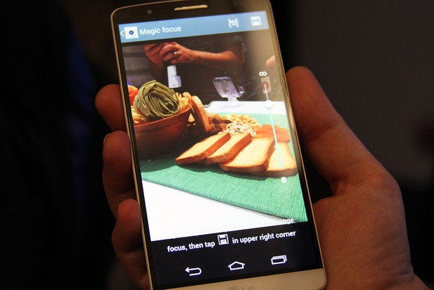
The camera modes have been simplified to just a few. This is the G3’s “magic focus.”
ile the G3 is fairly quick at snapping photos, there’s something off about the color composition in the final result. Despite its high resolution photo-taking abilities, the G3 still had some trouble with EG artifacts. There was “mosquito noise” around the edges of a wine glass that I snapped a photo of with the G3. I’m looking forward to getting the device in taking more comparison shots to see what’s really going on.


it. t take a selfie.
also jumped on the selfie train with its new selfie mode, which I am very much in favor of. The feature allows you snap a photo of yourself by simply making a fist at the screen. It’s helpful in group selfie—or “grouphie”—situations, but it’s silly when it’s just you, taking your own photo. I tried it out it worked really well the first few times; the viewfinder “locks in” on your fist then gives you a three-second countdown to smile. I also appreciated the “beautify” feature that’s built in, which instantly softens your face so that wrinkles blemishes are no longer visible.
Finally, a UI makeover for
It’s been a long time coming. finally overhauled its outdated Android interface with a flatter design, a less crowded keyboard, no shadowed or embossed icon in sight. In fact, the icons resemble many of the currently popular icon packs in the ay store.


remade its UI to be flatter, prettier.
also said it stuck with a circle graphic motif to help differentiate its interface from other manufacturer-skinned Android interfaces. Aesthetically, it’s a huge improvement over its predecessors even after just a few minutes with it I already like staring at it more than I’ve ever liked looking at an iteration of Samsung’s Touchz or HTC’s Sense. The Notifications shady is also less overwhelming now that you can remove the Qslide apps.


’s new circular aesthetic bodes well for the future of its interface design.
There’s so much more to cover about the G3, but we’re waiting to get some actual real-world experience with the device when it debuts at all four major carriers later this summer. Stay tuned.


