
The Android preview represents a significant design shift for the company, pushing a new aesthetic look called Material Design. Those eager to try the latest operating system version can do so. However, installing Android /a> is for a select few; you must have a Nexus 5 or 7 and be willing to wipe your phone. The App was removed from the Play store for violating the developer distribution agreement. And surprised it took so long. With a bit of searching, you can find sites hosting the App for you to sideload at your own risk. The App is very stable and usable for anyone. That wants to get a taste of Android before it hits devices later in the year. It also revealed much about Android’s take on design utility with the newest update to its operating system.
Material Design at Work
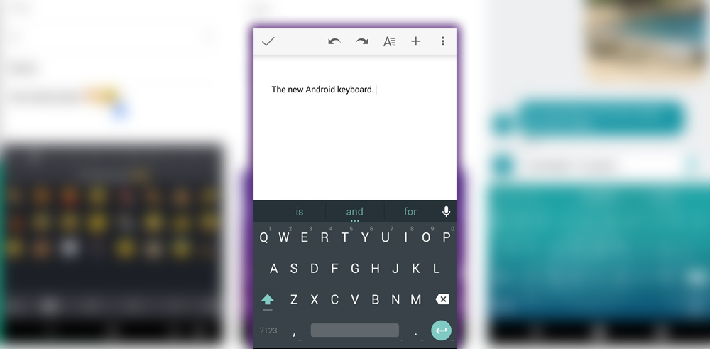

Androids’ new keyboard served as a benchmark for its new Material Design. It demonstrated one of its fundamental principles: bold color statements juxtaposed with muted environments. The stark white keys and blue accents are clearly visible when contrasted against the dark gray background. Additionally, flat modern elements were evident from the lack of mock keys between the characters. It’s a great look that give you a sense of where Android was headed.
Color Options

If the Material Design look wasn’t your thing, the developer had included the original blue-white themes from the current version. Which would presumably be available when the new Android hit the market. While they looked fine now, they would probably be out of place. When third-party Android apps are updated to meet the Android aesthetic.
Gesture Typing
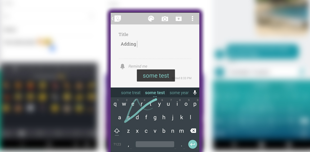

Android’s take on a Swype-style keyboard got even better, including some inspiration from SwiftKey. Like the former’s flow-through-space feature. You can now drag your finger across the keyboard, without lifting it. And drag it over the spacebar to insert a space between words. Gesture typing is definitely a personal preference. Some swear by it; others would rather not. Those in the former group have improved this capability.
Autocorrect
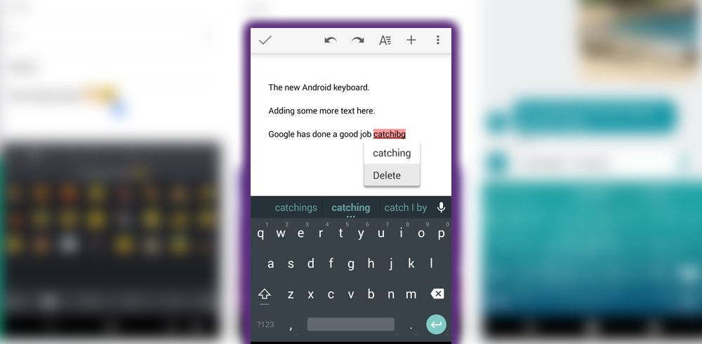

A specific comparison test makes it easier to determine how well autocorrect compares to the other Android keyboards. My anecdotal experience is that the autocorrect was good, though not as accurate as SwiftKey. Which is my typical go-to keyboard. However, it would not be surprising. If the final version included deeper ties into your app’s services. For the keyboard to learn more about your typing habits. Of course, if it does more harm than good, you can permanently disable autocorrect.
Numbers Alternate Characters
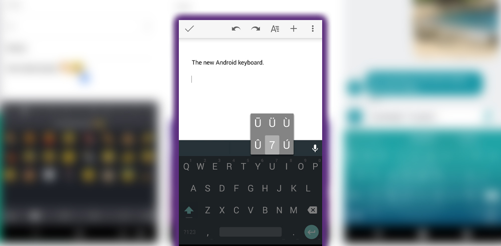

The Android keyboard puts numbers and alternate characters within easy reach. Hold down a button on the top row for numbers. Some will display international characters. If there is one you use frequently. You need to memorize where it is placed. As there are no visual indicators of which symbols, besides numbers, lie hidden under the long press of each letter.
Emoji
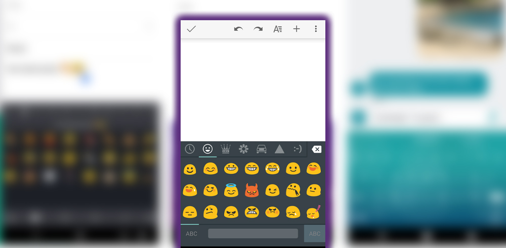

It’s time for one of the most essential components of any keyboard: access to Emoji. No matter which app you are typing in, a long press of the Enter key presents the Emoji menu. The emojis are grouped into categories, with the most recent used appearing in the leftmost section. After adding the necessary icon, hold the enter button again to get back to the regular characters.
Keyboard Settings
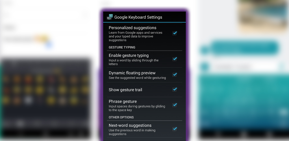

Just as the current Keyboard did, the Android version would ask permission to use your data from services. It also offered the standard suite of settings, including personal dictionary tweaks for gesture typing. The settings appeared to be the same as the current Keyboard, though more changes would come as Android built up.
Voice Input
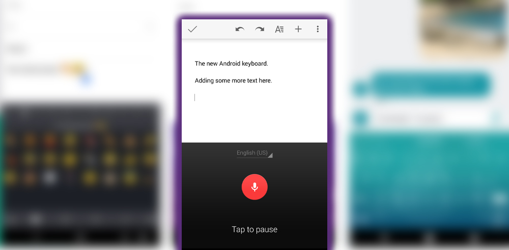

Android voice-to-text input was built into the keyboard and easy to access. To launch it, tap the microphone icon on the right side of the word suggestion bar. If you hit it accidentally, tap again to return to the keyboard.
How It Compares
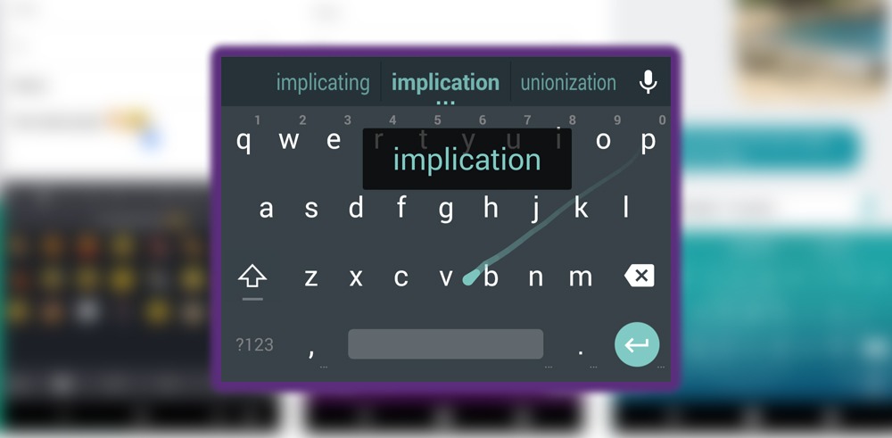

The Android keyboard was a good upgrade over the current stock keyboard. And served as a model for how applications built for the newest Android operating system would look. I have used it as my primary keyboard for about a week. I found it very fast to type with, accurate, and aesthetically pleasing. Gesture typing had even merited a trial. Although don’t expect much of it if you use lots of names or a sophisticated vocabulary.
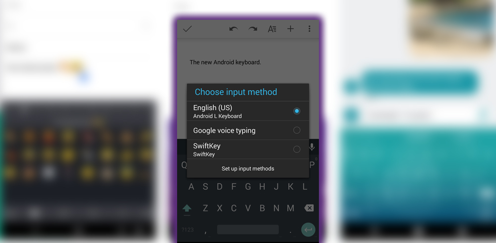
Suppose you are a diehard user of a specific third-party keyboard. In that case, the Android keyboard will unlikely make you switch immediately. So, switching is much easier now; hold down the spacebar to select a different keyboard. This makes it easy to try keyboards out while keeping your preferred keyboard ready.


