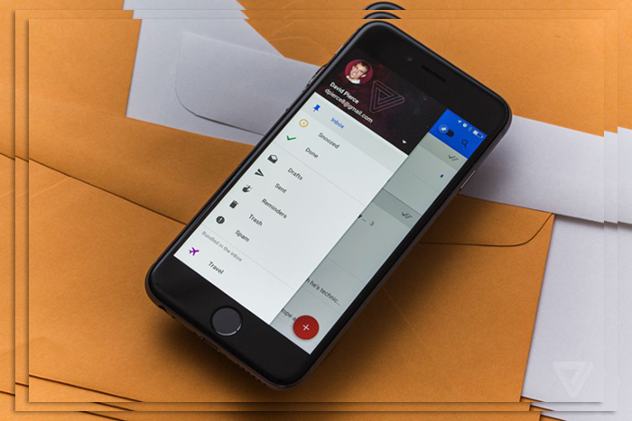
We’ve known for a while that email was broken; we just didn’t know that we knew it too. The Inbox app goes a long way toward fixing the problem of an excessive deluge of updates, solicitations, and downright junk. Like Mailbox, you can swipe and snooze your way to a clean inbox. Engaging in the email far more quickly than with the Gmail app. Yet there’s a learning curve for some features and growing pains for power Gmail users. But give it time; you’ll find yourself going all-in.
We’ve compiled the ten best features, highlighting a few areas in Inbox that could improve. Check out our slideshow and let us know your thoughts about Inbox. And if it’s changed anything about how you manage your Gmail. Inbox is invite only. The best way to get on the list is to mail inbox@gmail.com asking to test it out. Which sends out invites in waves.
Inbox is Easy on the Eyes
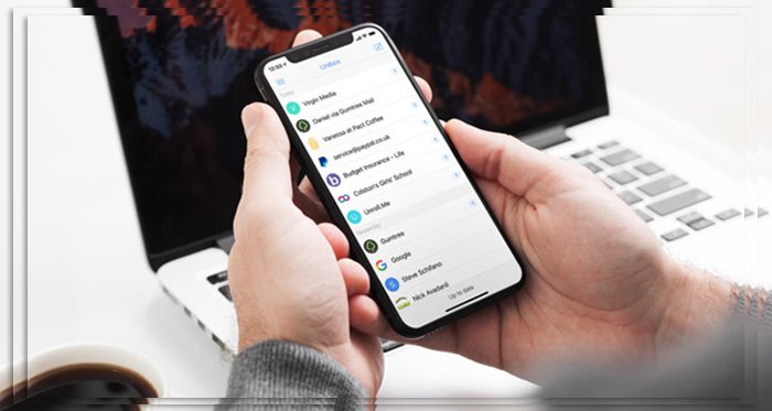

Google’s new app is much more excellent when comparing Gmail and Inbox. But the revamp is also better for productivity. You can more quickly spot the mail you need to address first. They’re grouped by date, it’s easy to decide when you go back. And get rid of all the emails from August in one fell swoop. The downside is that if you still like to scroll through the Inbox linearly and pick out what’s essential. Then you’re better off with Gmail. Gmail is to get a Material Design makeover. Which will be close to what Inbox offers in the beauty department.
Snooze is the killer Feature
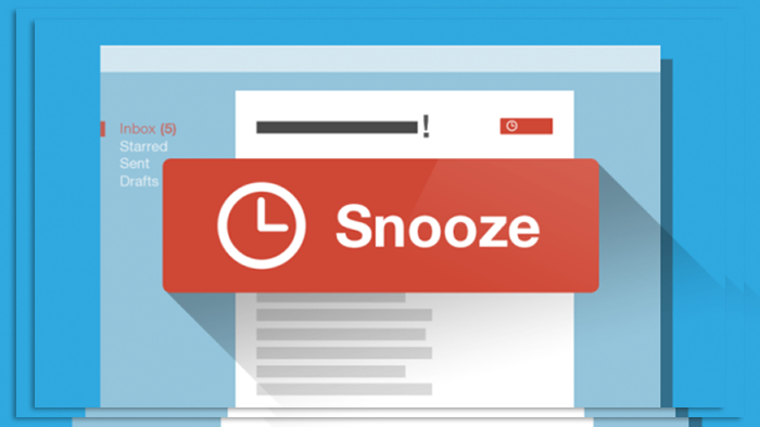

OK, this one is borrowed from Mailbox and other popular email apps, but that’s okay. It’s the best feature in Inbox because it really changes your workflow with email. There are usually plenty of messages you want to follow up with later. But that means they sit forever in your Inbox until you actually take action. Or you archive them and promise you’ll remember to come back to them, which you never do. Snoozing by location is cool; the two emails you archived at work come back up when your at home.
Unfortunately, it’s been a little quirky for me in practice. I’m not constantly pulling the email when I’m at the location. Snoozing emails puts them out of my mind. So I’m not continually going back and fretting about the details. Much as Dumbledore could store away thoughts for later. It gets out of your Inbox, but you’ve set it to come back later. When you need to deal with the content.
Bundles do the Organizing for You
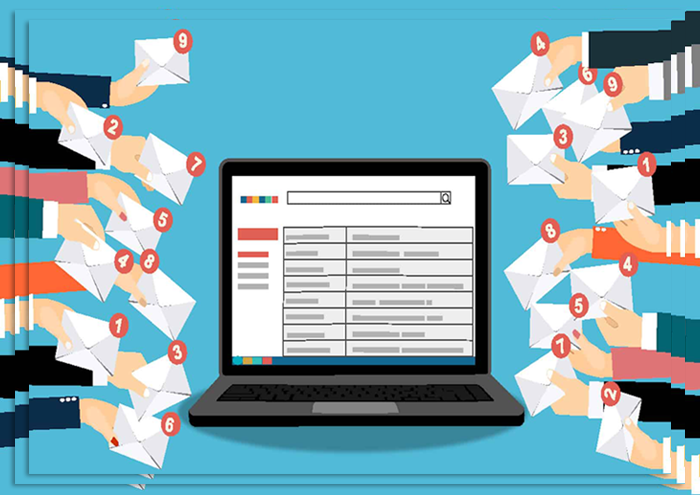

Inbox is excellent if you get many emails, as it bundles messages into manageable groups. Color coordination helps, as we have learned to quickly navigate to the bundles by recognizing the icons and colors. The categories are definitely geared toward consumer accounts. Inbox doesn’t work with Apps for work accounts, as the bundles include Promos, Travel, Social, and Finance. You can customize your own, but they’re less colorful than the default choices.
It’s also great to take a batch of promotional messages and swipe to the right to mark them as done. Which is the equivalent of archiving. The only downside here is it takes an extra step to permanently delete a message. You have to touch on the message or group. Then go to the menu; the three vertical dots at the top right select the trash. Sure, an extra step is very much a first-world problem. Still, de-cluttering your inbox should not mean cluttering your archive with unnecessary emails.
Cleaner and Easier to find Labels


You can still use your original Gmail labels and add new ones with Inbox. You don’t have to kiss away everything you’re used to. They’re just easier to find and navigate. We have also relied on the system of setting notifications for specific bundles. This way, we don’t miss emails from those who will hassle you. If you don’t respond, like family members or editors. This functionality is also there in Gmail, but it’s front and center with Inbox. We would like to see the ability to add custom colors or even icons to the bundles. And make it, so they’re not all drab looking like they are now. It’s much easier to spot the default Inbox with bright colors and recognizable images.
Quick Access to Contacts or Setting a Reminder
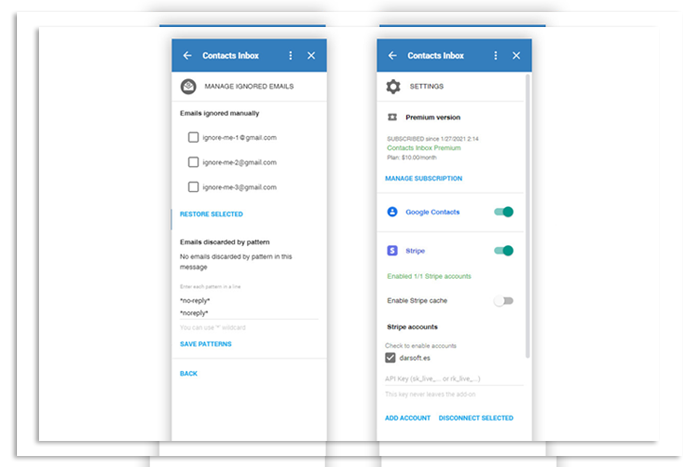

Gmail has one action to start a new message. Inbox soups this up with a nifty speed dial. Just press the floating red button, compose a new message, or touch one of your contacts. You can also quickly set a reminder. There are always voice actions; it may be faster if you’re already working in Inbox to do it this way. You can also begin new messages or replies from other non-Gmail accounts you use. However, that feature only appeared for us after a while, but it just showed up one day. So if you’re using Gmail to send or receive from an IM address, you’re in luck. This functionality does work with multiple accounts as well.
Pin It to the Top
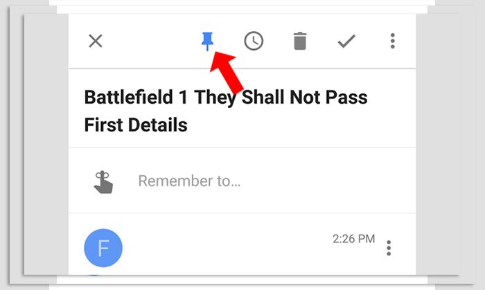

So what about that message you don’t want to snooze or hide away. Because you want to keep looking back at it? Just pin it. No, don’t send it to Pinterest. When you pin an email, it’s accessible by tapping the pin toggle on the top right. All your pinned messages instantly appear, making it easy to find that ice cream coupon or sports game ticket. It’s similar to the Gmail old starring system. But better, as it’s one action to get to this group instead of sliding out the navigation bar. Then finding the Starred list. So, it’s easier to move emails out of the pinned list. In contrast, starred messages tend to hang around forever unless you’re good about un-starring them. Which is usually not a top productivity task.
Find all Your Reminders
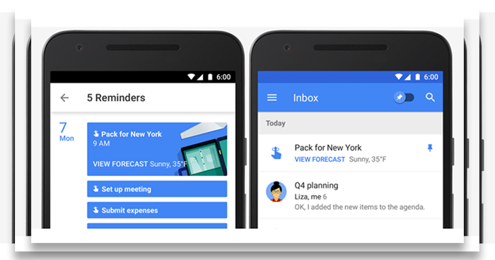

This is an excellent way for Android users to find all their reminders at once. You can also do a voice command or sift through the Now menu. But if you’re in your Inbox constantly like me, then it’s nice to find them in the slide-out menu. It shows you everything you’ve already created through Now. So it’s an excellent way to get visual confirmation about your accomplishments or what’s coming up. Also, jump into one of the reminders to change the details or further customize it.
You Don’t have to be Done
When you mark a message as done, it moves to a category by that same name and archives it. It’s located at the top right of the slide-out navigation bar. So you can go back into that section and snooze or pull out an email if you want it later. This is much faster than Gmail, which buried everything, archived or not, under the All mail label. We have also used this to delete emails I do not want forever. After swiping to get them out of the inbox, you can go to town and clean the done category. It takes some getting used to this procedure. For us, it works much better for mail management.
Visually Friendly Categories
Yes, Gmail puts more emails on your screen than Inbox when sifting through a label. But don’t be curmudgeons lament this as another tradeoff between utility and appearance. Not only does Inbox look better, but when you’re searching through a label. It’s easy to find stuff as the title is bolded. Any relevant images, attachments, or contextual information, like flight info or directions to a restaurant, pop out. I’m still not wild about the big letter or picture icon on the left of each message. Still, it serves a purpose and gives you an excellent target to tap on when moving a batch of messages.
Itineraries, Pictures, Maps
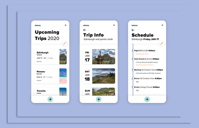

If you’re a frequent traveler, you will really like this feature. Inbox puts reservation details, itineraries, maps, and other photos from your emails front and center. When you’re staring at your list of messages. It makes it super easy to spot those travel details. Or to see that picture you were waiting for of your niece. Multiple images or itineraries in the same message are in a carousel that you swipe through. It does make images a bit of a distraction if you don’t move them out of the inbox. So best to swipe or snooze them away. This dramatically reduces the time spent diving into individual emails to get one key bit of information.
In March 2019, Inbox by Gmail signed off for the last time, all the features were brought to Gmail.


