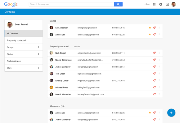
Contacts is getting a much-needed overhaul, eliminating the misery of managing who you message.
You can try out the new web app right now by going to the Contacts eview. Once you enable it with your account, you’ll default to the new page every time you navigate to your Contacts.
The design is reminiscent of ‘s Inbox email app, drawing heavily from the company’s new Material Design aesthetic. The contacts are grouped together in stark white bundles, which pop out from the light gray background.


The new Contacts page looks very similar to the new Inbox email app.
en you click on a contact, it pops to the foreground while the rest of the page fades into the darkness.
From here you can view edit any of the contact information. en you hover over a detail like a phone number or home address, an icon will pop up indicating where you got that information. If you added it in yourself you’ll see a contact card, or a + icon if it’s from ‘s social network.
The best new feature is the ability to merge all your duplicates. st click the Find duplicates section from the left then the merge all button. It blends all the redundancy entries together rather well, cleaning up the unnecessary details.
Another great addition is a clearer display of your past conversations, which are snippets of previous email correspondence with that contact.
The contacts reorganization also significantly de-emphasizes +, which has an uncertain future anyway. You can still look for contacts by your circles if you wish, but the main organizational structure is centered around your favorite most-often used contacts.
As is often the case with new products rollouts, announced that its Apps customers can’t get access yet, but will at some point.
The impact on you at home: If you use as your main repository for all your contacts, this is a much-needed overhaul. Sometimes it’s more convenient to add in a new phone number or email address on the computer instead of searching for your phone. Now you don’t have to deal with an interface that was designed for the era of Netscape Navigator.


