‘s Android 4.2 update may not be the rumored full-blown Key me e update we’ve been expecting, but it does add some much needed features improvements to the Android operating system. This new version of Android keeps the lly Bean moniker, doesn’t look all that different from the first version of lly Bean launched over the summer. Android 4.2 officially ls on November 13, along with the Nexus 4 phone, Nexus 10 tablet, revamped Nexus 7 tablets. Other devices—especially Nexus models—may get the upgrade, but neither nor hardware makers have said anything about their rollout plans.
On both phone tablet, Android 4.2 looks feels more polished than the previous version, it cleans up some niggling issues we’ve seen. It also provides an all-new interface for the camera, introduces an additional way to type using the native keyboard, helps to better unify the Android experience across phones tablets. Here are just a few of its new features.
An improved camera
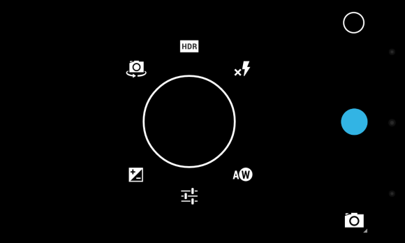

The native Android camera app receives a complete interface overhaul in version 4.2. The clean interface is heavily streamlined; it hides most of the camera’s options menus from the main screen. This approach makes it easier to focus on capturing photos or videos, but adds a little complexity for some important features you might need to access on the fly. For example, I wasn’t a fan of having to perform extra taps in order to toggle on/off basic settings like the camera flash.


Aside from the new look, the biggest addition to the camera app is the oto Sphere shooting mode. oto Sphere lets you take photos of your surroundings, much like Microsoft’s otosynth; the app will then stitch together the images into a 360 degree panoramic photo. In her Nexus 10 review, Senior itor renson mentions that she had some trouble getting the app to accurately stitch her photos together. en I tried out oto Sphere on the Nexus 4 I didn’t encounter any problems, though I did notice errors in my panoramas whenever I moved the phone around too quickly. It’s a neat feature, but your results will vary.
A new way to type
has added gesture typing to the stock keyboard in Android 4.2. Gesture typing is not new; this is the core of Swype’s app. Now, instead of poking at the screen in order to eke out words, you can simply glide your finger over letters the keyboard will offer predictions of what it thinks you’re trying to write. As someone who isn’t a huge fan of gesture-based keyboards (Swype’s in particular seems to hate me), I was pleased with ‘s implementation. The keyboard accurately predicted 90 percent of the words I was trying to spell, but it did have some problems recognizing when I wanted to spell words such as “success” or “buttress.”
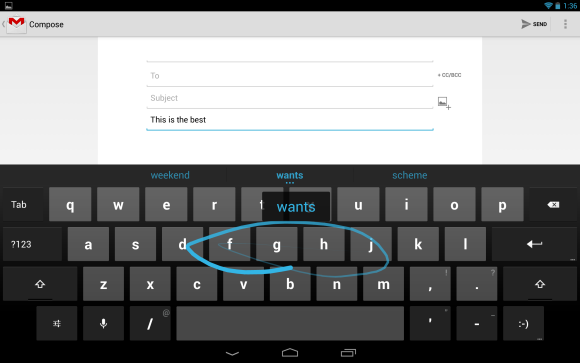

The gesture typing also works on tablet versions of Android 4.2, I took special joy in sliding my fingers all over the Nexus 10’s 10.1-inch screen. The extra real estate made it easier to accurately slide from letter to letter, resulting in fewer misspelled words. I’m still not entirely sold on gesture keyboards, but ‘s offering goes a long way in convincing me that they can be useful.
Now learns even more tricks
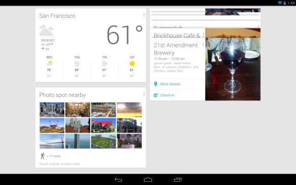

Now may not be exclusive to Android 4.2, but the service’s new functions are enough to make iOS ndows one 8 users green with envy. Now presents you with “cards”—pieces of information it thinks are relevant to you based on the time of day, your location, your search history. The service now lets you track things like packages, flights, hotel restaurant reservations, as well as events in your general area. Now has also added alerts for breaking news events, letting you know if a news story has been written about a particular topic you care about.
The service has matured considerably since its initial introduction, but I still feel like there’s more could be doing with the service. Most of the Now cards have only one or two basic options, would benefit from integration with third-party apps. Now is still extremely useful—on phones more so than on tablets, perhaps—but the service still has a way to go before it stops feeling like it’s in beta.
Consistent user experience
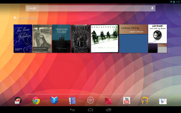

One of iOS’s biggest strengths is its consistent user experience: at you get on an ione or id touch is, for the most part, what you’d get on an id or id mini. On Android, this was never the case. tting aside the countless modifications made by carriers manufacturers, Android on phones is a different world compared to Android on tablets.
Android 4.2 changes all of that. Android phones tablets now share a similar user interface that—in many ways—looks like the phone version of Android blown up to fit a larger screen. The virtual navigation buttons on tablets have been moved to the bottom center of the display, making them more difficult to reach on larger tablets, especially if you are holding the device with two hs. And a dock now runs near the bottom of the screen where you can pin apps that you frequently use.
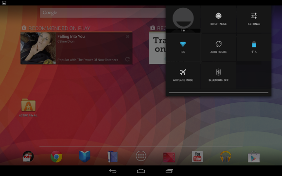

On large tablets like the Nexus 10, notifications the settings panel are split up placed in drop-down shaders on the top left right corners of the screen, respectively. The notification bar on phones smaller tablets (like the Nexus 7) is largely the same as it was before, though now you can use a two- finger gesture to gain quick access to toggles for the device’s data, -Fi, Bluetooth, brightness, among other settings. This gesture shortcut is perhaps the most welcome interface tweak brought by Android 4.2, since it saves you from having to dig through multiple menus in order to do simple tasks like adjust screen brightness.
Still in development
Unfortunately the version of Android 4.2 on our Nexus 4 Nexus 10 review units is not the final build. Other features will be added in an update still to come November 13, which is when ‘s latest devices go on sale. That’s when 4.2 will get already announced features such as the ability to pin apps to the lock screen to add multiple user accounts on tablets. ‘ll update this review at that time make note of any additional improvements we discover once the update goes live.
Bottom line
Android 4.2 lly Bean brings with it some interesting features, but ultimately doesn’t feel all that different from Android 4.1 on phones. The improvements to the camera interface, keyboard, Now are certainly welcome, but seems to have overlooked several aspects of the operating system that are in dire need of an upgrade. Navigation through the OS is still inconsistent from one menu to another, some system apps (like the News ather app) haven’t been updated since Android 2.2, many of Android’s settings are overly cryptic or redundant.
In many ways, this update is more important for Android tablets than it is for Android phones. By tweaking the Android interface so that it looks similar across both tablets phones, takes much-needed steps toward unifying the Android experience across devices. ether that translates to developers making more tablet-optimized apps remains to be seen, but in the end this approach can only be better for users going from one device to the other. Android still needs more polish, but with this update, Android 4.2 clearly has what it takes to compete head on with the likes of iOS 6 ndows one 8.
