
In less than a decade, Android has gone from an ecosystem. Consisting of only a couple of similar devices to one of unfathomable variety. Some stand out as particularly strange. Among the thousands of Android phones and tablets that have sprung into being over the years. Taking risks can be good. Sometimes you come up with the Galaxy Note, which did seem crazy at first. Other times, you create a boondoggle like one of these ten devices.
Samsung Galaxy Beam
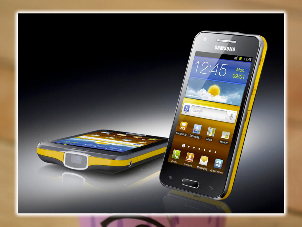

The Samsung Galaxy Beam was not a remarkable phone. Save for one, it had a tiny LED projector built right in. It could project an image up to 50 inches large several feet away in a dark room. But for barely long enough time to watch a movie. No one really needed this feature; even those who used projectors didn’t necessarily need one on their phone. Not to mention the projector hardware made the Galaxy Beam bulky and ugly.
Kyocera Echo
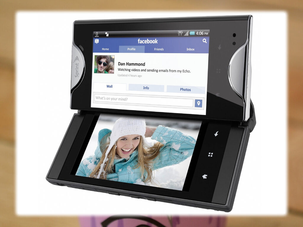

What’s better than one screen? Two screens! Well, maybe not in practice. The Kyocera Echo debuted on the Sprint in 2011 with a massive advertising blitz. This phone’s claim to fame was a second screen that could snap into place next to the main one. It created a weird minor dual-panel Android UI with buggy and severely limited software. Needless to say, the Sprint did not sell very many of these.
Samsung Continuum
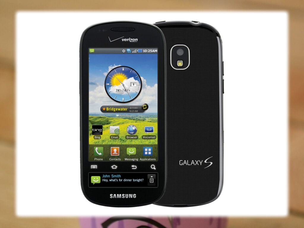

You may think that the Samsung Continuum was another dual-screen phone. But it had one big screen split into two parts. Verizon launched this phone in 2010 as part of the Galaxy S family. The navigation buttons were in a strip painted over the lower portion of the screen. Leaving a tiny sliver at the bottom. This second screen could show notifications, news, and other information. As interesting as the basic concept was, the implementation lacked and didn’t make up for the wasted space. Interestingly, the same basic idea is behind the Galaxy Note, though not the new Galaxy S6.
Pantech Pocket
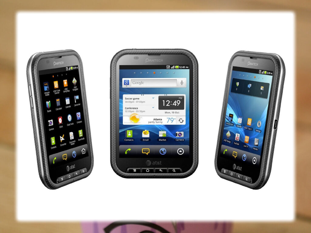

AT&T sold the Pantech Pocket for a brief period in 2011, but it vanished quickly from stores. It was a 4-inch phone with a 4:3 800×600 screen. It was like an iPad shrunken down and made considerably less attractive. No one seemed to know why they called it the Pocket. It does not look comfortable to carry in one.
Sony S2 Tablet
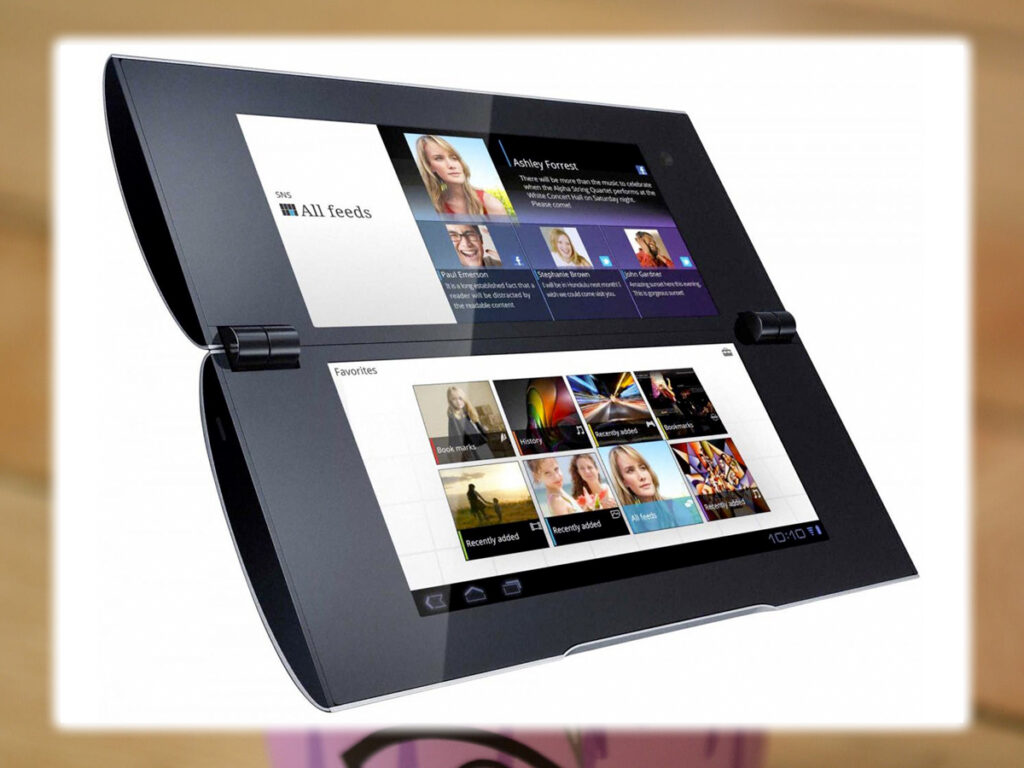

Sony didn’t learn its lesson from Kyocera. And made its own foray into the world of dual-screen Android in 2012 with the Tablet. This was a Honeycomb-powered tablet with a clamshell design. It was an exciting experiment, but the software support wasn’t there, and it was incredibly bulky, with huge bezels.
Motorola Backflip
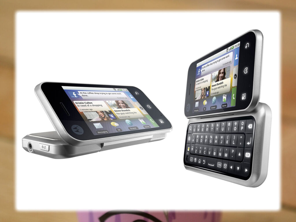

Long before Motorola’s acquisition and subsequent Android renaissance, there was the Backflip. This phone had a backward-folding hinge that closed to leave the keyboard on the outside rear of the device. Open for typing, there was a multitouch trackpad called the Backtrack on the bottom. It was highly awkward and could accidentally be triggered holding the device. If that wasn’t weird enough, Motorola also included Yahoo search as the default instead of Google.
Sony Ericsson Xperia Play
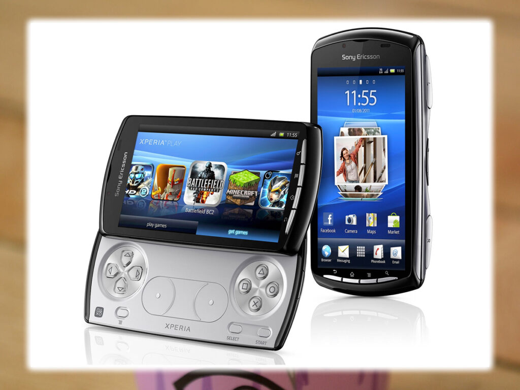

People wanted to love the Xperia Play, which was sold on both Verizon and AT&T in 2011. This Gingerbread-powered phone was a landscape slider, but instead of a keyboard, it had a gamepad. Sony offered a limited selection of classic PlayStation games in its PlayStation Mobile store, but the company quickly lost interest. This device still had its defenders but was too niche to succeed.
Motorola Flipout
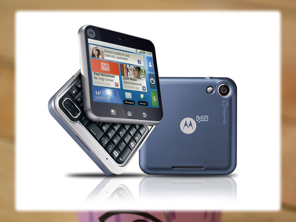

Motorola really used to love bizarre hinges. Around the same time, the Backflip was flopping on AT&T, and T-Mobile offered the Flipout. This phone had a tiny 2.8-inch 4:3 screen with a keyboard that rotated down, not a slider from behind it. The Flipout was an awkward little block when closed. The UI was no way optimized for the square display. The Motorola Flipout was so weird that it was actually fantastic.
Optimus Vu II / Intuition
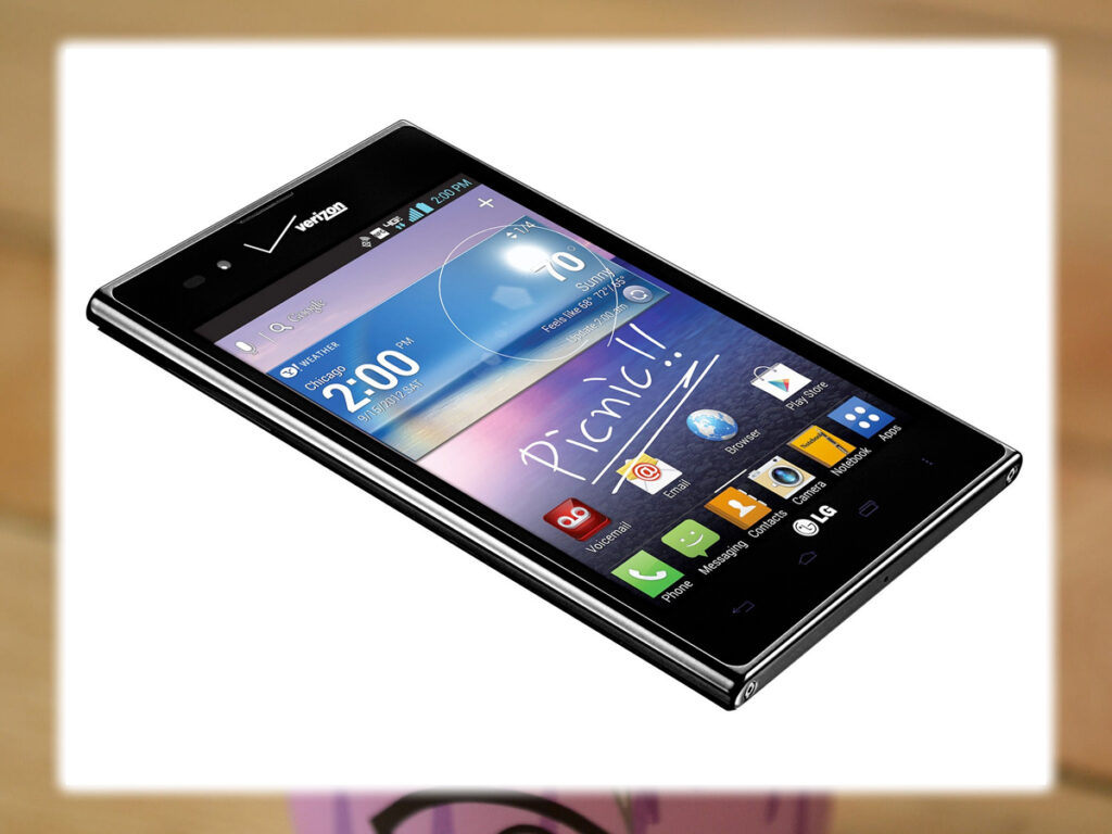

LG had tried a few times to copy the success of the Samsung Galaxy Note. But it had yet to hit the nail on the head. Perhaps its worst attempt was the Optimus Vu II, known in the U.S. as the Intuition. This phone had a 5-inch screen with a 4:3 aspect ratio. It also had a built-in capacitive stylus. The design was beyond awkward.
Samsung Galaxy Round
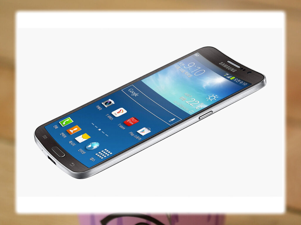

Curved phones are a thing these days, but they usually curve from top to bottom like a banana. However, Samsung chose to put a concave screen on the Galaxy Round. Angled from left to right like an ingles chip. There are only a few features designed to take advantage of this design, none particularly innovative. This phone was just weird for the sake of being weird.
The article was published in 2015, it’s now 2022. The manufacturers are still attempting to produce some weird and beautiful phones. Never be surprised at what you see and read about. Someone will come out with something you will not believe!


