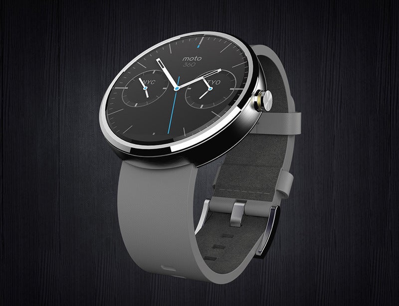

During a tour of Motorola’s striking new downtown Chicago headquarters, which is stationed in a large chunk of the monolithic Merchise Mart, I was whisked from lab to lab to see how the company creates its devices, such as the new Moto X Moto G, of course, the Moto 360.
But the most interesting part of the experience was seeing the Moto 360 that could’ve been—with a rounded square face, a racing stripe along the strap, or even the blacked-out screen section on top rather than the bottom. Here are some photos of the prototypes processes that helped lead to the watch you can buy today.
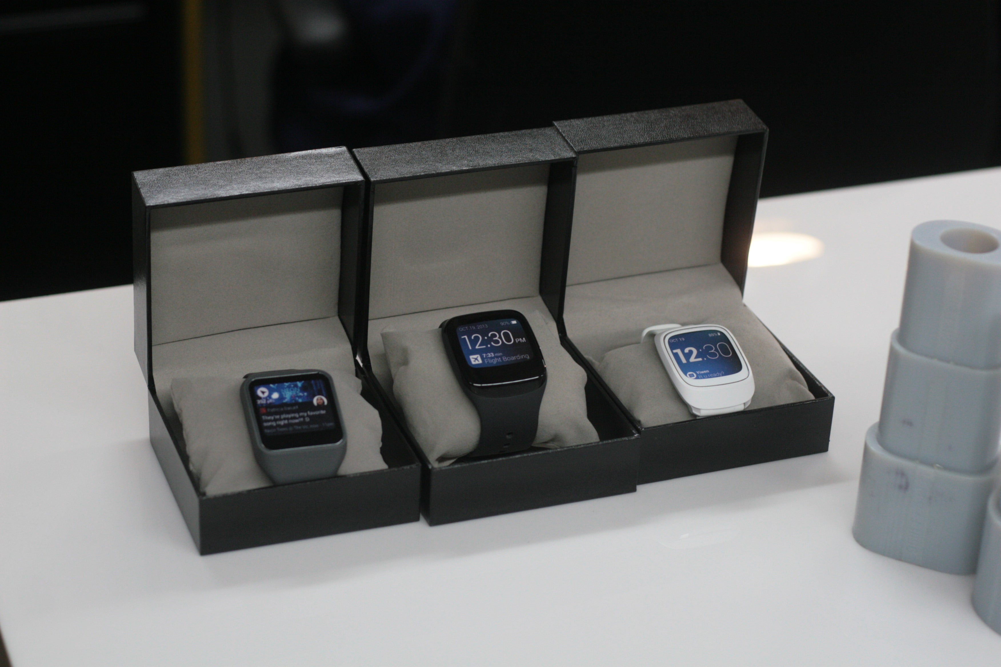

Image by
A non-circular face? Say it isn’t so! Indeed, Motorola experimented with a wide array of possible Android ar watch designs, including these rounded square shapes. They had numerous working prototypes prepared before deciding to pursue the Moto 360’s circular design.


Image by
This is a look at some of the other square-ish prototype watches developed in the early days of Android ar design at Motorola. You can see a slimmer b on the rightmost model—perhaps a female-targeted version—along with an interesting oval clasp design on a couple of them.
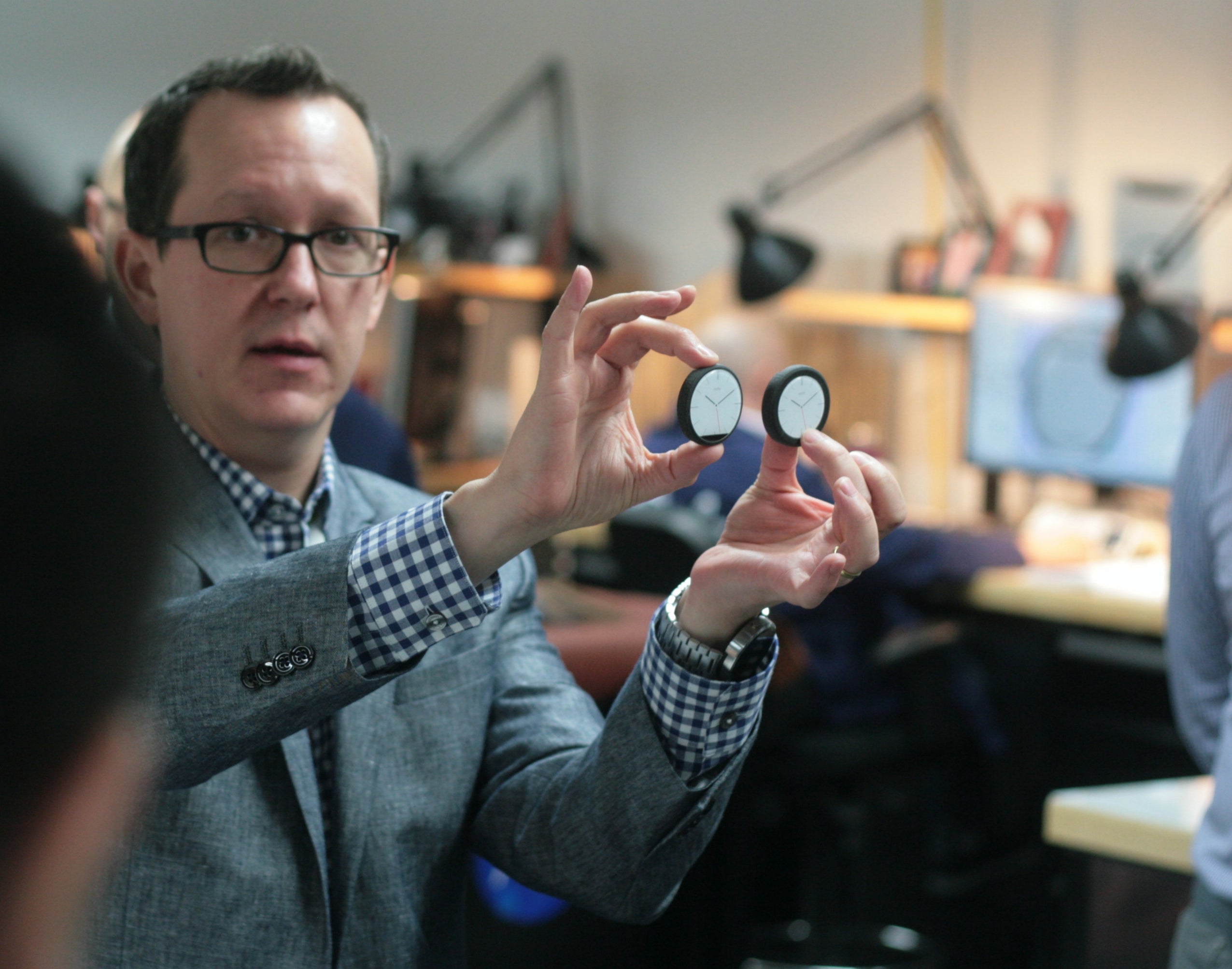

Image by
Here we see a member of the hardware team explaining that once they settled on a circular watch unit, they had to decide whether to keep the bezel slim have the black bar on the bottom, or deliver a chunkier watch that’s fully circular. It’s pretty clear what they ultimately decided for the Moto 360.
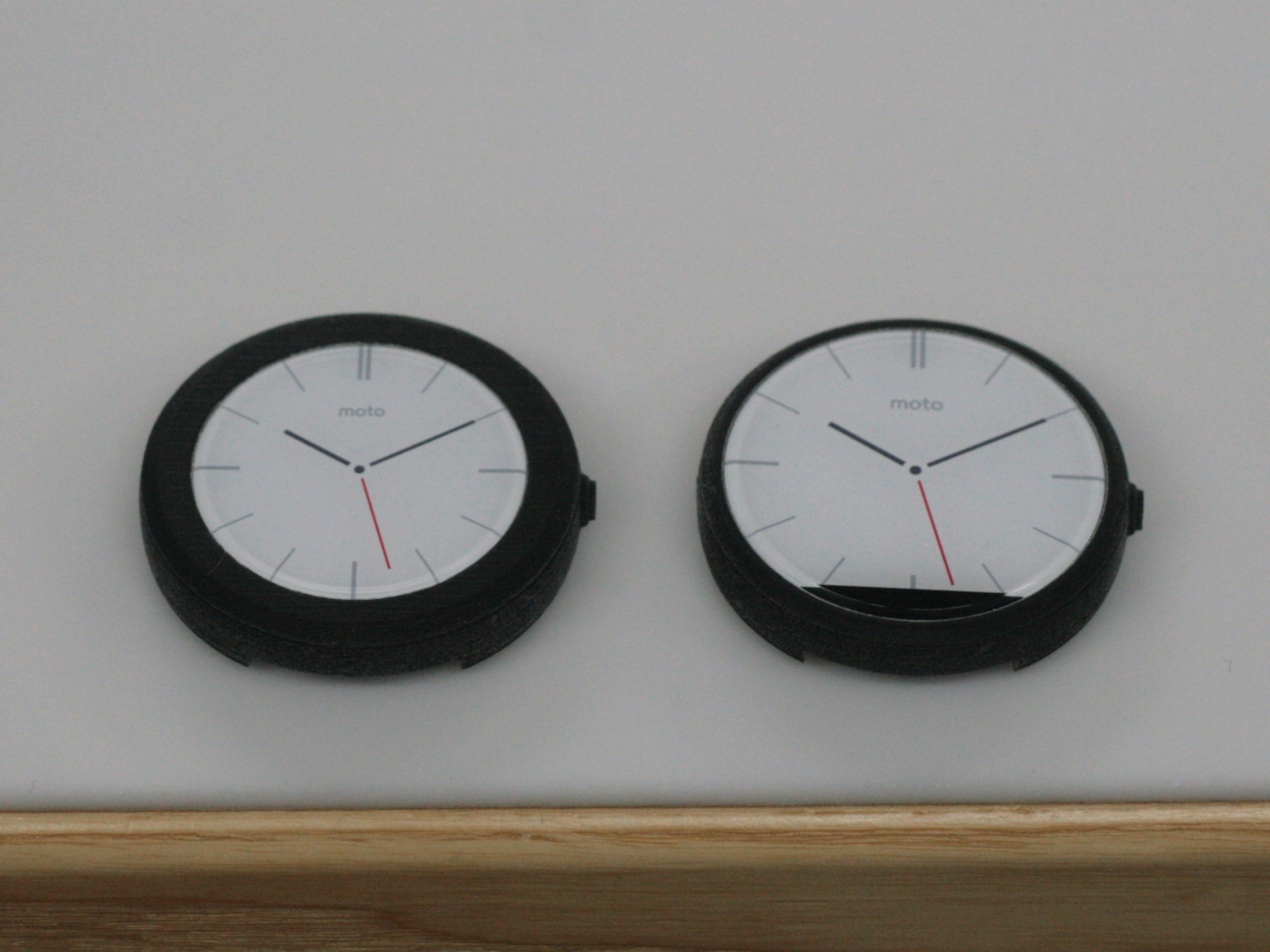

Image by
got a closer look at the proposed fully rounded face, while that would have been great, it’s clear that the trade-off would have been significant in terms of bulk feel (plus a smaller overall display). ‘ll soon find out how well ‘s G tch R hles that challenge.
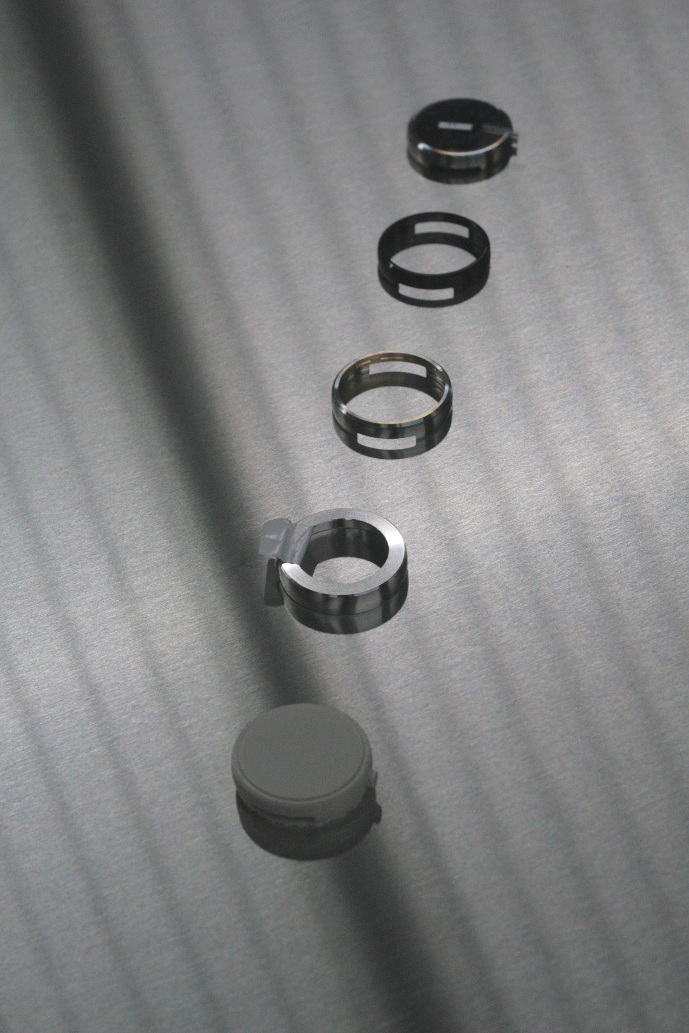

Image by
Here we can see the circular watch body coming together, from what looks to be the initial plastic prototype into its eventual stainless steel consumer version. There’s a much heavier-looking metal attempt seemingly shown in there as well.
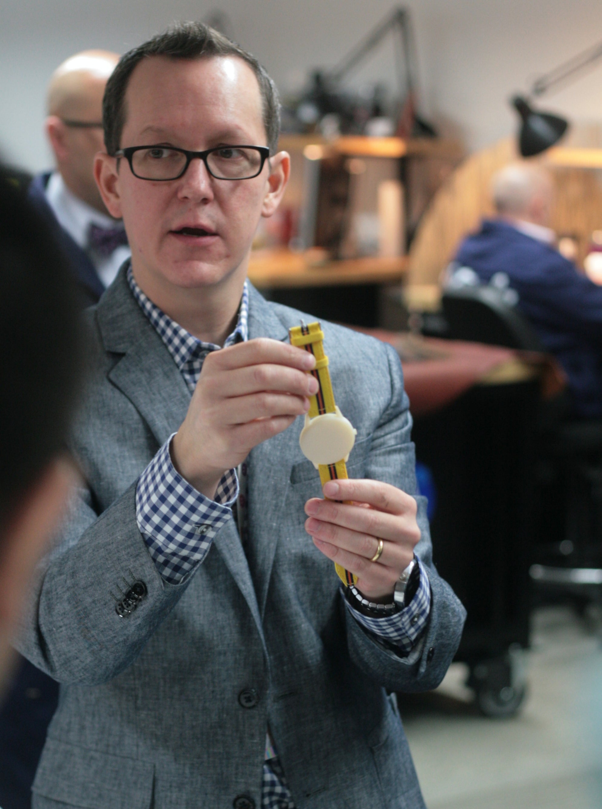

Image by
Motorola initially considered a circular watch that really popped, featuring a yellow leather b adorned with a racing stripe, but decided it was a little too sporty for their intentions. It makes sense, but I also can’t help but want that version as an eventual variant of sorts. How about Moto Maker for watches?


Image by
The hardware team shows off a completed prototype version of what would become the final Moto 360 design, but from there came the challenge of picking the best materials that would create the overall look feel that Motorola strived for.
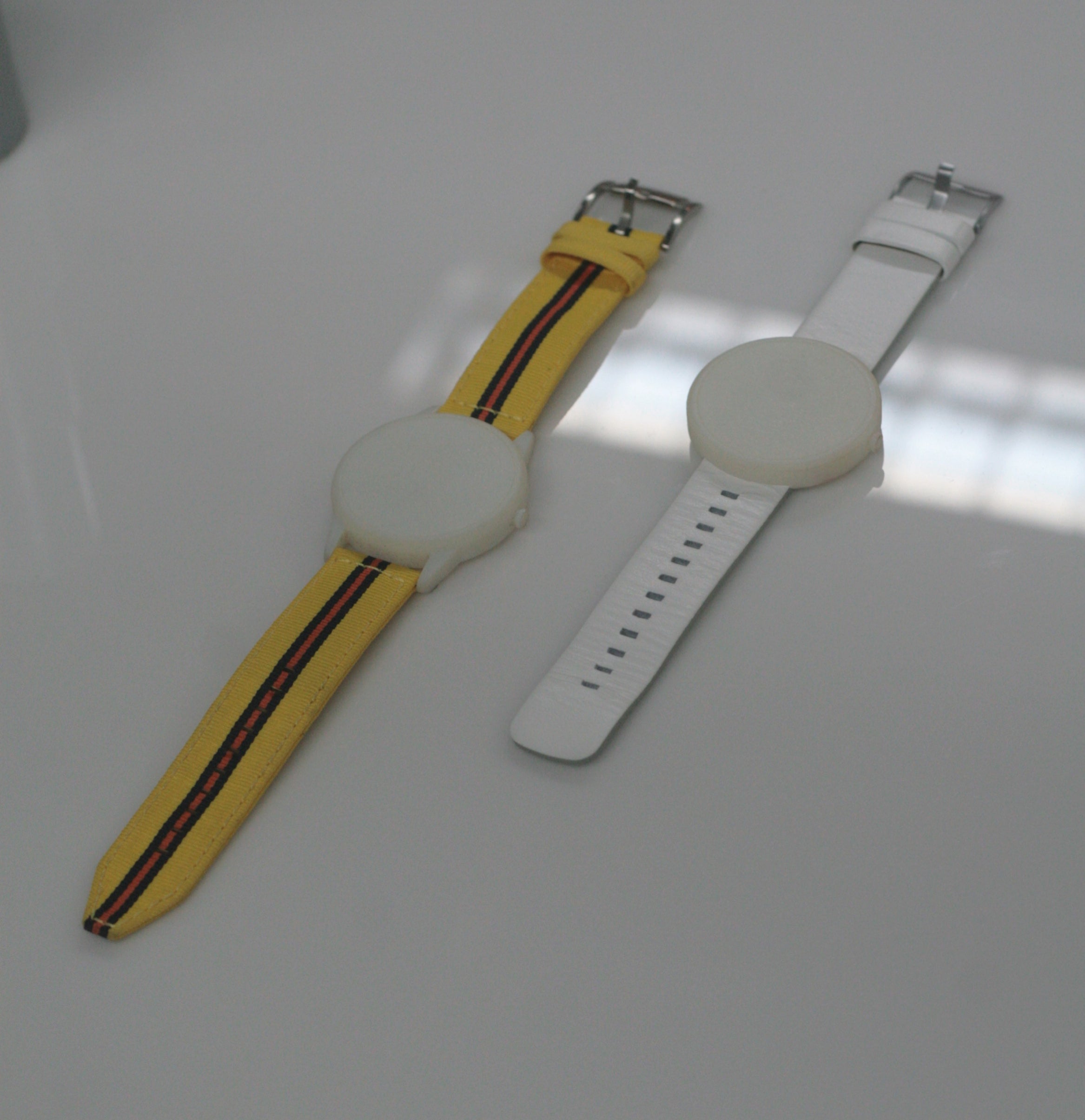

Image by
This closer look shows the overall design differences of the sporty watch compared to the final shape, ranging from the tail of the b to the little nubs that connect the strap to the core unit. The earlier design would have resulted in a less subtle look potentially also less comfortable feel on the wrist.
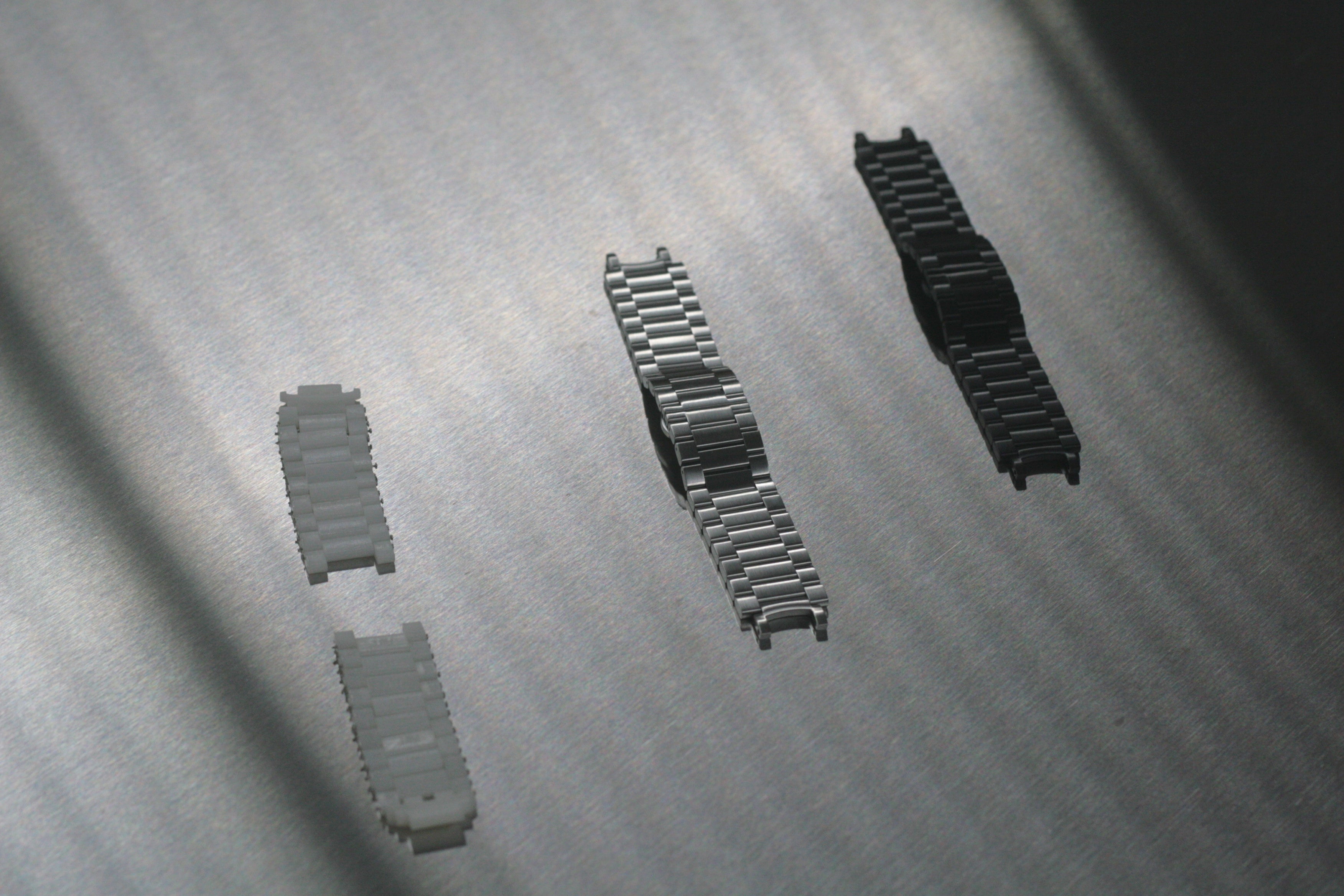

Image by
A plastic link b for the Moto 360? Not likely—it looks to be the in-house prototype developed as they devised the look feel of the premium metal bs, which were announced yesterday. You’ll be able to buy the Moto 360 with a metal b later this year, or just snag the metal bs separately for the stard model.
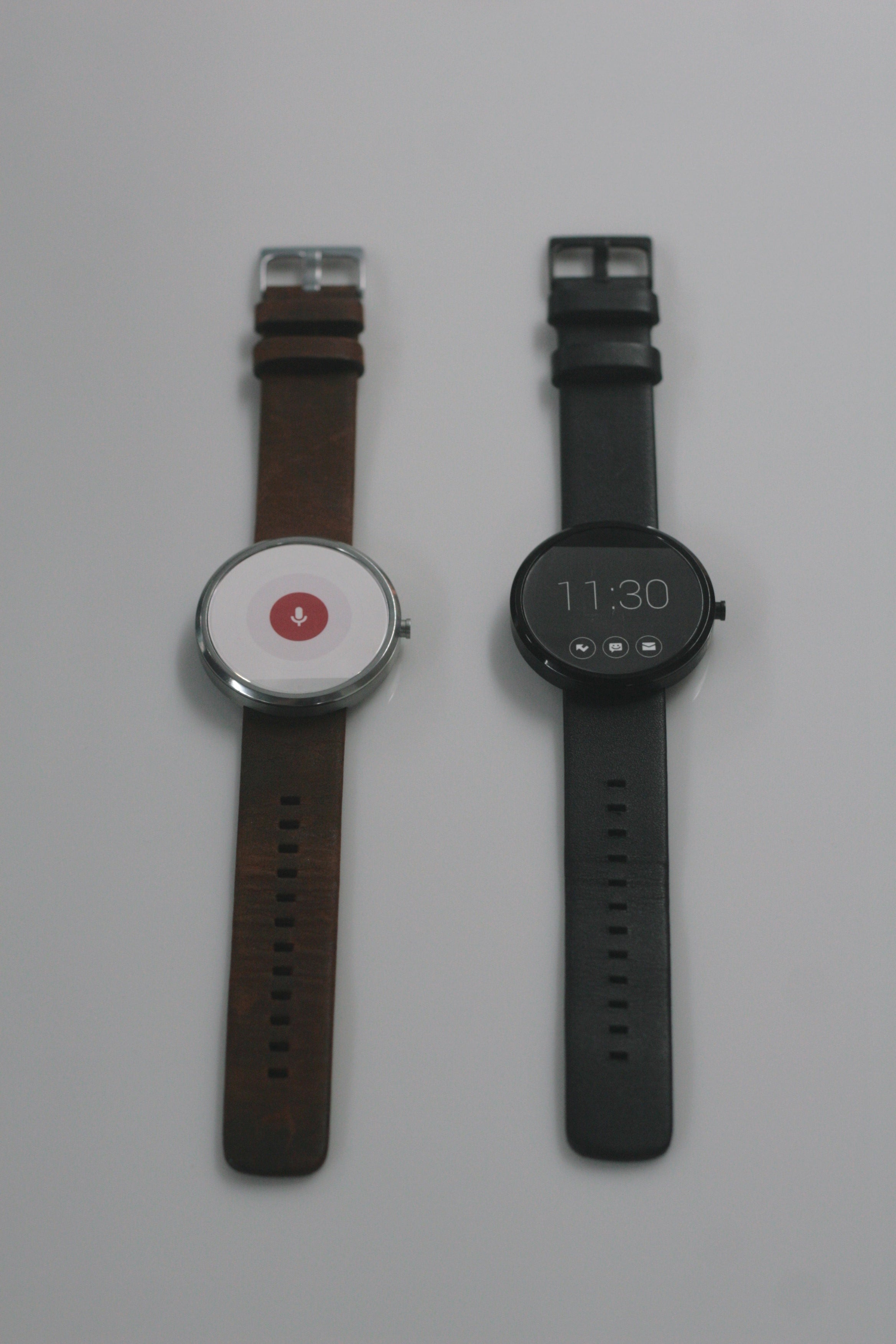

Image by
Now here’s an interesting idea: at if the black bar, which provides extra room to house internal components, was on the top of the display instead of the bottom? That’s what this right model seems to imply was considered, we can see the upside (no pun intended) of such an arrangement.
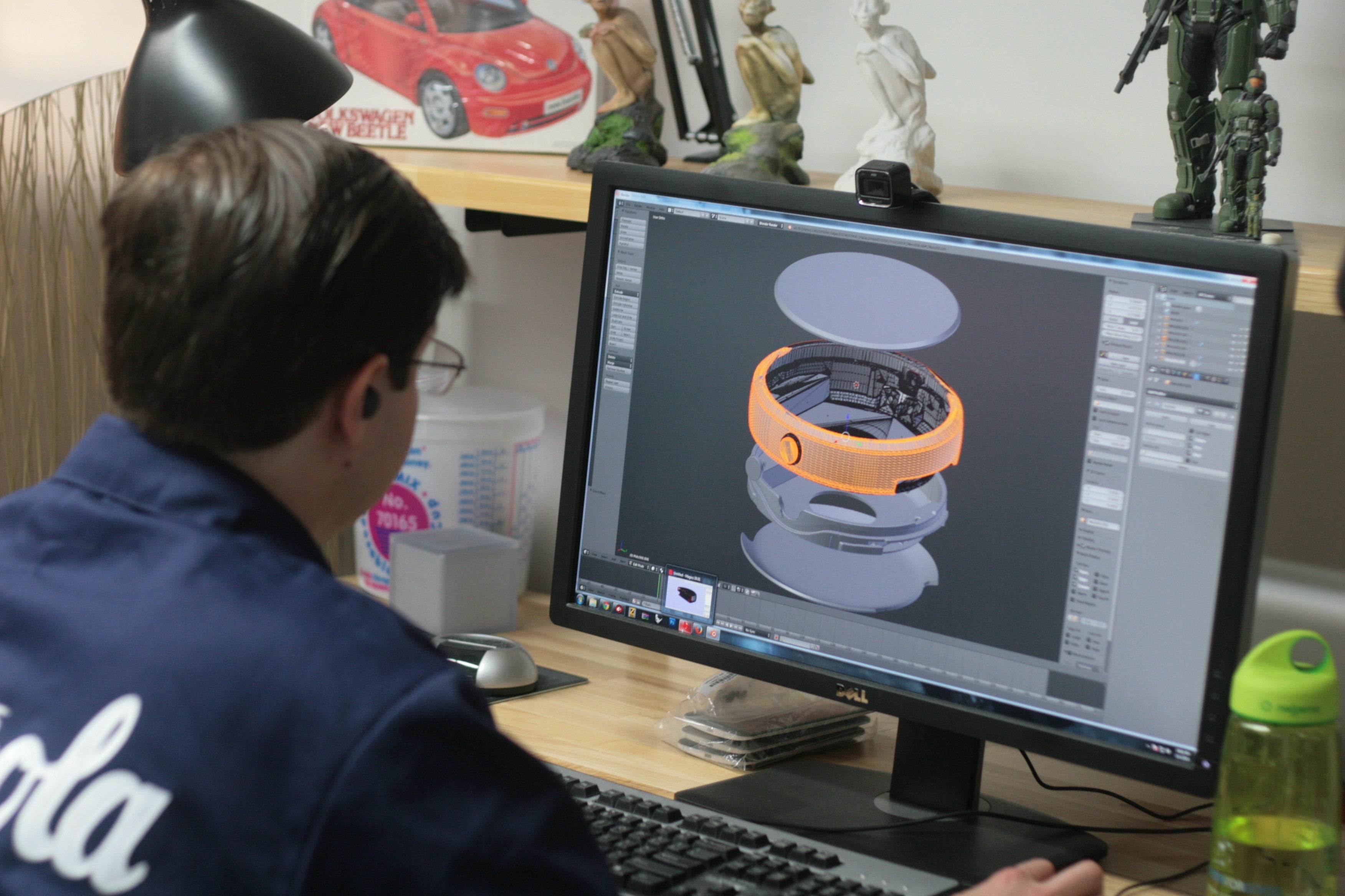

Image by
As we wered the lab, the employees pulled up 3D renders of the watch rotated them—a likely facade of “working” so we didn’t see what they’re actually tinkering with these days, but it served as an introduction for the next part of the building, which showed how they can quickly generate physical prototypes.
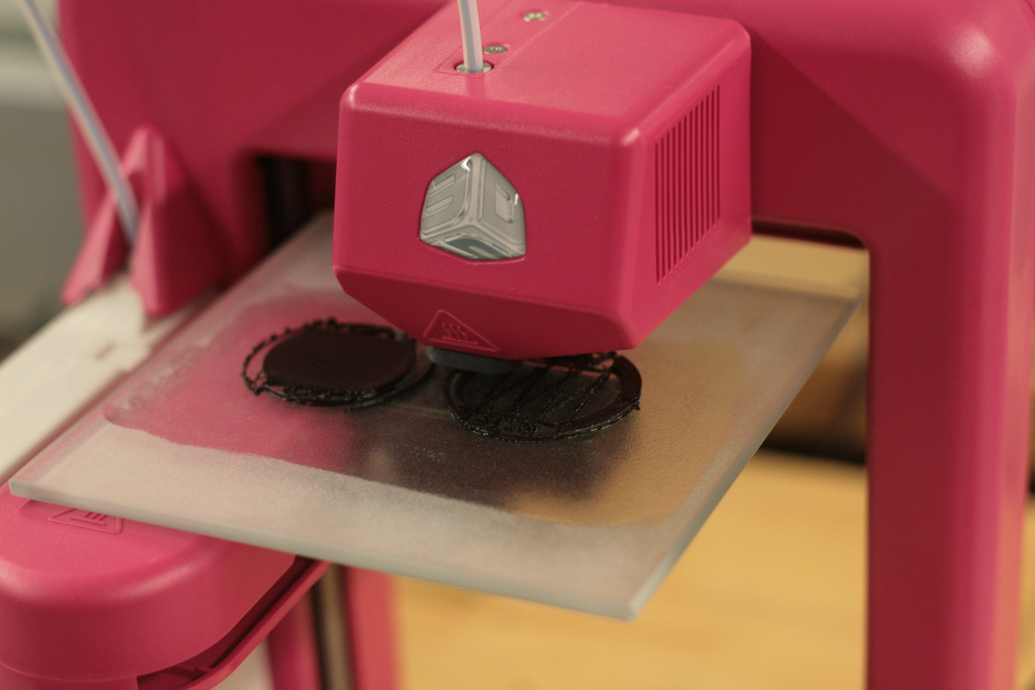

Image by
en the Moto 360 team needs a small component, they turn to this Cubify 3D printer, which can take a computer model generate a component right in front of them. This helps them make minute changes to the design without having to bring an external manufacturer ( lengthy waits) into the process.
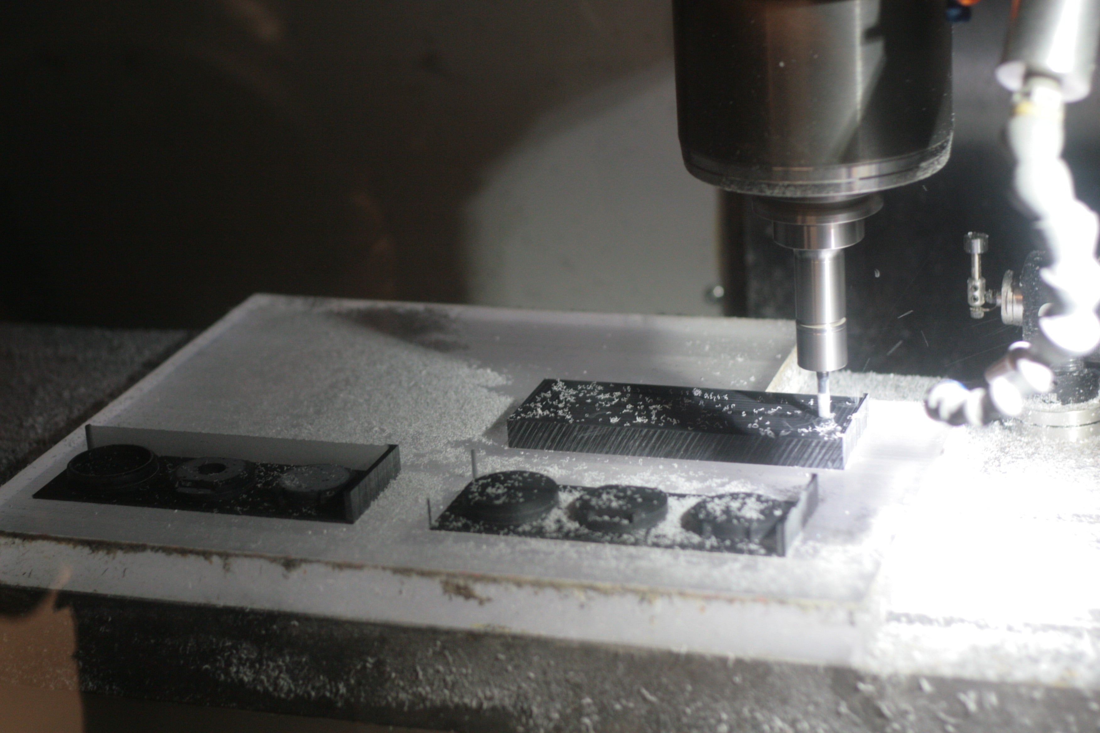

Image by
Creating a physical model of the full watch unit requires something much more powerful: this prototyper, which costs about $300,000 can chisel out a shape at a dramatically higher resolution consistency than the desktop 3D printer. Engineers can have the physical shape in h within about 12 hours.
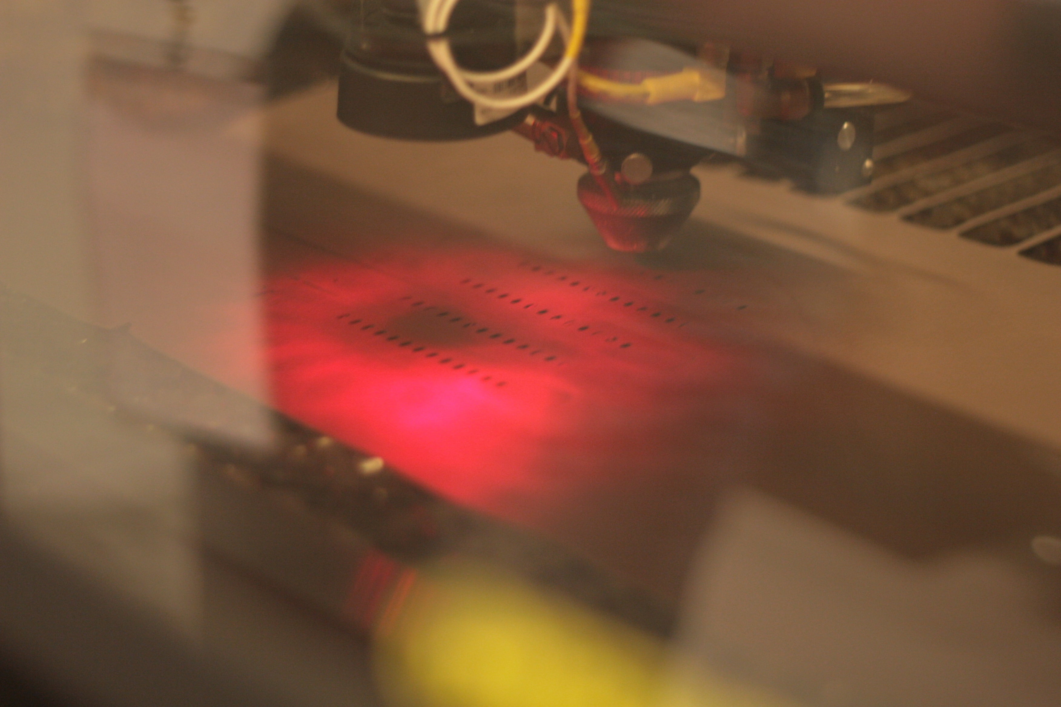

Image by
Of course, the strap is a key part of the watch build, when the team needs to experiment with a specific kind of strap design, they can have one laser-cut on site with this well-insulated machine. These aren’t the mass-produced straps you’ll wear, but they help get the watch closer to that finished state.
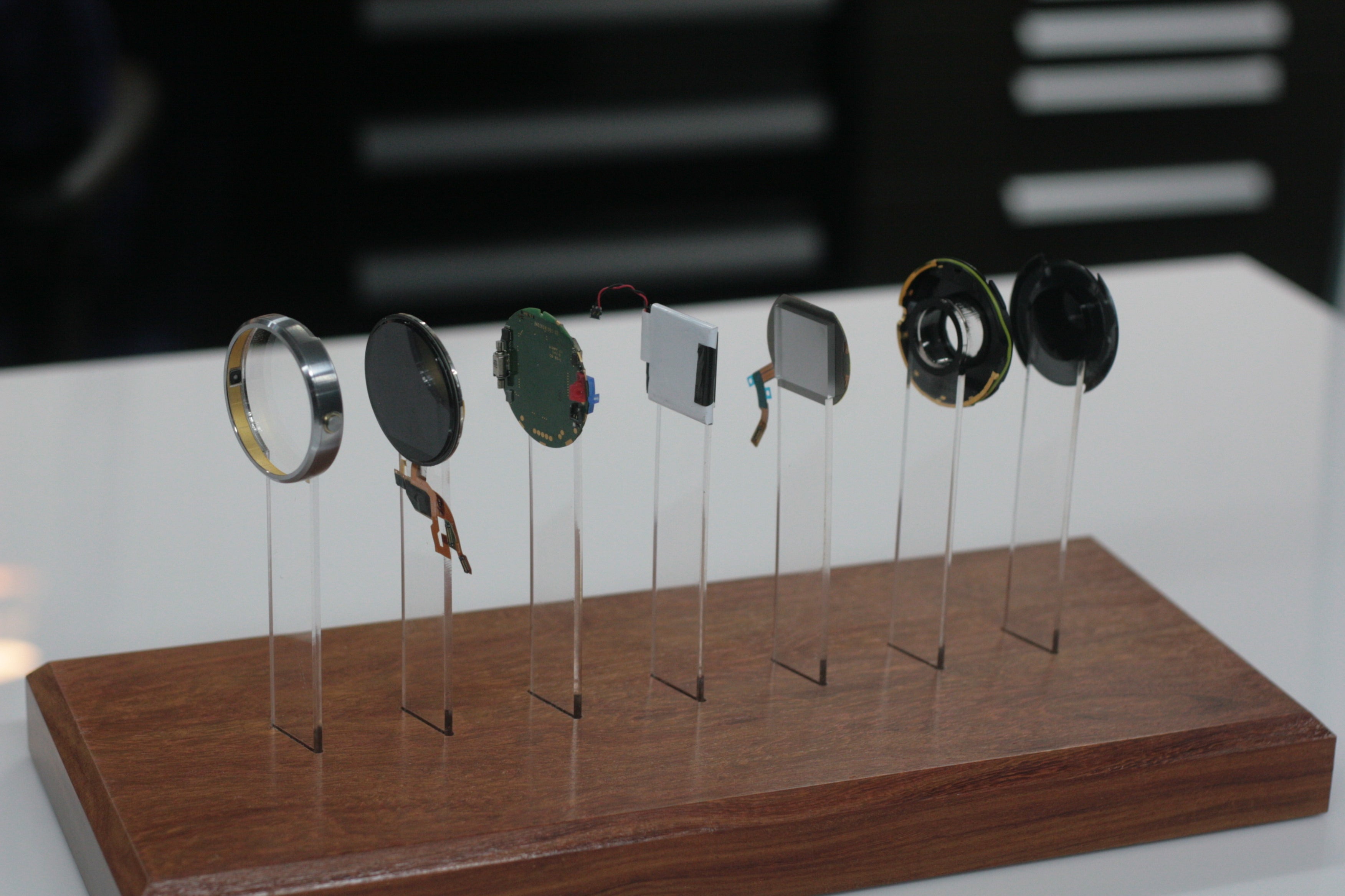

Image by
And finally, here’s an “exploded view” of the Moto 360’s final design, letting you see all of the individual components that go into making a refined smartwatch. That’s a lot to fit within such a small, sleek frame—you can start to underst why the blacked-out bar on the display was deemed necessary.

