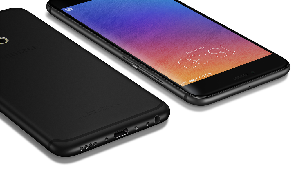
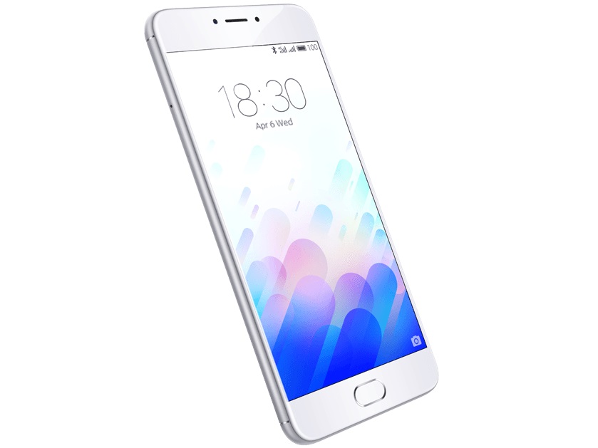
Meizu, today, unveiled its new flagship handset for the second half of 2013, the Meizu MX3. The MX3 is better than the MX2 in nearly every aspect, including the size. The handset is bigger than the MX2 (66.1mm x 110.2m), but is 21% thinner (9.1mm) as well. The design of the handset seems to be a heavily inspired from the Galaxy S4 and the iPhone, with the Home button in the centre of the device being strikingly similar to the latter. On the display front, the MX3 sports a 5.1-inch LCD manufactured by Sharp and JDI, with a whopping resolution of 1800*1080 that translates into 415 pixels-per-inch. The display panel also employs PSE screen refresh, as seen on the G2, which should help save battery life.
Surprisingly, the Meizu MX3 is powered by the Exynos 5 5410 Octa-core processor, which consists of four Cortex-A15 cores, and four Cortex-A7 cores. The processor was seen inside the international Galaxy S4 (I9500) and suffered from some serious issues, which greatly effected the performance and battery life of the device. It will be interesting to see whether Meizu has fixed these issues or not.
Other features of the Meizu MX3 includes a Sensor hub, 5GHz Wi-Fi network support with intelligent dual-band Wi-Fi support, dual-thermal design, Smart Wake, 2GB of RAM, NFC, a Wolfson DAC with DiracHD for some ground breaking audio performance. Another highlight in the MX3 spec sheet is the storage options, which includes a 128GB option, a first for a smartphone!
At the back of the Meizu MX3 is an 8MP third-generation BSI camera sensor from Sony, with an aperture of F/2.0. There is no OIS (Optical image stabilisation) here, but Meizu says the new camera sensor is remarkably better than the one found on its predecessor. A 2MP snapper in the front should be sufficient for all your video calling needs.
The MX3 runs a highly customized version of Android 4.2.2, which Meizu has dubbed as Flyme 3.0. Here is what Meizu says about Flyme 3.0 on the MX3 -:
Flyme 3.0 boldly used the flat style, with a new card layout and color elements, the interface is more fresh and simple. Subversive visual style, while adding a simple and natural transition animation effects.New Smartbar adjustment will be based on click behavior smart key position, the larger the screen you’ll see it’s advantage. Drop-down list, hover and system-level sliding menu, allowing the operator breakthrough mobile long and wide limits. Whether or top of the screen edge, far as the eye can reach.
Shockingly, the MX3 includes a tiny 2400mAh battery. The company says that the new battery has a 37% higher capacity than its predecessor, and is much more denser as well, which should give the MX3 9 hours of battery life on 3G, 10 hours on Wi-Fi browsing and up to 40 hours while playing music.
Sadly, the Meizu MX3 will only be available in China and neighboring regions sometime in second-half of September. The pricing of the device will start from CN¥2,499 (about US$410) for the 16GB model, with the 128GB variant coming in for CN¥3,999 (US$650).


