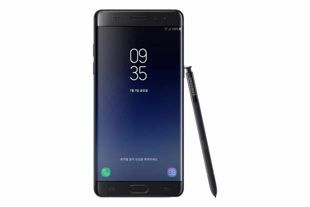
Samsung has been improving Touchwiz with every new flagship device launch, and the recently unveiled Galaxy Note 7 is no exception here. Leaked videos had already pointed to the device coming with a new cleaner looking version of Touchwiz — something that does not look like it was designed by a kid.
So, how exactly does the new Touchwiz on the Galaxy Note 7 look like? Check out the screenshots and see for yourself.
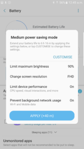
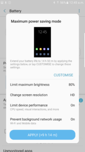
- New Power Saving modes
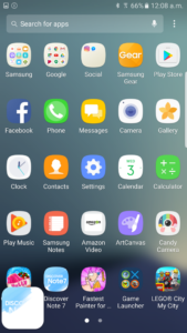
- App Drawer
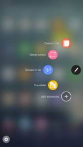
- S Pen features
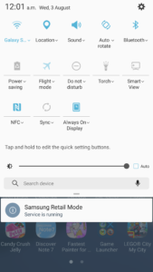
- Quick Settings
- S Pen features
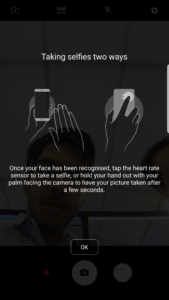
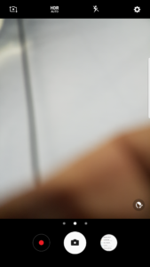
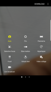
- Cleaner looking Camera app
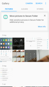
- Gallery app
- Same set of camera modes
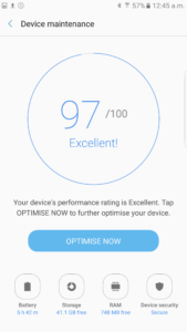
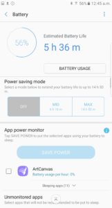
- Redesigned Battery menu
- Customisable Power Saving Modes
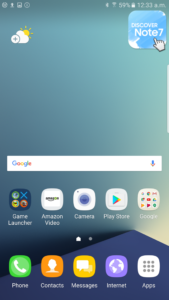
- Homescreen
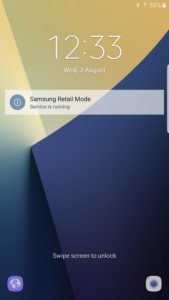
- Lock screen
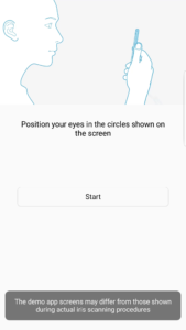
- Iris scanner setup
As evident from the screenshots, the new Touchwiz on the Galaxy Note 7 looks cleaner and usable than ever before. It is also surprising to see white being used as the predominant color throughout the UI even though the Note 7 features an AMOLED display.
In all likelihood, the Galaxy S7 and S7 edge should also get a taste of this new Touchwiz with their Android Nougat update. What do you think about this new Touchwiz on the Galaxy Note 7?
