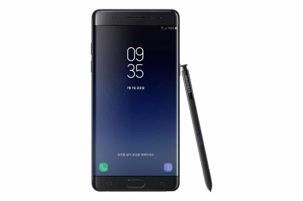
Last week, we got a look at the ‘Grace’ TouchWiz UX that will be making its debut on the Galaxy Note 7. The upcoming version of TouchWiz sports less cartoonish icons, with the overall system UI looking a lot more mature and polished.
YouTuber XEETECHCARE has done another video that shows Grace UX in action on his Galaxy Note 5 and has also compared it to the current version of TouchWiz found on the Galaxy S7. The video shows some of the new features that will be making their debut in the next version of TouchWiz, including a blue light filter, an improved notification bar, an Android N like Settings menu, and new icons. The Korean company has also taken this opportunity to consolidate many of its apps and services into one, including merging Action Memo and S Note into a simple Notes app.
Samsung has been working on optimising TouchWiz since it released the Galaxy S6 last year, and even with the Galaxy S7, the company gave its UI a pretty major overhaul. Now, with its upcoming Grace UX, the company seems to be fixing those minor annoyances and issues that have annoyed existing Galaxy users.
Samsung is currently testing its Grace UX through selected testers in South Korea who own a Galaxy Note 5. Once the Galaxy Note 7 launches though, it is likely that the company will eventually be releasing an update for the Galaxy S7 that also brings the same UI to it.


