![Samsung's New TouchWiz UI for Note 7 Leaks [Video] 1 image Samsung logo](https://www.androidbeat.com/wp-content/uploads/2014/06/image-Samsung-logo.jpg)
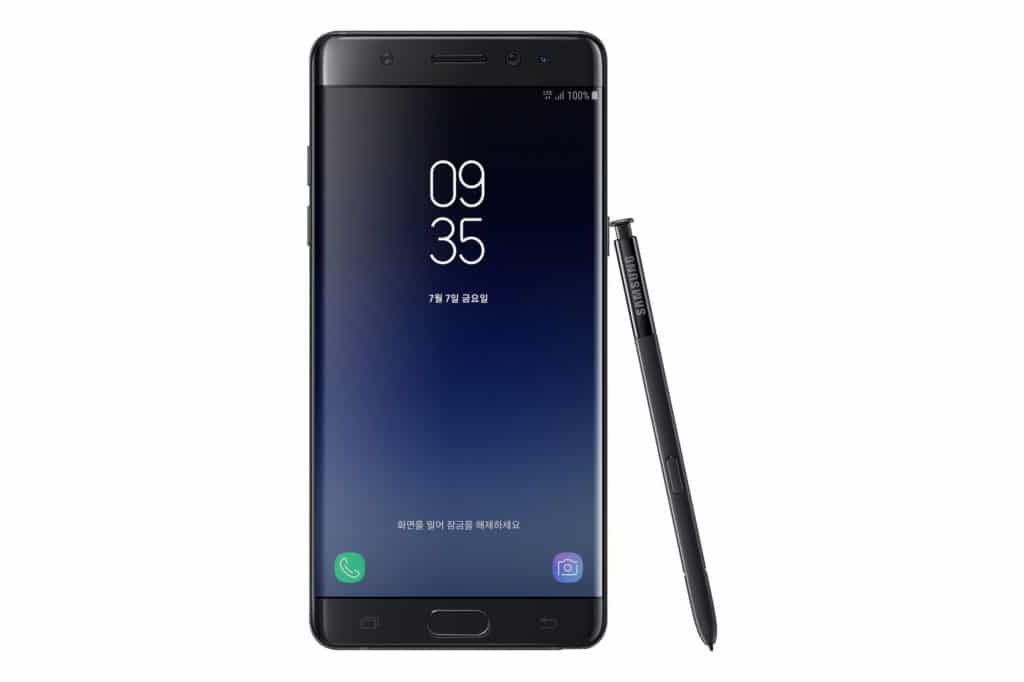
Samsung’s TouchWiz which has stirred up quite a few controversies is now in the limelight again, and this time its by an Italian blog. HDblog.it, the blog in question, has a video showing what they claim is the newest TouchWiz UI from Samsung that should debut on the Galaxy Note 7.
The newer version of the UI has more subdued colours and a cleaner look. The video shows us different personalisation and customisation options such as manipulating widgets, applying different themes and changing the wallpaper. Core app also seem to have changed, not only where the logo is concerned but within the app as well.
TouchWiz had started with a rocky start, with the public being critical of the cartoonish icons and stark display colours employed on the UI. Many were hoping for a lighter feel design, for them, the new TouchWiz represents the actualisation of their years of dedicated support to Samsung.
This new iteration of the UI is rumoured to have been potentially re-named Grace, which brings the possibility of a major overhaul of the current TouchWiz. For those with the Galaxy S7 and S7 edge, fret not, the updates will be pushed out to your devices, eventually.
[Via HDblog]


