Earlier this week, Google released the first developer preview of Android N, the next major version of Android. The company usually releases a new version of Android at its yearly Google I/O conference, but this time around to gather more feedback and help OEMs and app developers to better prepare for the update, the company unveiled the OS a few months earlier than usual.
Unlike Marshmallow, Android N comes with a number of new features, including some that have long been yearned by advanced Android users. Some of these features are also already found in many Android OEM skins like that from Samsung, LG and Huawei.
While Android N is still more than six months away from its public release, the developer preview gives us a good idea of all the new features that the OS will pack. Below, we have a look at every such major or minor new feature introduced by Google in Android N.
#1. Split-screen multitasking
This is the probably the biggest new feature of Android N. Split-screen was among the most requested features from seasoned Android users, and Google is finally adding it to the OS. Google’s implementation is similar to how the multi-window feature works on Samsung’s TouchWiz: you put an app in split view mode by long pressing the recent apps button, which then also brings up the recents app switcher at the bottom of the screen to allow you to select the second app you want in split view.
By default, the split-screen mode gives both apps 50% of the usable screen area, but this can be changed to one’s liking by dragging the handle bar between the apps up or down. Even better, you can drag ‘n’ drop text from one app to another in this mode, which can come in incredibly handy in some situations.
You can read more about split-screen multitasking in Android N here.

#2. Recent Apps button
Don’t worry if you think that split-view is not going to be useful for you. Google has also greatly improved the functionality of the recent apps button in Android N that will make it a boon for heavy multi-taskers.
On Android N, pressing the recent apps button while in the recent apps UI will toggle between the applications that you have opened, instead of taking you back to the foreground app or your home screen. You can also switch between two apps that you are using by quickly double pressing the recent apps button. This feature is very common in custom ROMs, though they require a long press to toggle between your two most recent apps. Google’s implementation, in my opinion, is faster and will make switching between apps a breeze.
Additionally, the Recent Apps UI now features larger app cards that makes it easier to tap on them.

#3. Picture-in-picture
Taking a cue out of Apple’s book, Google has also introduced a new picture-in-picture mode in Android N. Think of this feature as how you can minimise a video to a corner in the YouTube app, while you can continue to browse within it.
Picture-in-picture brings that same functionality to a system level, though this feature is currently missing from the first developer preview of Android N. And if the way Google has worded things on the Android N developer preview page, it looks like this feature will only be making its way to Android TVs. However, with the final release of Android N still more than a few months away, there is always a possibility that Google has a change of heart and brings this feature to Android smartphones and tablets as well.

#4. Revamped notifications
With Android N, Google is giving one of the strongest parts of Android — the notification shade — a major revamp. Beside a new look, the notification panel in Android N comes with many new features like Direct Reply, bundled notifications and more.
First, let’s talk about the new look of the notification panel, which is now sleeker and more information packed than before. At first glance, this might seem a bit overwhelming, but I think this new design makes better use of the high resolution screen found in most Android devices today. However, I do think there should be a better differentiation between notifications from two different apps, which right now is just a thin line that does not really help much.

#5. Direct Reply
Direct Reply builds on the quick reply feature introduced by Google in Marshmallow. On an actionable notification and a supported app, you can tap on the reply button and respond to the message right from within the notification panel itself.


#6. Bundled notifications
Bundled notifications will allow developers to group multiple notifications from their app into one. Each notification can also be individually expanded to reveal more information. So, for example, a Gmail notification for multiple emails will occupy the space of only one notification, but when you expand it using a one finger gesture, it will expand to take more place and then display relevant information of each email that you have received.

#7. Quick Settings
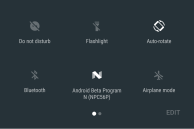
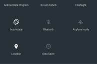
The top of the notification panel in Android N now also features quick toggles for Wi-Fi, Data Saver and other important system settings. Previously, accessing quick tiles required a second swipe on the notification panel, but that could be slightly cumbersome in certain cases. This change will make it easier for users to access the frequently used quick toggles, especially on Android device with a large screen.
The Quick Settings panel is still present in Android N, and it can be accessed just like before: using a two finger swipe down gesture from the home screen or by swiping down once with the notification panel open. The Quick Settings panel now opens with a slick new animation, and quick tiles are now spread across multiple pages. The Wi-Fi and Bluetooth tiles are no longer given special attention, with each column now having 3 tiles each.
The option to customise the tiles being displayed in Quick Settings has now graduated to a full fledged feature in Android N. You can not only add new tiles, but also rearrange the existing tiles in the order you like.
- Tiles in Quick Settings are now spread across multiple pages
- It is also possible to edit the tiles being displayed in Quick Settings
#8. Quick Settings Tile API
Building on the improved Quick Settings, Google has also added a Quick Settings Tile API in Android N that makes it possible for app developers to add their own custom tile to Quick Settings.
Even better, apps can now also add their own custom tiles to Quick Settings in Android N.
#9. Redesigned Settings menu
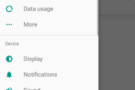
Google has given the Settings menu a major visual overhaul in Android N. Just like with the notification panel, the redesigned Settings menu now offers higher information density to take better advantage of the higher resolution displays of today’s Android devices.
The new Settings menu in Android N features a navigation drawer that can be accessed by swiping from the left edge of the screen. Google uses the same UI/UX in most of its apps and it is a part of the Material Design guidelines, so this change should not really bother seasoned Android users much. There is also a new suggestions panel at the top of the Settings menu that recommends some system settings you should play around with.
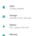
Scrolling down the Settings menu, you will notice that the status of key system settings are now displayed right below their listing. So, for example, the Wi-Fi listing contains the name of the Wi-Fi network your device is currently connected to right below it, your data usage is shown under the Data usage listing, etc. This way, you can have a quick glance through the Settings menu to know some key aspects of your device.
- The redesigned Settings menu in Android 7.0 Nougat
- The Settings menu has received a huge makeover in Android 7.0, and now comes with a navigation drawer.
- Having any major feature like data saver or power saver mode enabled will lead to a notification showing up in the Settings menu in Android 7.0
#10. Data Saver
Google offers a built-in data saver mode in Chrome for Android, but with Android N, the company is integrating this feature to the OS itself. The new Data Saver mode in Android N helps in reducing mobile data usage by restricting background app data usage. This feature was already present in previous versions of Android. The new addition here is that Android can now also restrict data usage for apps while they are in foreground.
Google has not exactly mentioned how the data saver mode works while an app is in the foreground though, but the onus is on app developers to make sure that their apps use less data while in foreground when this mode is enabled.
You can also whitelist apps to have unrestricted access to the Internet when the Data Saver mode is enabled.
#11. Improved Doze mode
Google released a number of new power saving features in Marshmallow, with Doze mode being one of them. As its name suggests, this power saving feature puts your Android device to sleep while it is lying dormant on a table. To improve battery life, Doze ensures that wakelocks from apps are kept to a minimum, and it also regulates CPU and network data activity to achieve this.
The biggest issue with Doze in Marshmallow was that it only kicked in once your device was lying on a table for sometime. With Android N, Google is making doze smarter, and it will now trigger itself even your device is moving. How exactly has Google achieved this is not yet known, but whatever the case might be, if you loved Doze on Marshmallow, it is going to get even better in Android N.

#12. Automatic Night mode
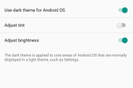
Google had included a hidden Night mode in the developer preview of Marshmallow, but the feature never graduated to ‘stable’ with the final release of the OS. In Android N, Night mode continues to be tucked under the hidden System UI tuner menu, but it has now received a few enhancements.
With the relevant options enabled, the OS can now automatically enable night mode for you depending on your location and time of the day. Even better, it is now possible to adjust the tint and brightness of the display when night mode is enabled.
- Do Not Disturb continues to be hidden inside the System UI tuner menu
- Do Not Disturb mode can now be set to automatically toggle itself in Android N
#13. Manual display calibration
Google included an sRGB mode option on the Nexus 6P in Android 6.0 Marshmallow, activating which made the display on the handset more accurate. With Android N, the company is now straight up offering an option to tweak the custom white balance of the display to once’s liking. This feature is hidden under System UI tuner -> Color & Appearance -> Calibrate Display.
#14. Hide (more) icons from status bar
The ability to hide icons from status bar was also present in Marshmallow, though hidden under the System UI tuner menu. The option is still hidden in Android N, but now it offers even more options for icons to hide.
#15. Powerful File explorer
In Marshmallow, Google introduced a rudimentary new file explorer that did not even allow you to copy or rename files. With Android N, Google is fixing these flaws and making the built-in file explorer in Android more powerful. You can now rename files, move them around, and even have multiple explorer tabs opened.
While still not an ES Explorer or Solid File Explorer replacement, the Explorer app in Android N is now good enough for basic use.
#16. Call blocking
Google updated its Contacts and Phone app to add call blocking capabilities to it. However, the feature was half-baked, and did not work as expected. With Android N, Google is integrating call blocking feature right into the OS itself. Not only will blocking a number block texts from it as well, all your blocked numbers are now stored in your Google account, which means they will persist across resets and even carry over to your new Android device. Third-party apps can also access blocked numbers to ensure that you don’t get messages in other apps from a blocked number.
#17. DPI scaling
With Android N, Google is adding DPI scaling as a default option in the OS. Previously, DPI scaling usually required entering some commands in adb, though that led to some usability issues. In Android N though, Google has made changes to the framework of the OS that allows users to adjust the DPI of the screen according to their liking in real time.
This is a great inclusion in my opinion, and will allow users to adjust the DPI of their device according to their taste.

#18. No more optimising apps
If you have ever installed an OTA update on your Android device, you must have gone through the ‘Optimising apps’ screen once your Android device boots up, which depending on the number of apps you have installed, can sometimes take longer than installing the OTA update itself.
Android N comes with a quick path to app installations, which leads to painful task of ‘optimising apps’ finishing in almost a few seconds. Additionally, the JIT compiler in ART now allows for much faster app installations.
Here’s how Google explains this feature:
One of the most tangible benefits of ART’s JIT compiler is the speed of app installs and system updates. Even large apps that required several minutes to optimize and install in Android 6.0 can now install in just a matter of seconds. System updates are also faster, since there’s no more optimizing step.
#19. Improved Project Svelte
Google introduced Project Svelte with KitKat to optimise Android for low-end devices. With Android N, the company is further optimising Android to make it run smoother on low-end devices by reducing RAM usage. The company is doing this by removing three intent broadcasts, which could wake up multiple apps at once thereby affecting battery life and increasing memory usage.
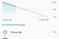
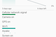
#20. Redesigned Battery menu
Along with the Settings menu, Google has also revamped the Battery menu screen in Android N. The redesigned menu does not offer any new feature, but it does come with a higher information density now.
- Redesigned battery menu in Android 7.0
- Redesigned battery menu in Android 7.0
#21. Emergency Info
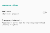
Android N comes with a new Emergency Info screen that displays your name, address, date of birth, blood type, known allergies, any medication, and more. In addition, you can now also set an emergency contact. Google will prompt you to enter the emergency info when you first go through the setup screen in Android N. Alternatively, you can enter this information again from Settings -> Users.
Once entered, the emergency information will be displayed on your lock screen, but only if you have some kind of lock screen security setup.
- Emergency Info in Android 7.0 Nougat
- Emergency Info in Android 7.0 Nougat
Keep in mind that Google has only released the first developer preview of Android N. With the final release of the OS still more than a few months away, it is possible that certain features can be removed or modified further. We’ll keep updating this post as we discover new features and improvements.
If you find anything new that hasn’t been mentioned here then please send us an email to [email protected].
