The ability to tweak manipulate the way your smartphone behaves is probably one of the reasons you use Android.
’s operating system has plenty of flexibility power features in its own right. But if you are hankering for more, you’ll be pleased at what some developers have engineered for you.
This short collection of apps give you more control customization options over things you do everyday, like saving a link, multitasking, or launching a new app. Every smartphone user’s palette is different, but odds area at least one of these apps will give you that “How did I live without this?” feeling.
zy Swipe is a customizer’s dream

Choose which apps you want to have at the ready with zy Swipe.
I really dig zy Swipe. In fact the name is a little misleading—it’s not really about being lazy, it makes you feel more empowered able to fire up apps more quickly.
zy Swipe creates a separate launcher that’s always at the ready just off your home screen. By swiping in from the corners (or the middle if you prefer) you’ll get a semi-circle of your most recently used apps, tools, quick links to functions like the flashlight.
It’s the first new take on tweaking how you access your apps that I’ve really liked after many attempts by launchers like Avitate or HTC’s new widget that try predict what apps you need based on time or location. It’s especially useful if you have a bigger phone like a Galaxy Note 4 or Nexus 6, as some of those app icons situated near the top of the screen may require you to really stretch your fingers.
You can also tweak it by adding in different themes, most of which have a stark color that hints of Material Design guidelines. My favorite was the bubble theme (it may remind you of the app layout on the Apple tch, which is not a bad thing).
If you really like zy Swipe check out the companion ckscreen, which gives you access to the toolbar without needing to unlock the phone.
zy Swipe is free, though the payoff is that one of the app slots is dedicated to a promoted app from the ay Store. It’s not terribly intrusive, but I’d be willing to pay a few dollars to eliminate it.
Flynx simplifies opening links

Flynx turns articles that you want to read into tiny bubbles.
Flynx is a pretty clever app for saving articles that you may want to read in just a few minutes after you’ve finished your social media session. It’s kind of like cket meshed with Facebook’s chat heads. en you enable the app it will open links in a tiny bubble, collecting them on the side of the screen until you want to power through reading them.
The app also reformats the text strips away the graphics advertisements to make it more reader-friendly. It’s great for social network surfing, when it’s easy to accumulate a ton of things you want to read. For longer pieces I still prefer to save them to cket, but Flynx keeps them in the foreground if you want to zip through some shorter articles.
It also has a cket-like vault for your stories, which you get to by going into the Flynx app.
Tapth is for quick sharing saving

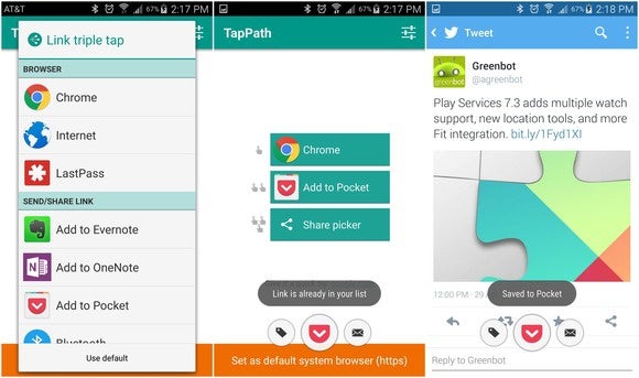
Tapth lets you customize what action to take when tapping on a link.
There’s a lot to read out there. This is another good add-on if you’re a heavy cket user or end up doing a lot of sharing or saving of links while on your Android phone or tablet.
ile Android has a great extendability for letting you open a link with the app of your choice, the process of selecting an app can get a little slow when the Share button fills up with so many options.
Tapth lets you choose what happens when you tap a link once, twice, or three times. Each action then corresponds to a specific application. For example, you can tap once for Chrome, twice to save to cket, or three times to pull up the Share cker (pictured).
You of course can choose your own service, so if you want to clip stuff to Evernote or elsewhere you just have to tweak that setting in the Tapth app. Once you memorize which combination does what, you’ll find it’s tremendously faster more convenient than the traditional route.
st App Switcher

st App Switcher keeps a persistent button on the screen that jumps right into the last app you used.
Android is already pretty good about multitasking, but like any hard-core Android user you’re probably always looking for that extra edge to speed things up.
st App Switcher is a great tool for this. It puts a floating button on your screen (notice the theme, here?) that takes you directly into the last app you were using. You get to skip right past that multitasking layout of cards.
It’s rather quick, until you get to a point you’ve used 20 different apps. I found it got a little sluggish then, but of course your experience may differ depending on your hardware or custom interface.
But don’t let that stop you. In many ways st App Switcher is a better implementation than Android’s back button, which can sometimes be inconsistent depending on which app you’re using.
You may only find one or a couple of these are to your liking. But that’s one of the niceties of Android, that you can extend this much control over the operating system to work the way you want.


