A Refined Familiar Design
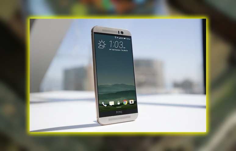
The One M9 looks almost exactly like the One M8 of last year; that’s not necessarily bad. HTC’s all-metal phone is a beauty and stands as one of the best-built. Most aesthetically pleasing phones on the market. The M9 is a couple millimeters shorter than the M8. Although still unusually tall for a 5-inch phone. Thanks to the black bar with the HTC logo that sits beneath the display. We’re told that this space is needed to house circuitry. Maybe that’s the price one has to pay for the pair of amplified stereo speakers. On the top and bottom of the phone. Other phone makers certainly don’t seem to need this extra space.
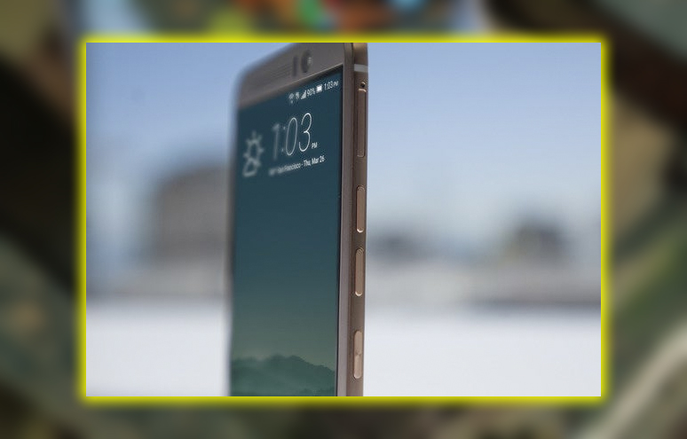
Look closely you’ll spot several minor refinements to HTC’s phone design. The power button has moved from its awkward perch on the upper edge to the right side. It takes a little getting used to, but this is a better placement overall. The back is still rounded but slightly less so; there’s a pleasant grippy ridge around the edges. While the M8 was prone to slipping out of your hand, when trying to hit that power button. The M9 feels easier to hold.
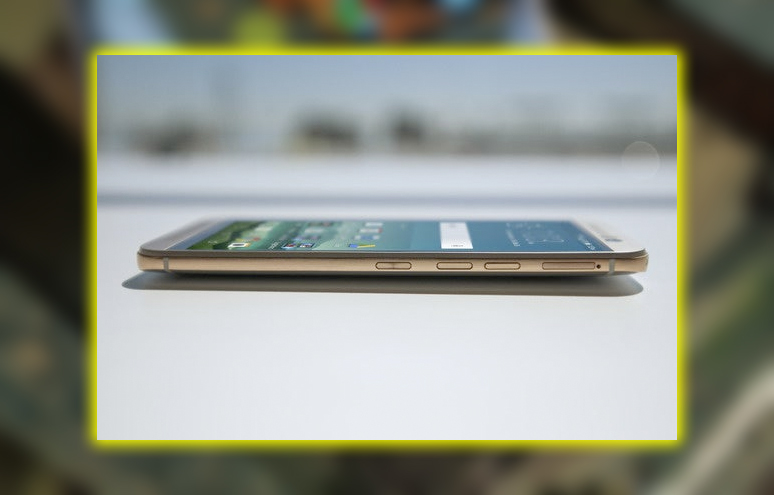
A new color option is also available: a silver finish with a gold band around the edges. Those in our office who like gold gadgets think it looks great. I prefer the darker gunmetal grey, which is still an option.
Beefy Hardware Specs that Don’t Deliver
The One M8 shipped with the Qualcomm Snapdragon 801 processor at the time, the highest-performance mobile C on the market. Using it felt fast and fluid, and it topped benchmark charts. The M9 takes the same approach, giving us the powerful Snapdragon 810. The RAM increases from 2GB to 3 GB. The 2600mAh battery of the M8 has been boosted to 2840 mAh. On paper, it’s a significant upgrade over the M8. So what’s the problem? The problem is that in practice, it’s not any faster than last year’s phone.
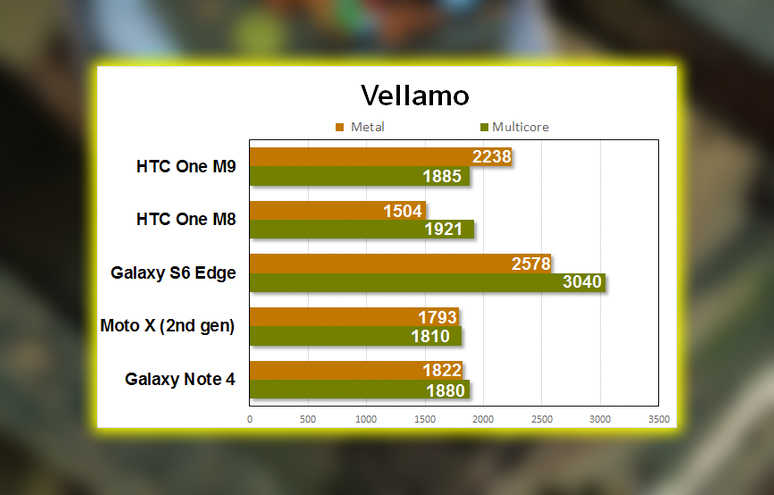
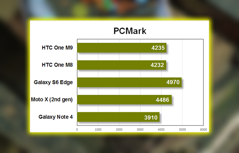
Jumping around the Sense 7 interface. Switching between open apps, and scrolling through Twitter or Facebook is smooth and responsive. Just like it was on the M8. Our benchmarks are all very similar to those on the M8, too. The new phone is sometimes a few percent faster, sometimes a few percent slower, but overall very similar. Only in 3D graphics tests did the new processor distinguish itself, not by an impressive margin. I have a hard time believing there’s some app that will run well on the M9. But not on the M8.
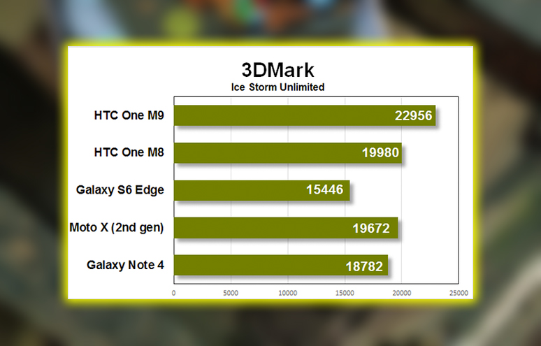
And the battery life is worse! Even though HTC is crammed in a battery with 9-percent higher capacity, it won’t last quite as long. With the display calibrated to 200 cd/m2, the battery test gave the M8 a score of 5 hours, 48 minutes. The M9 a score of 5 hours, 12 minutes, a 10 percent difference. The disparity in the Geekbench battery test was much more pronounced. In that test, the M8 lasted 4 hours and 41 minutes. The M9 a mere 2 hours and 33 minutes!
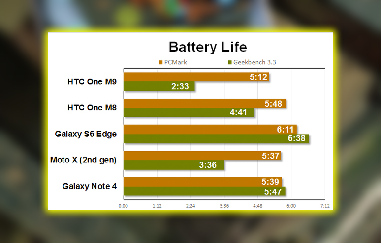
The phone still managed to get through an average day without recharge in my daily use. But if I played games on the bus in the morning, browsed social media throughout the day, and took photos. I needed to hit the charger in the evening. So that Geekbench number shouldn’t freak you out too much. The One M9 has what I would call all-day battery life with moderate use. But I’m left wondering; why isn’t it getting better?
The M9 supports Qualcomm’s Quick Charge 2.0, but HTC only gives you a regular 5V, 1.5A charger in the box. It took about 2.5 hours to charge up. It was not awful, but certainly not what I’d call quick. And who wants to buy a separate charger to take advantage of the fast charging capabilities? You may have read reports about the One M9s getting uncomfortably hot. That wasn’t my experience and is likely the fault of early unfinished software. Running benchmarks can really get cooking, but that’s true of many phones with metal exteriors. Under everyday use, it didn’t feel hotter than any other high-end phone.
Still the Best Speakers in the Business
One of our favorite features of HTC’s One M series is the loud BoomSound stereo speakers. That feature is still found on the M9, with a new partner in Dolby. They’re wonderfully loud, clear. Not quite as loud as those on the M8 at full volume, but with less distortion. Dolby’s virtual surround sound. Supposed to make a wide sound field with either headphones or the phone’s built-in speakers, but it didn’t impress me. Still, with either headphones or the phone’s own speakers, this is basically the best-sounding phone on the market. Motorola and Sony are making strides in phone audio, but there’s still no better-sounding phone than HTC’s flagship.
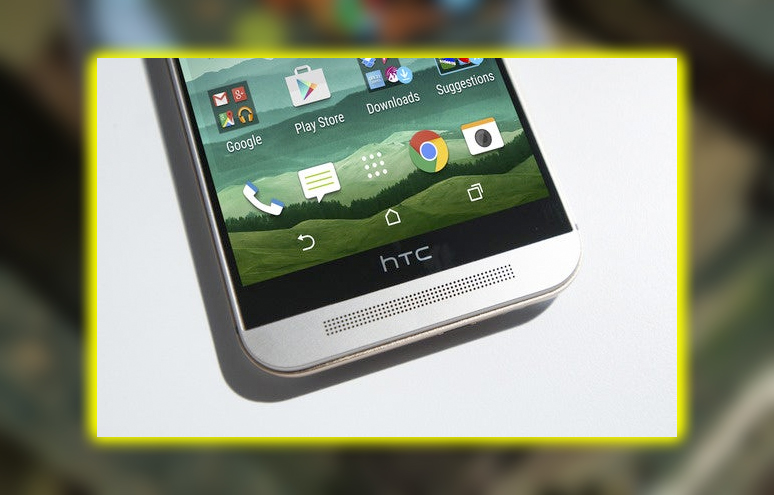
I wish I could say there’s no better-looking display, but that’s not true. While much of the rest of the phone market has moved to 2560×1440 displays. HTC is content to continue shipping its 1920×1080 LED. It’s a good display; the resolution is satisfactory for a screen of this size. It gets pretty bright, making it easy to read in the sunlight. Still, this is essentially the same display we saw last year. With the white point calibrated a little on the green side. It’s not the highest resolution screen. Nor the one with the broadest color gamut, best viewing angles, or most accurate color calibration. It’s good, but that’s all. Just good. Flagship phones aren’t supposed to be just good, right?
The Camera with a 20 Mediocre Megapixels
The back of the One M9 is adorned with a single 20-megapixel camera. It seems like an over-compensation for the love-it-or-hate-it camera on the One M8. Which married a paltry 4-megapixel Ultraxel camera with a gimmicky Duo camera. It’s as if HTC said, okay, people don’t dig our science experiment and say 4 megapixels isn’t enough. Let’s put the highest resolution sensor in this thing we can find.
But more than megapixels are needed to make great photos. A good smartphone camera experience consistently takes excellent pictures in all situations, with as little waiting around as possible. The camera app should launch instantly. The photo should take the very instant you tap the shutter button; the result should look great. Sometimes the M9 camera delivers, and sometimes it does not.
First, the good news. The camera interface is excellent. It’s simple and easy to understand and puts the most common functions at your fingertips. You can tap the display to refocus, adjust exposure, or tap and hold to lock exposure and focus. There are plenty of options for enthusiasts to tweak and tune tucked away in the menus. The live view camera interface doesn’t update as smoothly as it should; it’s choppy sometimes, but it’s not a dealbreaker.
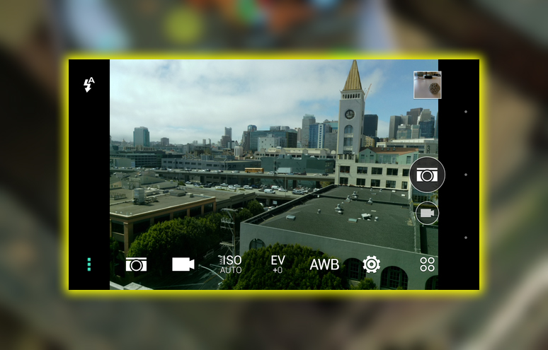
And sometimes, in well-lit scenes, you get really great photos. They’re sharp, with good color and tonal range. And, of course, they’re 20 megapixels big, so there’s plenty of room to crop down. Other times, the shots are ruined by a host of minor faults. In bright scenes, hot spot areas, like reflections on metal bumpers or glass, can throw off severe lens flare.
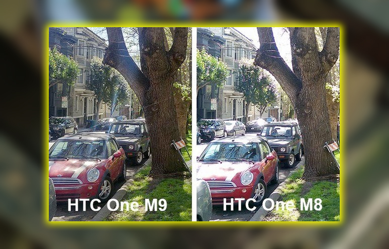
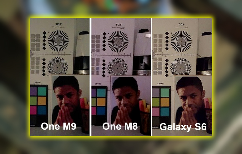
Low-light photos look worse than with the One M8; those Ultra pixels were suitable for something. The white balance is good, but they’re significantly grainier. And they don’t compare favorably with that other flagship phone shipping simultaneously, the Galaxy S6.
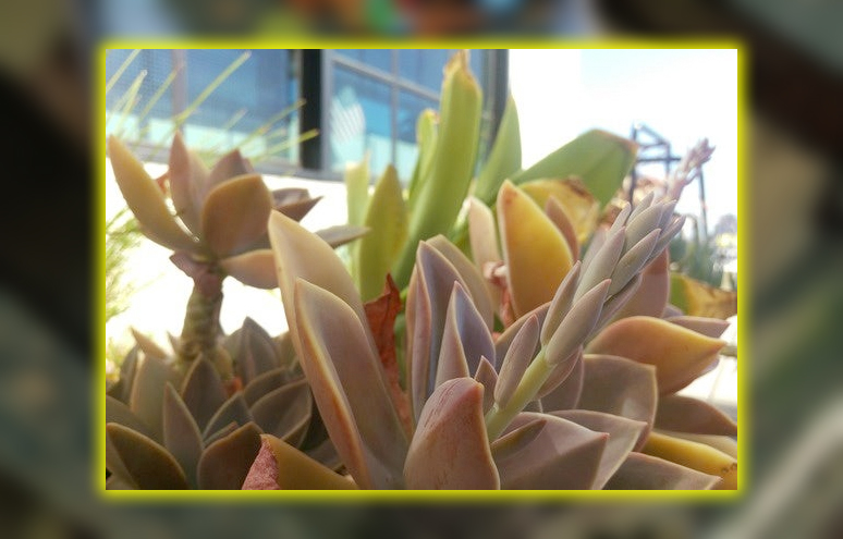
But sometimes you just get a really nice, beautiful, 20 megapixel photo.
The camera now takes video up to 4K slow motion video at 720p with up to 120 frames per second. But neither is worth writing home about. Without optical image stabilization. The extra resolution of a 4K video feels like a waste. The phone doesn’t smooth out all the little wiggles and jitters of your unsteady hands. The slo-mo video is grainy and noisy unless you’re in a really well-lit environment.
Smartphone cameras are a big deal for all users, and you will always have them with you. A high-end flagship phone can have a few new gimmicky features. Still, it does need to take photos and videos that look great. In a wide variety of conditions, with minimal effort. The One M9 camera would have been considered impressive a couple of years ago. Still, in 2015, it doesn’t compare with other flagship phones.
Sense 7, More Like Sense 6 with Themes
A year ago, one of our biggest complaints about Android phones. Was the heavy-handed skinning all the significant manufacturers applied to the Android interface. Phones were bloated with lots of preinstalled software, and interfaces. Had so many bells and whistles that they made the phone feel sluggish. HTC was lauded for its Sense 6 interface, which was fast, simple, and straightforward. Android launched Android Lollipop in the fall of 2014. Bringing with it a whole new design and aesthetic, a set of principles, and guidelines. Developers, could use to make apps that look like a cohesive, sensible part of the Android ecosystem.
So when I say Sense 7 looks and feels almost identical to Sense 6. That’s a huge missed opportunity for HTC to deliver icons, fonts, menus, and animations, behaviors that mesh with Android’s Material Design principles. While the M9 ships with Android 5.0.2. The Sense 7 interface could be a more natural extension of the Lollipop design. This interface feels like Sense 6.5.
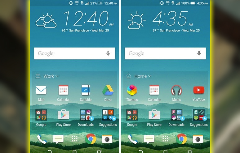
There are three significant new features in the Sense 7 interface, two of which I disabled after a few days. The first is restaurant suggestions in Blinkfeed. Which uses Foursquare and Yelp reviews to suggest nearby places to eat around mealtimes. It can even put these on the lock screen. I’m not adventurous, but I didn’t want to find a new restaurant so frequently. I needed my phone to push suggestions. When I get the itch, I’m okay with opening Foursquare or Yelp apps.
The second is a 4 x 2 home screen widget that shows a dynamically changing set of apps. Depending on whether you’re at home, at work, or out on the go. This is based on your usage, you probably don’t use Swarm at home or work. But you might launch it often when you’re out. Two icons are smart folders. One shows your most recently downloaded apps handy. And the other makes many stupid suggestions for downloading new apps; HTC must be getting paid for this lame idea. Several Android launchers have tried this dynamic app list idea but have yet to catch on. People get comfortable with where they put their app icons and don’t have any problem navigating to them. At least it’s just a widget and easily removed.
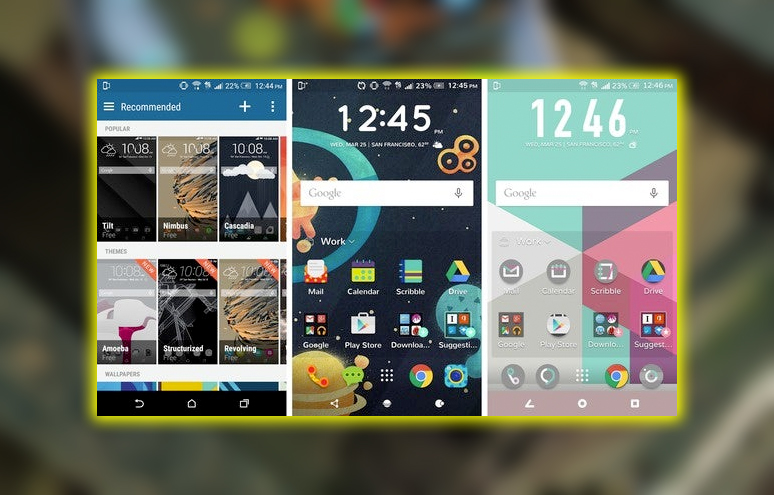
The valuable addition to Sense 7 is HTCs excellent extensive theming support. I got lost in the new Themes app for at least a few hours. The theme store has a lot of really nice themes, all of them free. Presumably if prices are listed, there will be paid themes at some point. You can download individual wallpapers, sound packs, fonts, and icons. Use the theme editor to mix and match your heart’s content. Take a photo, and you can build a theme from it. Using cropped parts of the picture for your wallpaper and various interface elements. Even pulling interface colors from the dominant colors in the image.
Themes have been a feature of many Android launchers and skins, and HTC nailed it with their implementation. It’s fast and easy for newbies but flexible enough to please a compulsive tinkerer. While Sense 7s themes are a great addition. HTC needed to go further to make Sense feel like it’s part of Android’s new design principles. It still feels like a great KitKat skin instead of a good Lollipop skin.
HTC takes a Small Step Forward where it Needs a Leap
It feels like HTC is treading water with the One M9. It tweaks, tunes, and makes minor improvements in a few areas but delivers something new or dramatically better. The design is nearly identical, with a couple of nice refinements. The speakers are the same, not that I’m complaining. There’s a new processor, but overall performance is about the same; battery life is slightly worse.
Where are the new technologies? Here’s the fingerprint sensor? The wireless charging? The energy-efficient AMOLED display? The retina-scanning? I’m saying only some new flagship phones need to be loaded with gimmicks. Like see, and heart rate sensors, but there’s no useful new technology on the One M9. The One M9 is a good phone. But it’s only that, good from both a hardware and software last point of view. This feels like one of the best phones of 2014, not a contender for the best phone of 2015. You would be good off buying one, but you wouldn’t be better off buying last year’s model. That’s painfully faint praise for a flagship phone.


