Image by
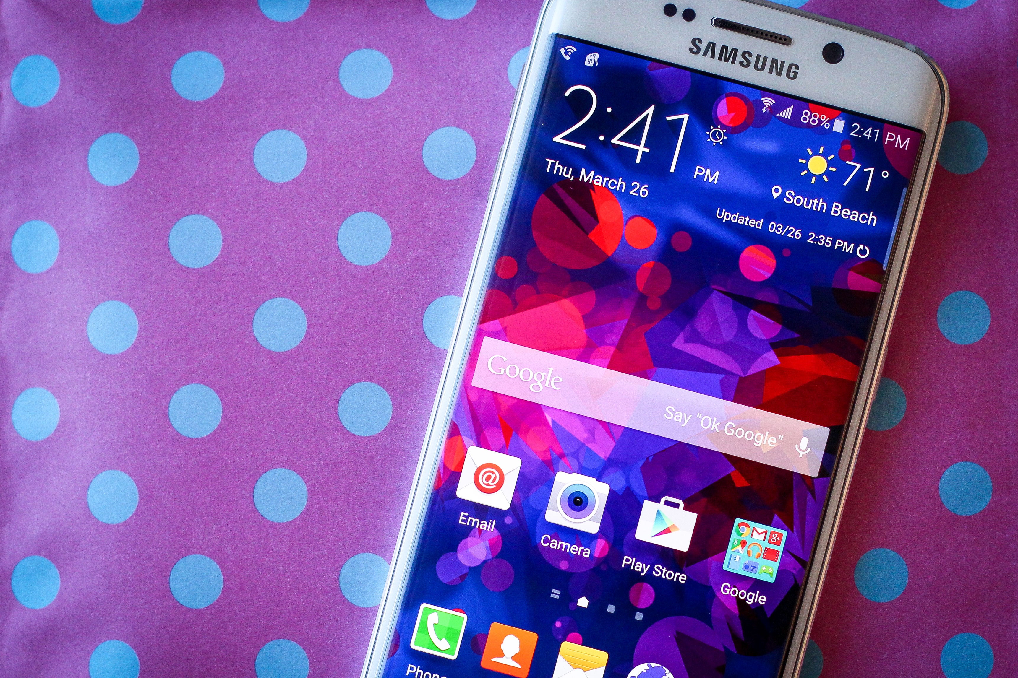
th the Galaxy S6, Samsung promised that it was scaling down the blue-hued atrocities on its Touchz Android overlay. It kept its promise, more or less.
For what it’s worth, I actually really like the new version of Touchz. It’s something I’d consider using every day, I’ve already found wallpapers widgets to make it all look nice. The only bummer is that it doesn’t have Now embedded on its far-left Home screen, like the uncher (you can turn off Flipboard on the left screen, but you can’t replace it). Instead, you get to Now by long-pressing the home button.
Samsung adding in a new Themes feature this time around, though I won’t touch upon it in this writeup, I will be using one over the weekend to see what life with a dedicated Samsung theme is really like.
For now, here are my initial impressions of Samsung’s newly revamped user interface. It’s friendly, easy to use, still blue, but it’s so much better than it’s ever been. The fact that it runs Android llipop certainly helps, too.

I did not expect to like Touchz as much as I do on the Galaxy S6. ed, it’s still sporting the same blue-hue that Samsung’s put on its Android phones since day one, but with the right wallpaper an appropriately colored keyboard, the interface really isn’t so bad.

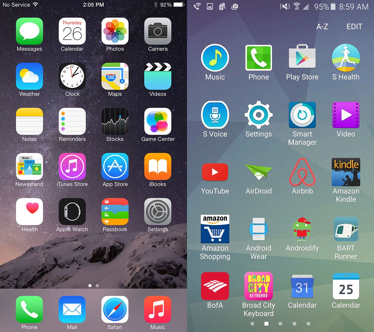
In fact— forgive me, diehard Android fans—but Touchz (right, above) now looks a little iOS-y. The phone itself already resembles an ione (left, above) on the outside, but I could see novice techies attracted to this particular device precisely because it offers an Apple-like experience without actually being an ione. I even had a friend exclaim she was excited to try out the Galaxy S6 because she wants an Apple experience without actually buying into the ecosystem.

Samsung greatly pared down the blue, though it’s still prevalent in the Notifications shade, seen here. The Quick Settings are still busy lengthy, though I’m glad Samsung kept the Brightness slider where it did.
If you want, you can use the S Finder to browse files folders on your device, like OS X’s Spotlight, there’s also a shortcut for Quick connect. Thus far, I haven’t found the option to remove either of these features from the drop-down shade. rhaps there will come a time when I’ll feel compelled to use them.

The application drawer has also greatly improved in the last year. Samsung stuck with Android llipop’s way of doing things rather than reverting to the usual busy drawer interface it’s implemented in the past (seen on the left). Applications can be sorted alphabetically or by order of which apps you use the most, though there are no longer an overwhelming amount of customization options.
Curiously, some apps that live on the Home screen don’t appear in the Application drawer. I haven’t figured out why just yet.

Samsung finally figured out a proper layout for its Settings interface it’s so much more sophisticated than before. On the left you’ll see the Settings menu for the Galaxy S5, which evolved into what you see on the right on the Galaxy S6.
From here, you can choose to customize a batch of Quick settings at the top of the Settings panel based on your needs. Then, as you scroll down, you’ll see the Settings all laid out the essentialy the same as stock llipop. If you really can’t find what you need, you can simply use the search function.

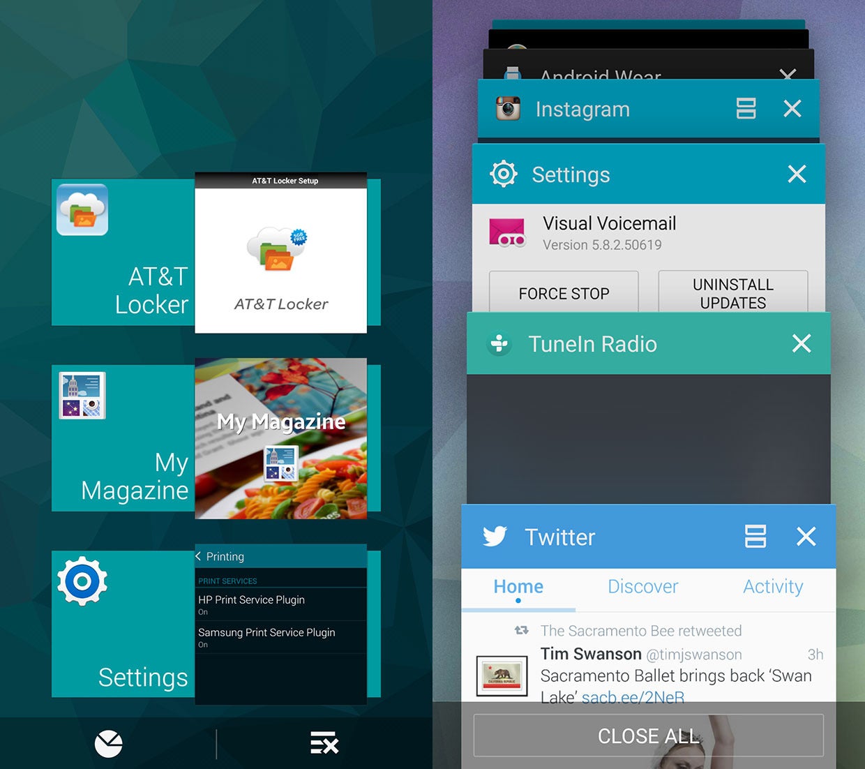
I also appreciate that Samsung stuck to some of Android llipop’s conventions, like the Cards motif for its multitasking menu, seen here on the right. On the left is the Galaxy S5’s multitasking menu.
Samsung still added a few of its own bits to it. You can tap an icon to engage Multi-window, for instance, or tap Close l at the bottom to dismiss all apps at once—that’s something stock llipop doesn’t currently do.

The Galaxy S5 came preloaded with an application called My Magazine, which you could use by scrolling all the way to the left. It was basicaly a re-bred Flipboard. That’s since been replaced with an authentic Flipboard reader, which you can sort of customize based on keywords.

The Application Manager in the Settings menu also makes it easier to pick choose your defaults, rather than making you find every app on your list of installed apps, selecting it, then choosing whether you want it as your default. It’s much more accessible from this menu than on other versions of Android.

The Galaxy S6 comes with three folders of pre-loaded apps–four if you factor in what your carrier bundles in. This includes three Microsoft applications—OneDrive, OneNote, Skype—though you do get about 115GB of cloud storage with OneDrive, so that’s nice.
The phone also comes preloaded with Facebook Messenger the okout security suite, both of which are unremovable. I’ve never consistently used a security suite for Android, except for the few times I’ve written about them, I don’t plan to start now. It’s a bummer, because both apps take up 100MB of space together, the Galaxy S6 is no longer equipped with an expansion slot.
At least most of the apps it bundles are actually apps you’d use.

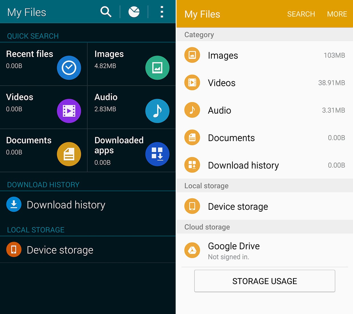
ile there may still be some bloatware, at least Samsung’s default applications have been effectively made-under. Apps like MyFiles the Gallery app appear to have been simplified, at least compared to past versions. The lighter palette color certainly helps, too, it’s obvious that Samsung pulled a lot of inspiration from Material Design.

The white background of the Touchz apps look better because of the pastel color combinations. eviously, Samsung used dark backgrounds a gritty color palette, as seen here on the left. Note the hard lines between buttons names, while the new interface (right) is open larger. The simplification of the user interface certainly looks nicer, too.

The Gallery app has also received a much-needed makeover. The photo thumbnails look nicer against the white backdrop, there is also location info for every set of photos. See how the unlabled icons at the top of the screen have been replaced by text? That’s prevalent throughout the Touchz interface, it makes it a lot easier to figure out.


