I’ve been using Android ar for just a few days now, but because ’s new smartwatch OS is so simple grokkable, I feel I’ve already drawn some reliable conclusions on its pros cons. For this slideshow, my hardware model is the $200 Samsung Gear ve, but both this wearable the $230 G tch (see my video here) basically do the same thing. Android ar is dedicated to pushing brief notification cards Now alerts to your wrist, while also enabling voice control for text messaging, searches, a host of other tricks.
lk with me as I show you important Android ar features, share what surprised me the most.
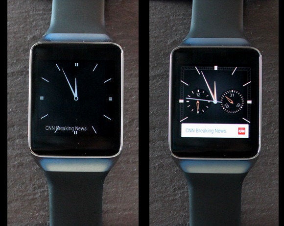
Image by Image:
says all Android ar hardware will run the same OS experience, so expect an always-on watch face option to matter which model you buy. en your watch is idle, it will display a black–white version of your chosen watch face, along with a text-only snippet of your most recent notification. You can exit this “dim” mode see the watch face in full-color glory by tapping the screen, or by raising your h, turning your wrist, looking at the watch.
Notice how this particular Samsung watch face (“Dark Analog”) turns into a more complex chronograph upon waking.
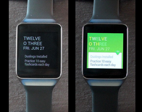
Image by Image:
In the lead up to Android ar’s public unveiling at I/O, I was under the impression that the OS featured a constantly changing home screen, with ar’s “context stream” pushing new notification cards through the display like a quick-changing carousel. ll, I was wrong. The home screen is essentially static. The context snippets do change dynamically—when you receive a new notification.
Notice how this watch face exposes more card information than the face in the last slide. Samsung offers 17 faces, they all seem to vary in the depth of their notifications. tch faces offer OEMs a small degree of customization (Samsung offer different face options), you can pick a new face with a long-press on your display.
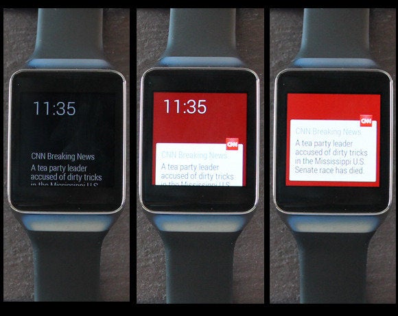
Image by Image:
These images illustrate the progression of information that Android ar surfaces. On the left we see a dimmed watch face—I have a CNN alert. In the middle, I’ve woken the watch for a more colorful presentation. On the right, I’ve swiped up on the screen to see the full notification.
Notice that it’s just a brief snippet. ’s intention is to limit the amount of text you see on a single card to make these screens as “glanceable” as possible. It’s a UI approach that’s mostly consistent throughout the OS, though if you run a voice search that spawns an information card, you might see a multi-line presentation with three screens worth of scrolling.
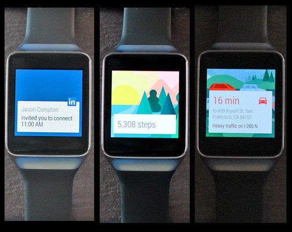
Image by Image:
Once you’ve chosen to look at a card, you can continue to swipe upward to see all the alerts Now notifications that have piled up. Besides the cards shown here, I’ve also seen alerts for baseball scores, travel times, Twitter activity, a friend’s birthday (via Facebook), the weather, an invitation to buy something from Fancy (an early ar app coded just for the smartwatch OS).
Once you kill a card by swiping it to the right, it’s gone forever. engineering director David Singleton told me that user studies indicate there’s no outsting reason to maintain a card history. He also said Android ar won’t expose Now cards for information that doesn’t fit the context of a wrist wearable—for example “at to watch” TV recommendations.
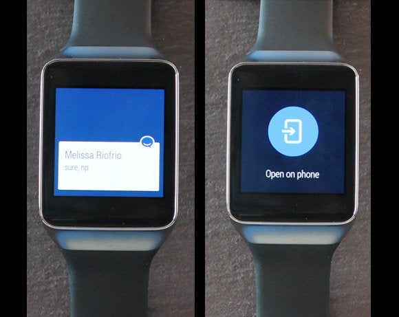
Image by Image:
Any notification you receive on your phone will push to your watch. But unless the originating app has a custom Android ar version too, your notification experience will be limited. Here we see an alert from the group-chat platform HipChat. I can see ’s message, but when I slide the card to the left for options, I’m prompted to use HipChat on my phone. Clearly, HipChat needs an Android ar app so I can chat with full voice control from my wrist.
The good news is that when you turn on your hset after mashing the “Open on phone” button, your phone will shoot you straight to the app or information you requested.
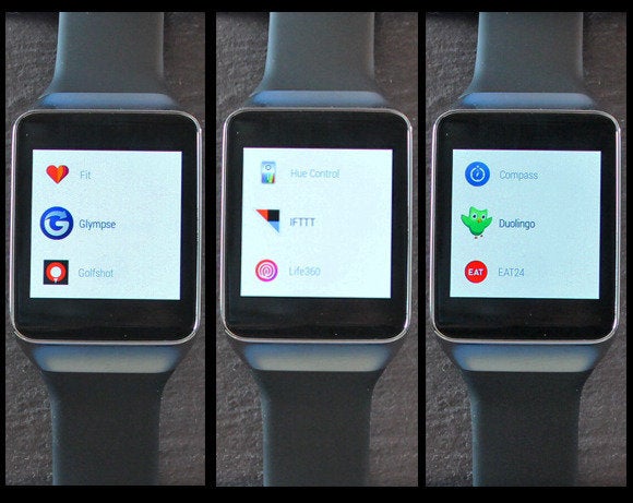
Image by Image:
The lack of a custom Twitter app is frustrating, as I would love to compose tweets @reply directly from my wrist. Still, lined up a number of partners to show off what bespoke Android ar apps can do. The custom apps you see here are nested in the Start menu, which is buried in a list of “OK ” comms. Sure, you could hit one of these icons to launch an app, but the preferred method is to summon an app with a voice comm (e.g., “OK … launch Eat24”).
The upshot: Android ar runs apps, but completely ditches the traditional “home screen with a grid of app icons” construct.
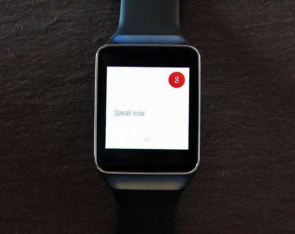
Image by Image:
This is probably the most important interface element in all of Android ar. Simply utter “OK ” into your watch to trigger a vast array of voice-controlled comms. For example, “Take a note” will let you dictate a quick memo that will be sent to your email address or Keep, if you have it installed. You can also “OK ” basic Internet search queries (e.g., “at day is bor Day”), , best of all, send reply to text messages with voice control.
st two early observations about where voice control breaks down: First, I found the feature unreliable in loud environments. Second, I felt like an OKhole when uttering the phrase in public.
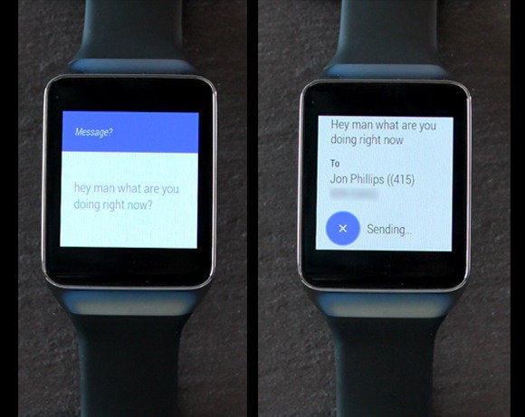
Image by Image:
Voice-controlled texting from your wrist can be a great convenience, I found it usually works quite well, at least in relatively quiet environments. First you utter “OK … send a text to Doe.” Assuming that person is in your Contacts list, you’ll be prompted to voice your message. From there, a new screen lets you check your message content, your recipient his or her phone number. And of course you can voice-reply to any message you receive in return. But caution! l your messages will send automatically unless you cancel them by mashing the blue X button.
The speech-recognition algorithms are surprisingly accurate. The most frustrating part is resolving duplicate or same-name entries in your phone’s Contacts list.
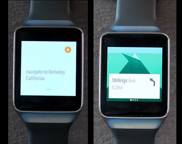
Image by Image:
Another voice comm triggers turn-by-turn navigation. For example, from a location in San Francisco, I can say “OK … navigate to Berkeley California,” Android ar will show me turn comms. ar’s navigation app also spawns the familiar Android navigation system on your phone, so you can also hear the turn-by-turn directions (it doesn’t look like any ar watches will have speakers).
It’s a convenient way to launch a navigation session when you’re driving. You can keep your h on the steering wheel, while your phone remains cradled. Unfortunately, you can’t yet default the system to walking directions, that’s a shame because Android ar shows such great potential for exploring cities by foot.
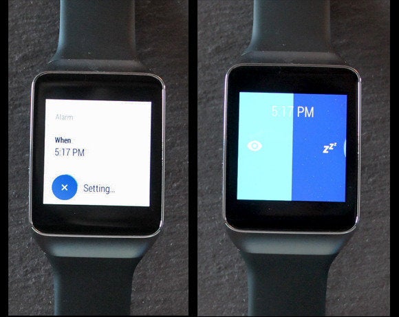
Image by Image:
Android ar is packed with a bunch of convenient voice-control actions. Directly from your watch, you can set an alarm for a specific time, when that time rolls around, the watch will buzz, you’ll see the interface on the right—from which you can either kill the alarm or hit snooze.
There are also voice comms for setting reminders, timers, a stopwatch function. The “Send a note” function is great, but I’d like an option to send notes to a note-taking app instead of to my own personal email address.
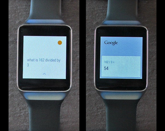
Image by Image:
Another great Android ar use case: Tapping into voice control for simple math problems. Need to split a bill three ways? You can, “OK … what is 162 divided by three.” You can also query, “at is 20 percent of 54,” but if you do so at a restaurant, everyone will know how much you tip.
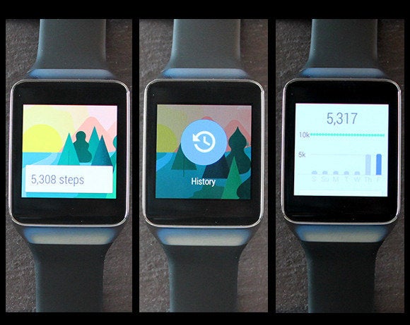
Image by Image:
Here’s a look at Android ar’s step counting app, which appears to look the same on both the Samsung watches, per ’s “no OEM skinning” initiative. l Android ar watches are packed with accelerometers, so step cards appear automatically in your context stream, as illustrated by the image on the left. You can also swipe to the left to see your step history: A timeline graph that shows your last seven days of activity.
Samsung’s step interface also has a feature that lets you check you heart rate with the Gear ve’s built-in spectroscopic sensor.
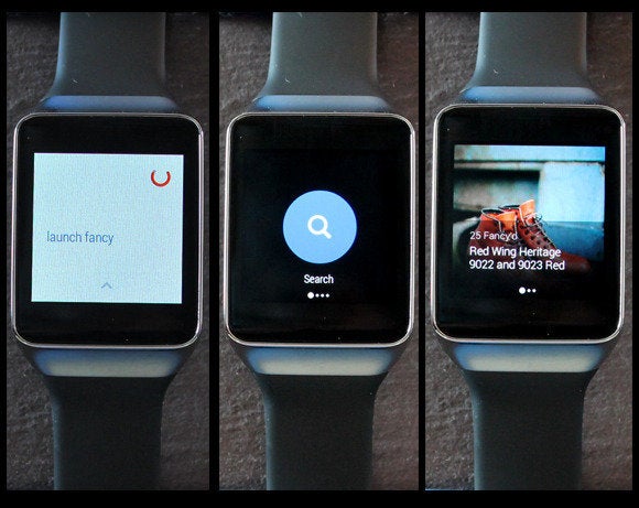
Image by Image:
I’m not a fan of the Fancy app—“a place to discover, collect buy amazing goods—because it assaulted me with notifications. But it’s a good illustration of the Android ar user interface experience. You launch it with an “OK … launch fancy.” From there, you see a very short list of simple, bold, pithy interface comms. There’s not much reading to do, per Android ar’s design brief. Next tap Search, voice your desired product: “Red ng boots.” Up comes an appealing beauty shot of the boots, along with a brief snippet of text.
This is pretty much the Android ar way: l the cards are big on visuals, light on text. This is ’s “glanceable” promise to users.
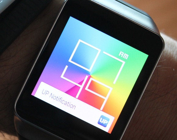
Image by
I’ve spent enough time with ar to know some likes dislikes, but this slideshow is still just a collection of early impressions. is still working out bugs, no official, third-party Android ar apps have hit ay yet.
That said, I’ve used Android ar long enough to know it’s pointing smartwatch interface design in the right direction. don’t need smartphone apps on 1.6-inch displays. need the simple, easily digested information snippets that ar provides. Add in Now’s contextual alerts (usually) accurate voice control, you have a platform that could make us forget the convoluted software design of earlier smartwatch efforts. To that extent, the Gear ve is Samsung’s best smartwatch yet.

