Image by
just released the Android developer preview for the Nexus 5 phone 7 tablet, we’re busy kicking the tires. Right away, a few things jumped out at us as seriously, drastically different.
There are some rough edges, but this is a big step forward for the look feel of stock Android, it makes us even less excited about the prospect of devices with custom interfaces. Here’s what we noticed in just the first couple hours.
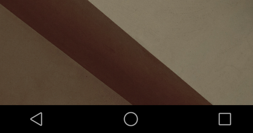
Instead of the familiar back, home, recents buttons we’ve seen on Android since Ice Cream Swhich, the latest version of the OS switches them out for simple shapes, instead.
Back is now a triangle, home a circle, recent apps a square. The change isn’t very dramatic, but the use of shapes gives off a more playful inviting feel to Android
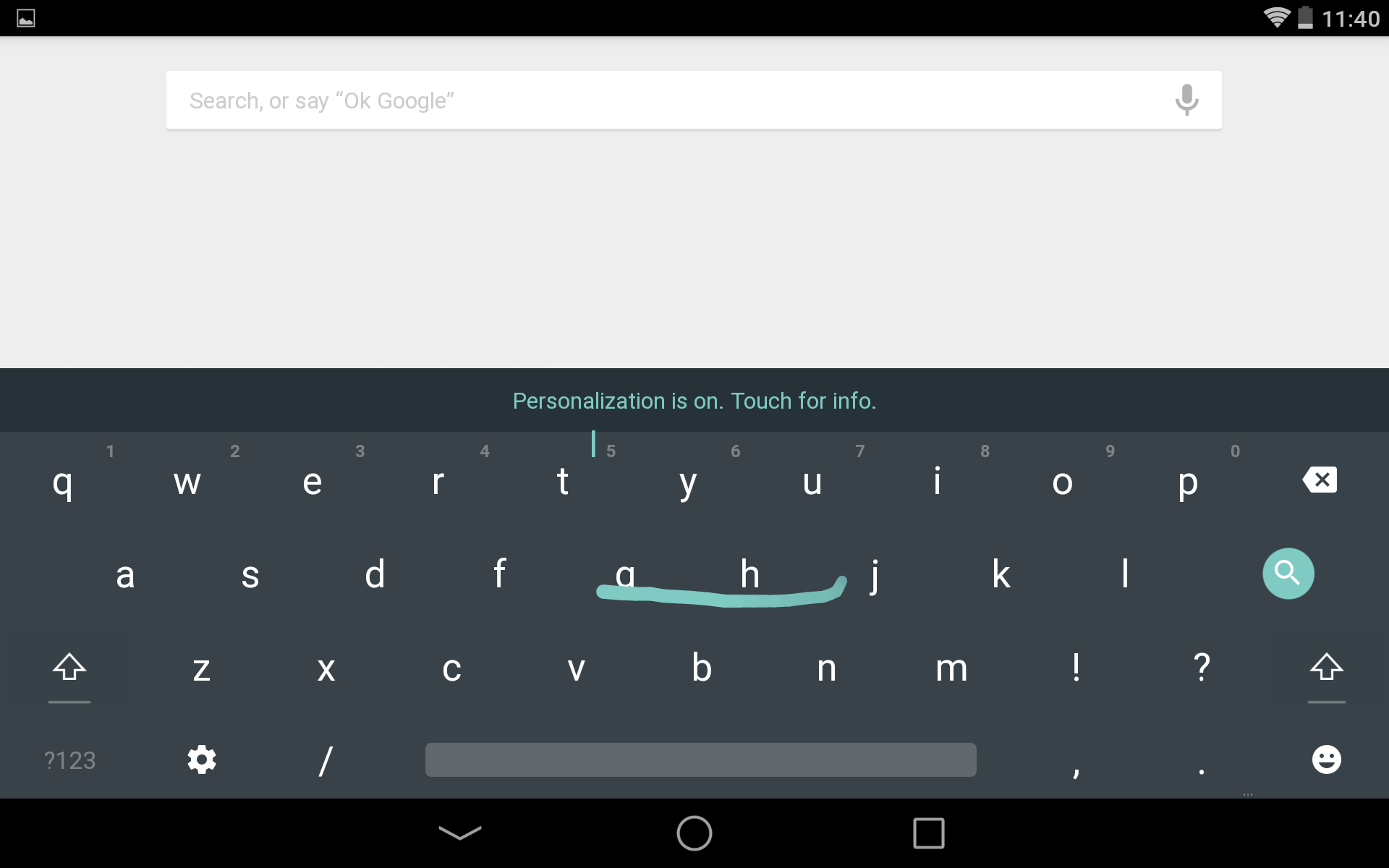
The keyboard on Android hasn’t changed too much as far as function goes, but the look has. The keyboard now has a very flat look, with no separation between keys. (www.simpleeverydaymom.com) Essentially themed, Android s keyboard offers more muted tones, with a pop of color when typing.
If you’re not a fan of the new look of the keyboard, you can easily change back to it’s old look in the settings.
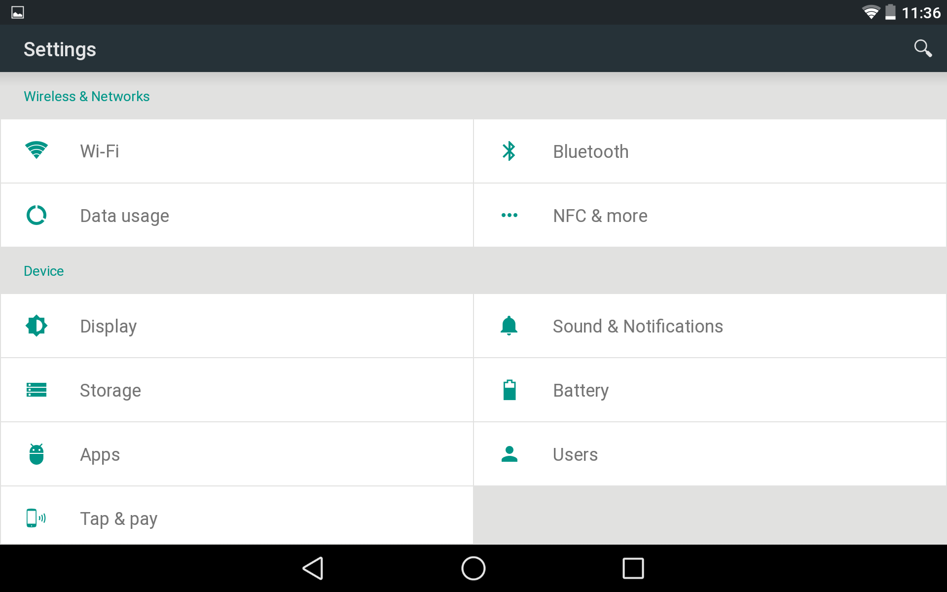
Instead of the normal list view in the settings menu, Android brings a new layout to the table. This is a trend that we’ve seen a couple of OEMs implement into some phones, like the Galaxy S5.
en using the Nexus 5 in portrait mode, the menu is displayed as a categorized list, but you’ll still see settings side by side in lscape mode.
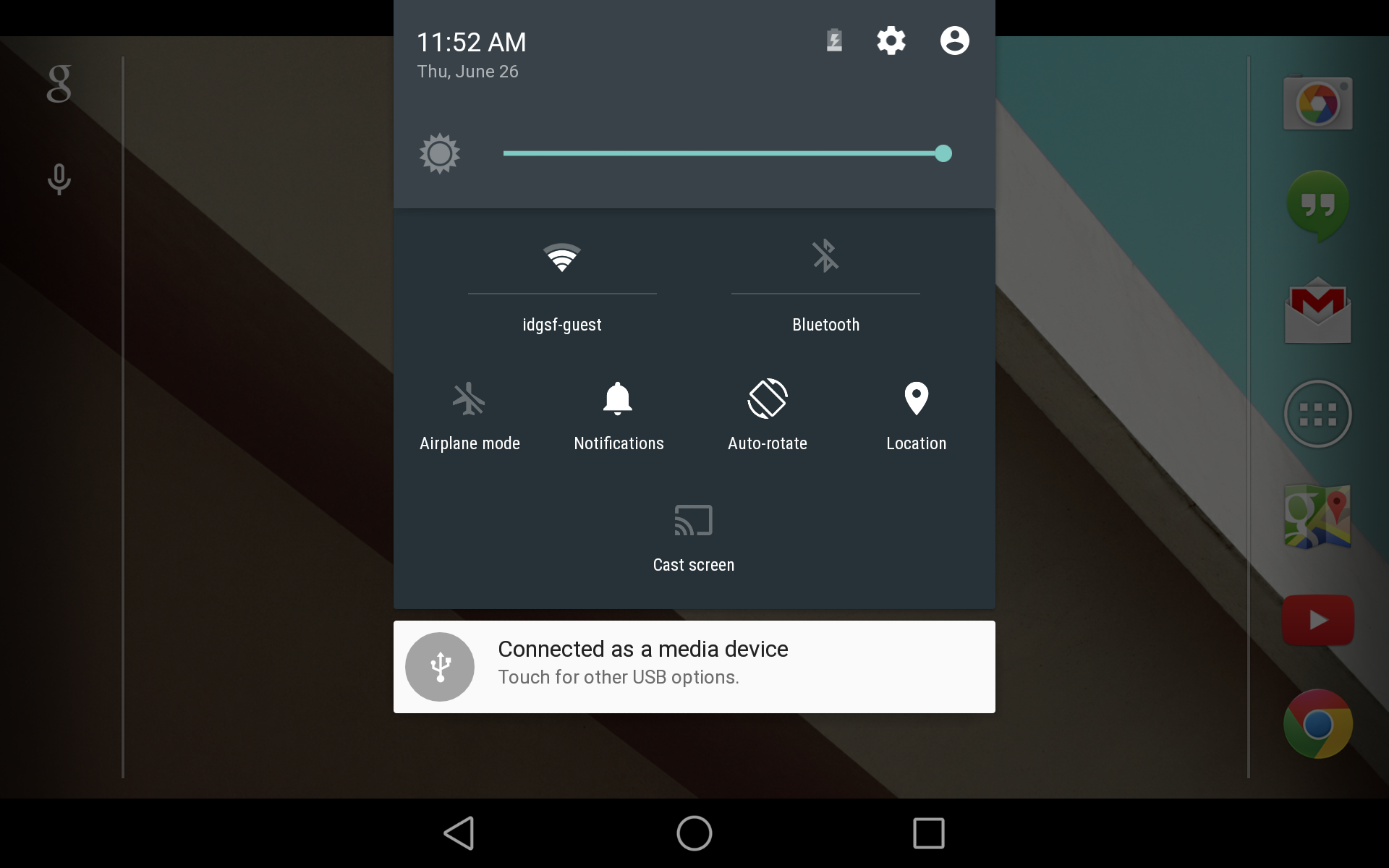
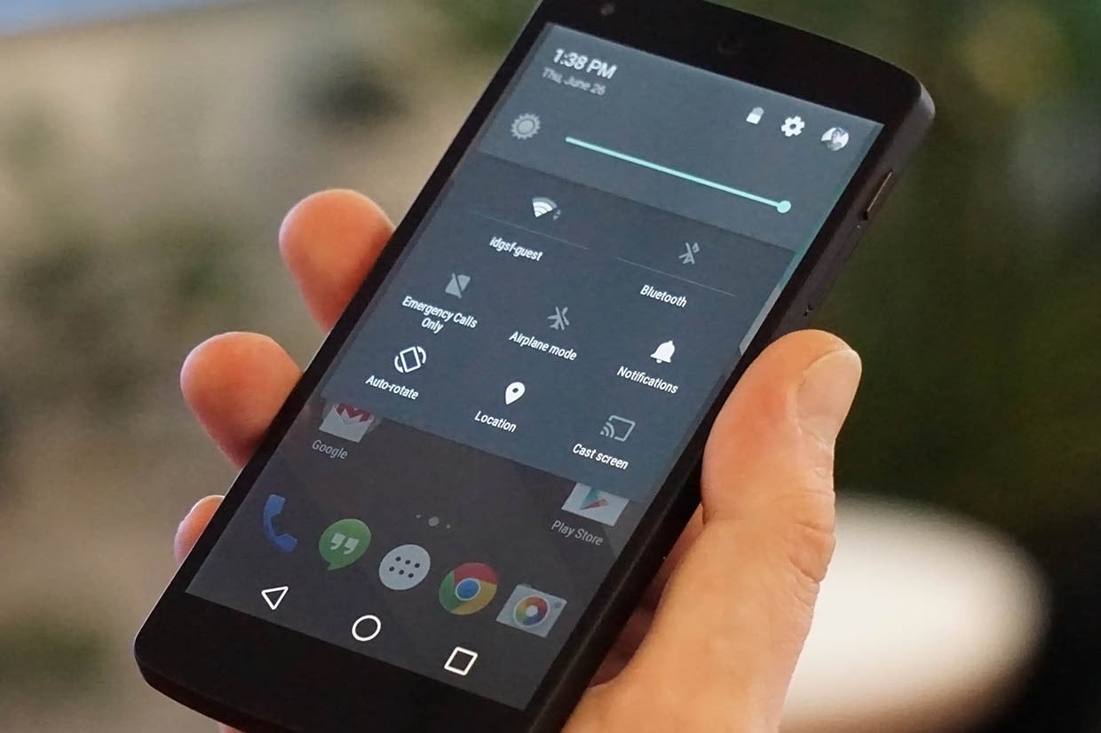
Gone is the old Quick Settings menu that required you to tap a button on the top right of the panel or pull it down with two fingers. Android brings a huge change to the panel. You still get to your notifications on a quick pull-down from the top edge, but you open quick settings by swiping down again. The two-finger swipe no longer works.
The panel no longer covers the full screen in portrait mode, but only a part of the screen, making it look as if it’s floating on top of the screen.
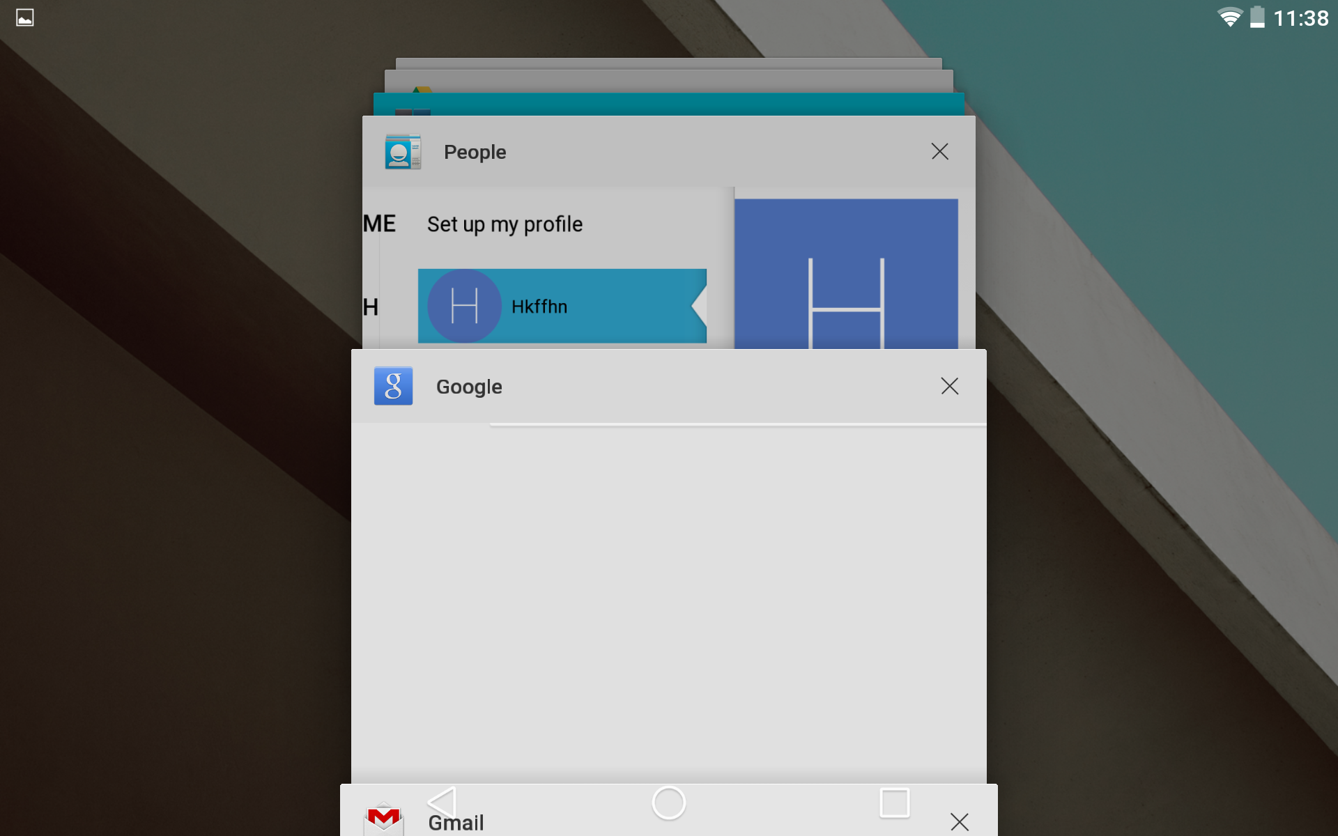
ile it funtions just the same, your recent apps are displayed much differently compared to KitKat. Now in a stacked, card view, your recent apps look better than ever.
I’d be lying if I said it didn’t resemble the way tabs are displayed in Safari on iOS. Then again, Chrome for Android also has a similar way of displaying tabs.
The new recent apps design is easy on the eyes I have my doubts there will be many complaints.
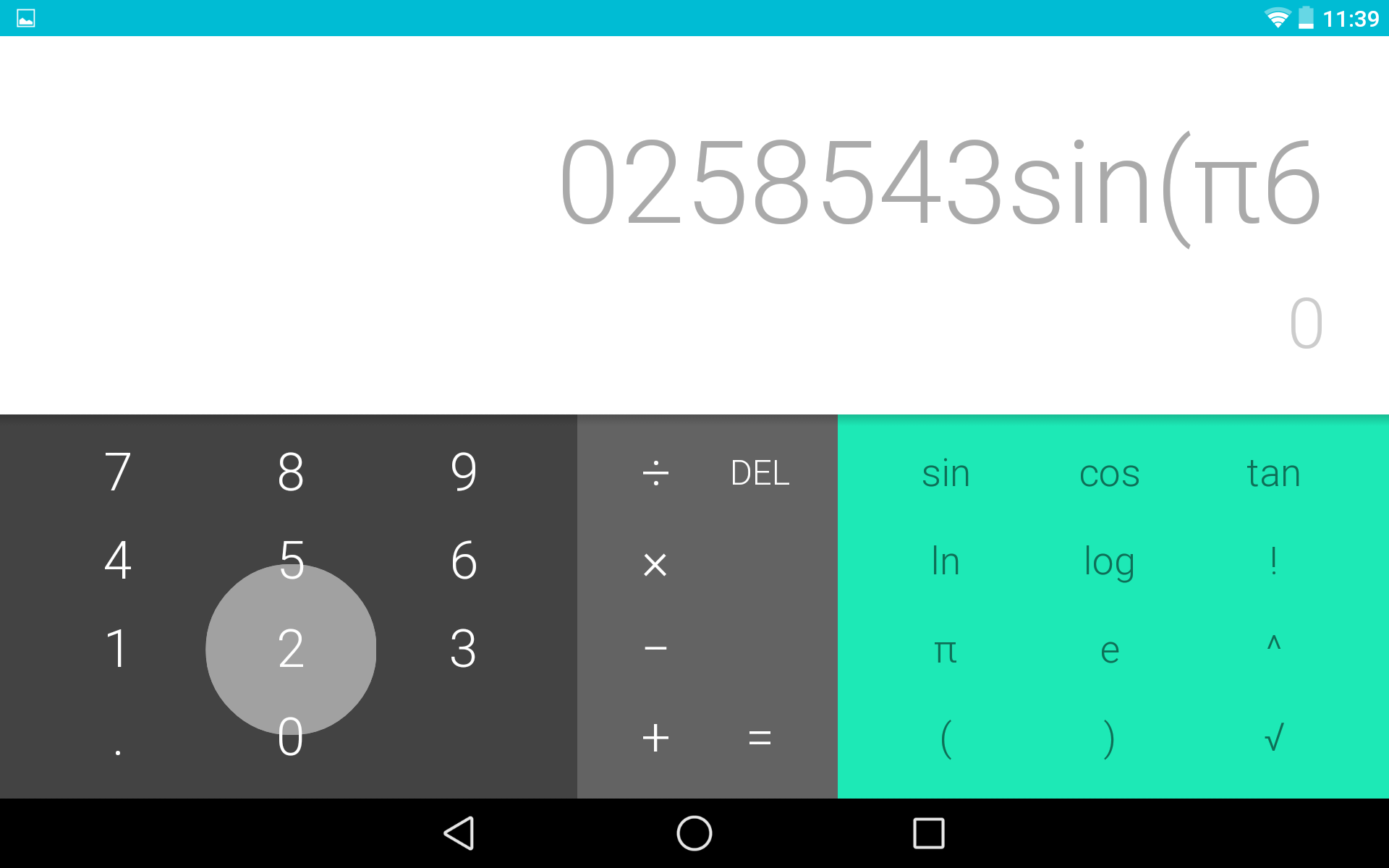
Thanks to ‘s new Material Design guidelines, you’ll find there are splashes of color intentionally put alongside more muted tones to provide a nice contrast. For instance, the calculator app has pops of green against the grey, as well as a blue notification bar.
As a part of its new design approach, encourages developers to breathe some life into apps to define their brs delight the user.
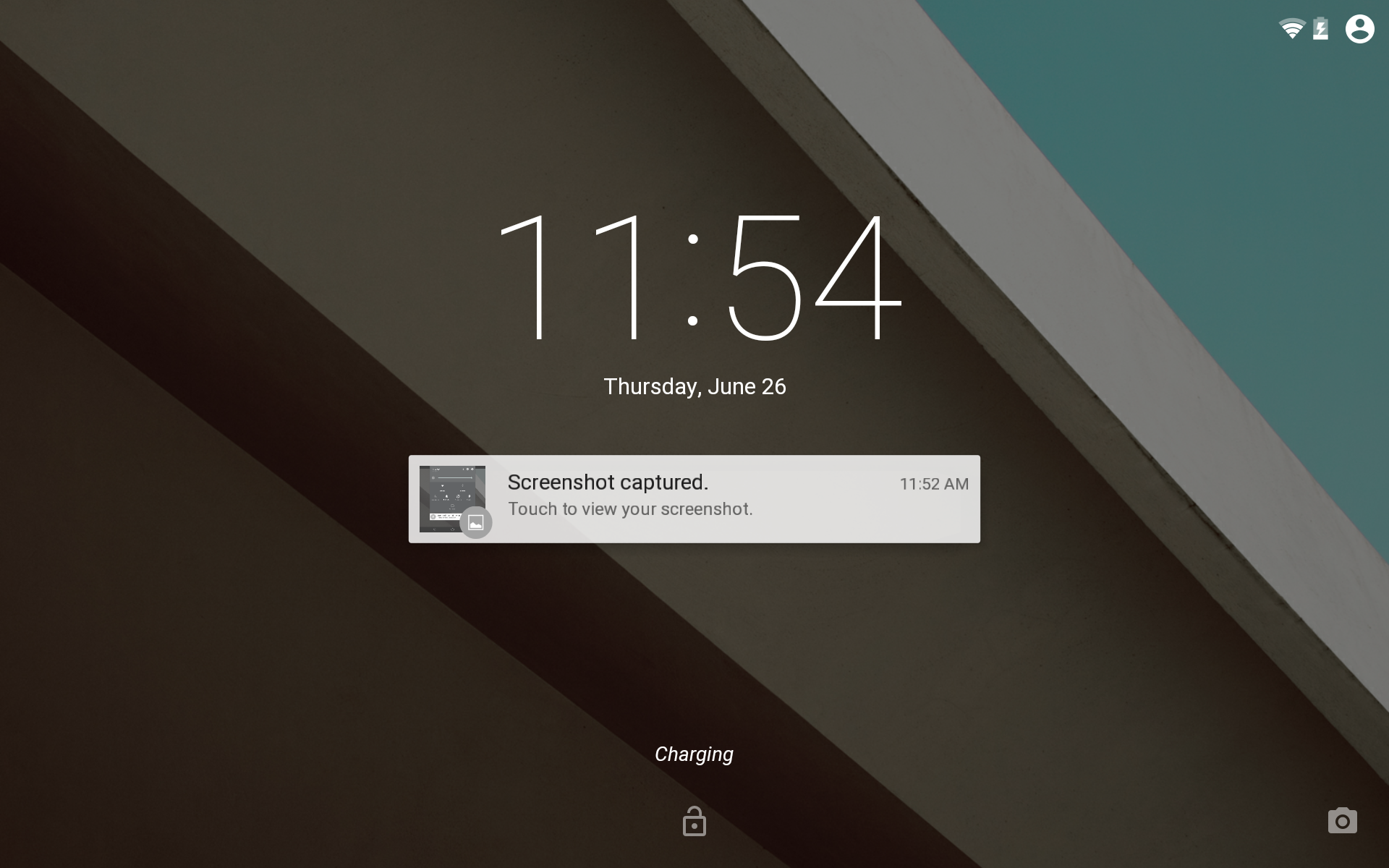
The lockscreen on Android has also received a revamp. Expanadable notifications are now displayed on the lockscreen can be quickly brought into view or dismissed with a swipe.
By swiping right on the lockscreen, you’ll still be able to access your camera, but now, swiping left will launch the dialer app.
en you’re charging your phone or your tablet, the amount of time until its fully charged will be displayed on the lockscreen.
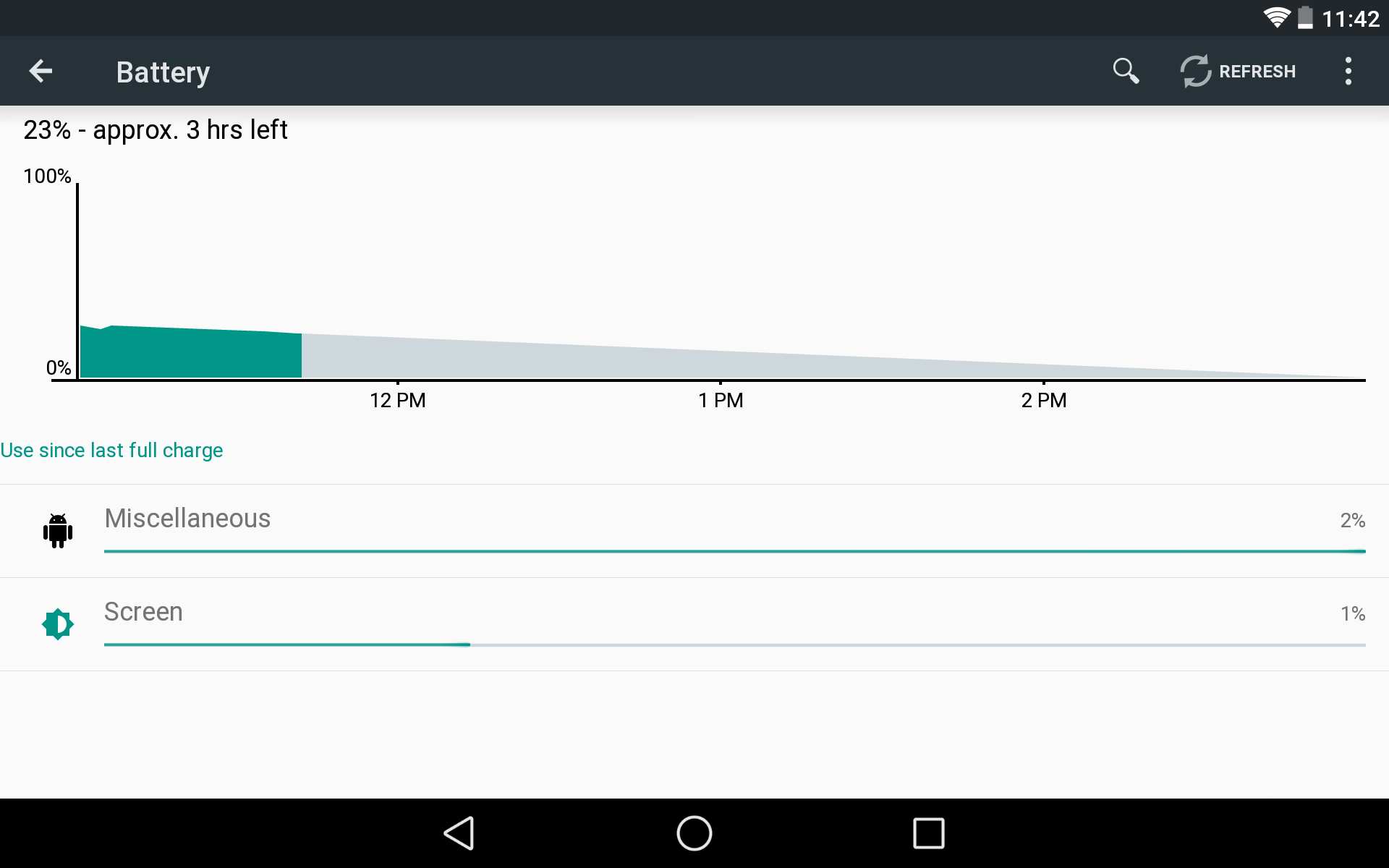
Seemingly everything has been tweaked or touched up in Android including the battery monitor in the settings. The design is simple played-down, falling in like with s overal aesthetic.
followed in the steps of a hful of other Android OEMs built a battery saving mode, this is where you’ll be able to activate or deactivate it.
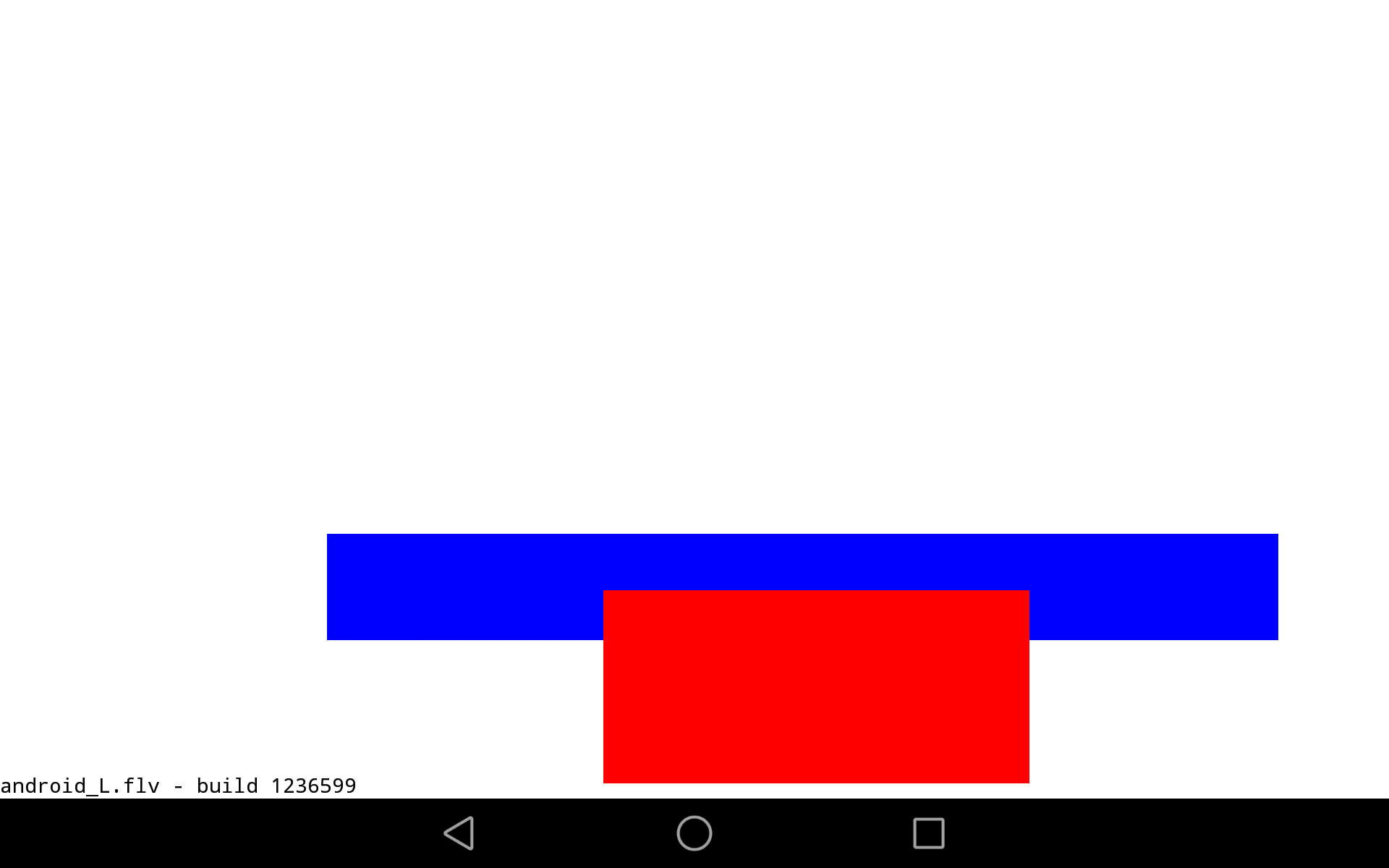
famously hides easter eggs in the settings of Android, usually found by tapping multiple times on the “Android version” in the settings menu. Doing that in the Android developer preview brings up a somewhat odd animation of squares rectangles. ile it is different from what we’ve seen before, it’s probably just a placeholder as works on it’s final “sweet treat” bring (our money’s on “lollipop”).
